


1,TextInput组件介绍
TextInput 组件除了作为输入框实现基本的输入功能外,它还提供了许多其他功能,比如自动校验、占位符以及指定弹出不同的键盘类型等。
2,组件的属性
(1)autoCapitalize:首字母自动大写。可选值有:none、sentences、words、characters。
(2)placeholder:占位符,在输入前显示的文本内容。
(3)value:文本输入框的默认值。
(4)placeholderTextColor:占位符文本的颜色。
(5)password:如果为 true,表示密码输入框。文本显示为“*”
(6)multiline:如果为 true,表示多行输入。
(7)editable:默认为 true。如果设置为 false 表示不可编辑。
(8)autoFocus:如果为 true,则自动获取焦点。
(9)clearButtonMode:表示什么时候会显示清除按钮。可选值有:never、while-editing、unless-editing、always。
(10)maxLength:能够输入的最长字符数。
(11)enablesReturnKeyAutomatically:默认为 false。设置为 true 表示没有输入文本时返回键无法使用。
(12)returnKeyType:表示软键盘返回键显示的字符串。可选值为:default、go、google、join、next、route、search、send、yahoo、done、emergency-call。
(13)secureTextEntry:默认为 false。如果为 true,则像密码框一样隐藏输入内容。
3,组件的方法
(1)onChange:当文本发生变化时,调用该函数。
(2)onEndEditing:当结束编辑时,调用该函数。
(3)onBlur:失去焦点时触发。
(4)onFocus:获得焦点时触发。
(5)onSubmitEditing:当结束编辑后,点击键盘的提交按钮触发该事件。
4,使用样例
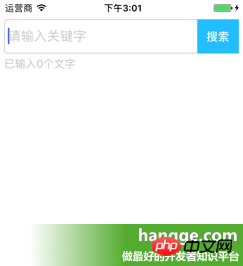
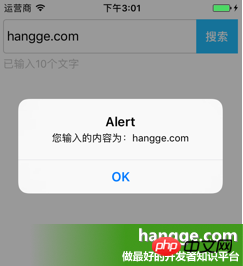
(1)效果图
页面上添加一个 TextInput 用于输入文字,并设置相关的占位符文字以及样式。
当输入框文字改变时,下方 Text 组件会实时统计并显示输入的文字长度。
点击输入框右侧“搜索”按钮,则将输入框内容弹出显示。

1 2 3 4 5 6 7 8 9 10 11 12 13 14 15 16 17 18 19 20 21 22 23 24 25 26 27 28 29 30 31 32 33 34 35 36 37 38 39 40 41 42 43 44 45 46 47 48 49 50 51 52 53 54 55 56 57 58 59 60 61 62 63 64 65 66 67 68 69 70 71 72 73 74 75 76 77 78 79 80 81 82 83 84 85 86 87 88 89 90 91 92 93 94 95 96 97 98 99 | import React, { Component } from 'react';import { AppRegistry, StyleSheet, Text, View, TextInput,} from 'react-native';//输入框组件class Search extends Component { //构造函数 constructor(props) { super(props); this.state = {text: ''}; } //组件渲染 render() { return ( <View style={styles.flex}> <View style={[styles.flexDirection, styles.inputHeight]}> <View style={styles.flex}> <TextInput style={styles.input} returnKeyType="search" placeholder="请输入关键字" onChangeText={(text) => this.setState({text})}/> </View> <View style={styles.btn}> <Text style={styles.search} onPress={this.search.bind(this)}>搜索</Text> </View> </View> <Text style={styles.tip}>已输入{this.state.text.length}个文字</Text> </View> ); } //搜索按钮点击 search(){ alert("您输入的内容为:"+this.state.text); }}//默认应用的容器组件class App extends Component { render() { return ( <View style={[styles.flex, styles.topStatus]}> <Search></Search> </View> ); } }//样式定义const styles = StyleSheet.create({ flex:{ flex: 1, }, flexDirection:{ flexDirection:'row' }, topStatus:{ marginTop:25, }, inputHeight:{ height:45, }, input:{ height:45, borderWidth:1, marginLeft: 5, paddingLeft:5, borderColor: '#ccc', borderRadius: 4 }, btn:{ width:55, marginLeft:-5, marginRight:5, backgroundColor:'#23BEFF', height:45, justifyContent:'center', alignItems: 'center' }, search:{ color:'#fff', fontSize:15, fontWeight:'bold' }, tip:{ marginLeft: 5, marginTop: 5, color: '#C0C0C0', }});AppRegistry.registerComponent('HelloWorld', () => App); |
以上就是TextInput组件的详细介绍的详细内容,更多请关注php中文网其它相关文章!
声明:本文原创发布php中文网,转载请注明出处,感谢您的尊重!如有疑问,请联系admin@php.cn处理


网友评论
文明上网理性发言,请遵守 新闻评论服务协议
我要评论