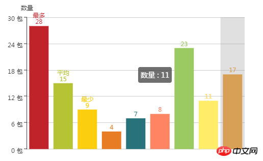
Sometimes we need to use Echarts to develop histograms, but if the columns are all the same color, it may look "hard", but if in the histogram, the columns representing different meanings use different colors, it will look like It will be much clearer, so this article will introduce to you how to set different colors forecharts histogram. Without further ado, let’s take a look at the following content.
You need to know Echarts commercial-grade data charts. It is a pure JavaScript icon library, compatible with most browsers. The bottom layer relies on the lightweight canvas class library ZRender to provide intuitive, vivid and interactive. Highly customizable data visualization charts. (If you don’t know echarts, you can refer to:What is echarts? How to use it? Introduction to echarts)
Let’s take a look at the code directly:
xAxis : [ { type : 'category', // name:'额度', //这是设置的false,就不不显示下方的x轴,默认是true的 show: false, //这里呢,就是每个柱的name了,根据实际情况下就好了,我就先写这三个 data : ['最多','平均','最少'], axisLabel: { //这个是倾斜角度,也是考虑到文字过多的时候,方式覆盖采用倾斜 // rotate: 30, //这里是考虑到x轴文件过多的时候设置的,如果文字太多,默认是间隔显示,设置为0,标示全部显示,当然,如果x轴都不显示,那也就没有意义了 interval :0 } } ], yAxis : [ { type : 'value', name:'数量', //下面的就很简单了,最小是多少,最大是多少,默认一次增加多少 min: 0, max: 30, interval: 6, //下面是显示格式化,一般来说还是用的上的 axisLabel: { formatter: '{value} 包' } } ], series : [ { name: '数量', type: 'bar', itemStyle: { normal: { //好,这里就是重头戏了,定义一个list,然后根据所以取得不同的值,这样就实现了, color: function(params) { // build a color map as your need. var colorList = [ '#C1232B','#B5C334','#FCCE10','#E87C25','#27727B', '#FE8463','#9BCA63','#FAD860','#F3A43B','#60C0DD', '#D7504B','#C6E579','#F4E001','#F0805A','#26C0C0' ]; return colorList[params.dataIndex] }, //以下为是否显示,显示位置和显示格式的设置了 label: { show: true, position: 'top', // formatter: '{c}' formatter: '{b}\n{c}' } } }, //设置柱的宽度,要是数据太少,柱子太宽不美观~ barWidth:70, data: [28,15,9,4,7,8,23,11,17] } ]
The effect is as follows:

Note: In fact, you can also use color to set the color of the histogram, but sometimes the color setting has no effect. So the above method was adopted.
This article ends here. For more exciting content, you can pay attention to the php Chinese website.
Related recommendations:
Echarts implements dynamic color changing histogram
echarts sets the polyline line color and polyline points Examples of colors
The above is the detailed content of echarts histogram color setting: How to set different colors for echarts histogram? (code). For more information, please follow other related articles on the PHP Chinese website!