


Recently I was redesigning my blog site and decided to use a calendar-style icon to display the time. The previous solution was generally to use background images. Thanks to CSS3, we can now achieve this function using CSS3. I will be using some linear-gradients, border radius and box shadow properties to replace the previous photoshop design.
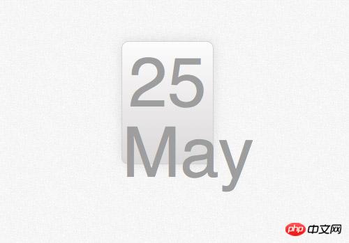
photoshop concept map

Many designers use the method of designing directly on the browser, but I still prefer to do it first Concept drawing in photoshop. Although many effects can now be achieved directly with CSS, the way to design effects using Photoshop is much simpler than constantly trying to modify CSS to finally achieve the effect you want.
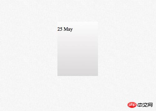
First create a rounded rectangle, set the rounded corner radius to 10px, and then we will use the border-radius property of css to implement it.

Add a vertical gradient to the rectangle. The gradient color is from #dad8d8 to #fcfcfc.

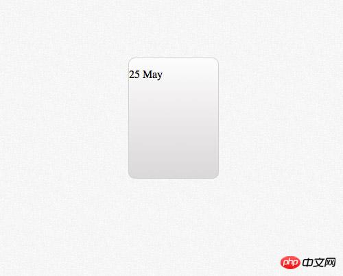
Set a 1 pixel stroke and the color is #e3e3e3
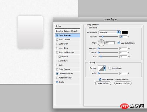
Finally add a downward shadow effect with transparency is 20%, 0 pixels distance and 15 pixels size. These effects will be implemented in css using the box-shadow property.
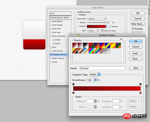
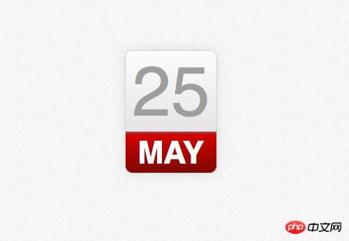
Copy the rectangle just now and remove the upper part. Modify the gradient from #790909 to #d40000 and fill the newly created rectangle where the month information will be placed.
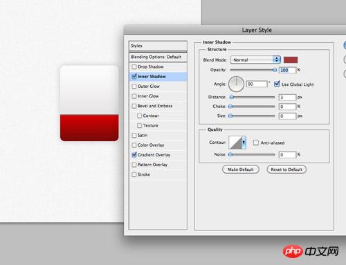
Set an inner shadow to represent the top border, color #a13838, 100% transparency, 3px distance and 0px size.

Use the font tool of Photoshop to set the font effect of the time content in the upper half of the calendar icon. The font is Helvetica and the color is #9e9e9e.
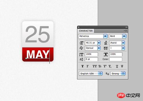
Enter the month information in the red part below, set the font to wide and the color to white.
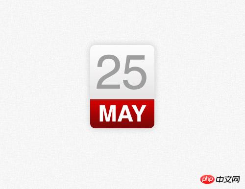
The photoshop model is completed. In the past, we would extract the image as the background and write html numbers on it, but now all of this can be achieved with css.
HTML structure
<p class="date">
<p>25 <span>May</span></p></p>This time the html of the ICON demo is very simple. We will use p with class as 'date' as the container, and then use a p tag to represent the date number. Days and months are represented by characters of different sizes in our design, so we use the tag to treat different elements differently.
css style
.date {
    width: 130px; height: 160px;
    background: #fcfcfc;
    background: linear-gradient(top, #fcfcfc 0%,#dad8d8 100%);
    background: -moz-linear-gradient(top, #fcfcfc 0%, #dad8d8 100%);
    background: -webkit-linear-gradient(top, #fcfcfc 0%,#dad8d8 100%);
}
.date {
    width: 130px; height: 160px;
    background: #fcfcfc;
    background: linear-gradient(top, #fcfcfc 0%,#dad8d8 100%);
    background: -moz-linear-gradient(top, #fcfcfc 0%, #dad8d8 100%);
    background: -webkit-linear-gradient(top, #fcfcfc 0%,#dad8d8 100%);
    border: 1px solid #d2d2d2;
    border-radius: 10px;
    -moz-border-radius: 10px;
    -webkit-border-radius: 10px;
    box-shadow: 0px 0px 15px rgba(0,0,0,0.1);
    -moz-box-shadow: 0px 0px 15px rgba(0,0,0,0.1);
    -webkit-box-shadow: 0px 0px 15px rgba(0,0,0,0.1);
}
.date p {
    font-family: Helvetica, sans-serif;
    font-size: 100px; text-align: center; color: #9e9e9e;
}
.date p span {
    background: #d10000;
    background: linear-gradient(top, #d10000 0%, #7a0909 100%);
    background: -moz-linear-gradient(top, #d10000 0%, #7a0909 100%);
    background: -webkit-linear-gradient(top, #d10000 0%, #7a0909 100%);
} 
红色部分的实现是通过为span的背景设置linear-gradient属性实现的,红色的数值也是来自于photoshop。
.date p span {
    background: #d10000;
    background: linear-gradient(top, #d10000 0%, #7a0909 100%);
    background: -moz-linear-gradient(top, #d10000 0%, #7a0909 100%);
    background: -webkit-linear-gradient(top, #d10000 0%, #7a0909 100%);
    font-size: 45px; font-weight: bold; color: #fff; text-transform: uppercase;
    display: block;
} 
修改文字样式,使它和设计匹配,大小设置为45px,设置为粗体字,颜色设置为白色,使用text-transform实现大写转换。将span标签设置为块元素,这样他就会匹配容器的大小了,设置红色背景。
.date p span {
    background: #d10000;
    background: linear-gradient(top, #d10000 0%, #7a0909 100%);
    background: -moz-linear-gradient(top, #d10000 0%, #7a0909 100%);
    background: -webkit-linear-gradient(top, #d10000 0%, #7a0909 100%);
    font-size: 45px; font-weight: bold; color: #fff; text-transform: uppercase;
    display: block;
    border-top: 3px solid #a13838;
    border-radius: 0 0 10px 10px;
    -moz-border-radius: 0 0 10px 10px;
    -webkit-border-radius: 0 0 10px 10px;
    padding: 6px 0 6px 0;
}
剩下的就是添加头部边框,用border-top样式实现,还有就是用border-radius属性实现下部两个圆角。一点点的padding属性可以让月份文字上下和其他元素有些间隔。
浏览器兼容性
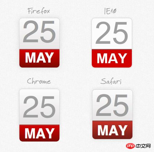
尽管css改进的属性可以帮助我们实现photoshop中渐变和阴影的效果,但是我们仍然要面对以前web设计师要面对的问题,浏览器兼容性。
The above is the detailed content of HTML5 practice-detailed explanation of using css to create time ICON (picture). For more information, please follow other related articles on the PHP Chinese website!


![[Web front-end] Node.js quick start](https://img.php.cn/upload/course/000/000/067/662b5d34ba7c0227.png)


