
Do you know how to add a thick edge area chart to an Excel chart? This is an excellent chart type for showing data trends concisely and clearly. In this tutorial, PHP editor Youzi will guide you step by step, allowing you to easily create business-style Excel charts.
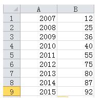
As shown in Figure 1, it is a set of original data. Select the second column of data and insert the line chart to get a line chart. However, the X-axis data has not been added yet. You need to select the chart data. Finally, design-select data-horizontal axis label-select the year column data in this example. After completion, you will get the line chart shown in Figure 2.
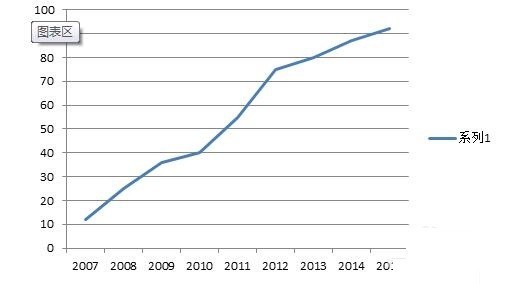
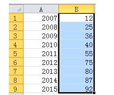
The first step is to generate a line chart, this step is to generate an area chart, as shown in Figure 1, select the data column again, Ctrl C copy, select the chart area, Ctrl V to paste, and then find an identical curve covering the original curve, as shown in Figure 2.
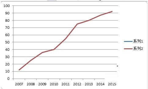
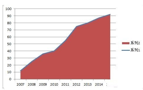
Select the data in legend 2 and change the chart type to area chart to get a rough area chart with line (Figure 1).
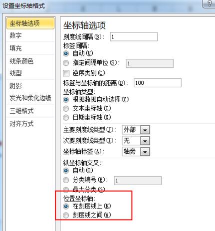
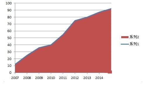
Adjust the coordinate axis format and set the position coordinate axis to [on the tick mark]. After adjustment, as shown in Figure 2, the starting position of the area chart has been aligned with the coordinate axis.
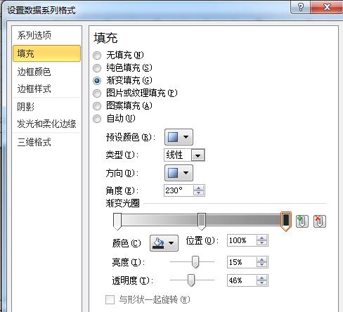
Beautification step 1: Set the area chart fill to gradient fill, as shown in Figure 1.
Beautification step 2: Set the line color to the theme color (orange in this example)
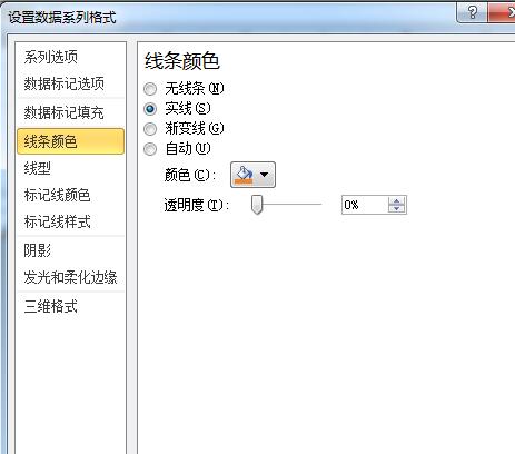
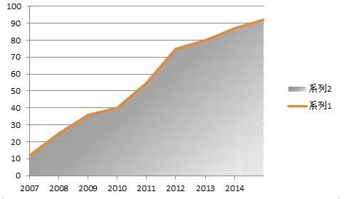
Beautification step 3: Delete the grid Line and legend, set the scale of the ordinate axis to [None], you can get the effect shown in Figure 2, and the chart has basically taken shape. Finally, set the background color of the chart area to light gray to get the effect shown in Figure 3.
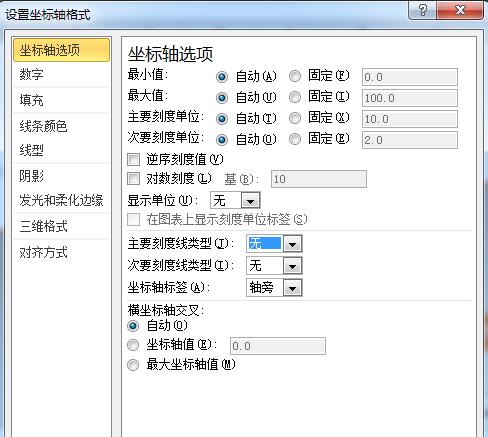
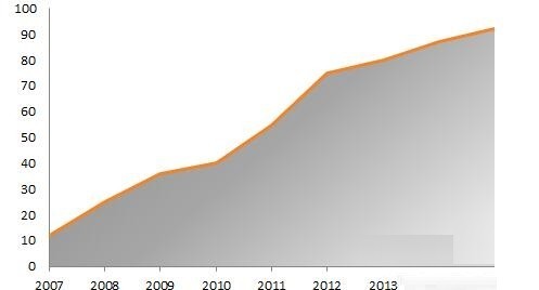
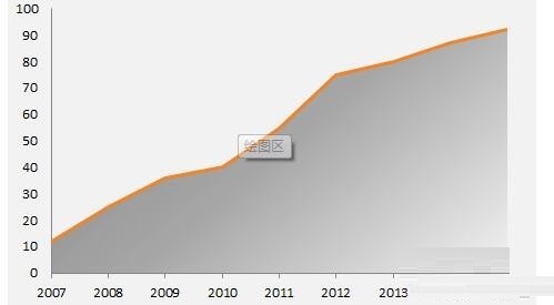
Beautification step 4: Appropriately add some data point labels, text boxes, titles, etc. to form a style, as shown in the picture.
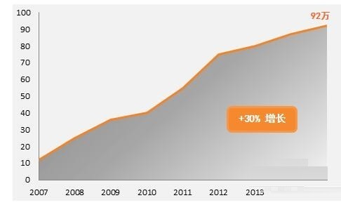
The above is the detailed content of How to create a business-style bold edge area chart in Excel charts. For more information, please follow other related articles on the PHP Chinese website!
 Which laptop battery testing software is best?
 Advantages of plc control system
 What does CX mean in the currency circle?
 The Metaverse recognizes the top ten potential coins
 How to set linux environment variables
 What currency is USDT?
 Detailed process of upgrading win7 system to win10 system
 Windows 10 activation key list


