Want to know how to merge radar charts with pie charts to show data comparison? PHP editor Youzi brings you detailed tutorials, allowing you to easily master the skills of making mixed data comparison charts in Excel and understand the steps to solve the problem.
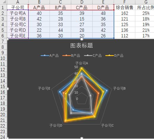
First, add a column to the original data to calculate the proportion of each subsidiary in total sales, and the result is used as the data source of the pie chart. Select the sales data of each subsidiary and each product (i.e. A1:E6), select the [Insert] tab, click [Waterfall Chart → Radar Chart with Data Markers], select the inserted chart, and click [Chart Tools → Design] Style the chart as needed.

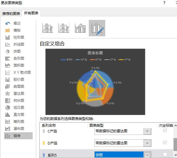
Select the pie chart data source (i.e. A2:A6, G2:G6), copy the data, select the chart, and paste; right-click the chart, select [Change Chart Type], and in the pop-up window Select [Combination], set the chart type of each product to [Radar Chart with Data Markers], and set the chart type of Series 5 to [Pie Chart].

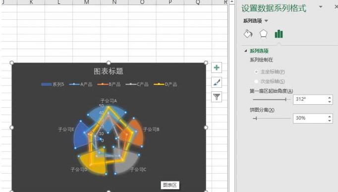
Right-click the pie chart in the chart, select [Format Data Series], and in the [Series Options] tab, adjust the starting angle of the first sector so that each pie The company represented by the chart corresponds to the data of the corresponding company in the radar chart; adjust the pie chart separation percentage.

Select the pie chart, set its fill color to [Solid Color Fill], and delete the label representing the company in the radar chart. Select the pie chart and click [Chart Tools→Add Chart Elements→Data Labels→Data Annotation] to add numerical labels to the pie chart. Right-click the network line of the radar chart, select [Set Grid Line Format], and set it as needed in the right window.
Finally, delete [Series 5] in the legend and change the chart title. Of course, the chart can be further beautified as needed. In this way, the pie chart and the radar chart are combined, and the comparison between the data is obvious.
Tips:
Of course, you can also change the pie chart to a donut chart as needed. You also need to adjust the starting angle of the first sector and adjust the inner diameter of the donut chart to further beautify it. Combination chart.
The above is the detailed content of How to create a mixed data comparison chart of radar chart and pie chart in Excel. For more information, please follow other related articles on the PHP Chinese website!


