Dynamic charts are a very commonly used chart in our daily work. Different from static charts, it can display data more intuitively and flexibly, allowing users to conduct interactive comparative analysis. It is a higher-level form of chart analysis. So today I will tell you how to use excel to create a dynamic chart that automatically changes based on time periods. Come and take a look!

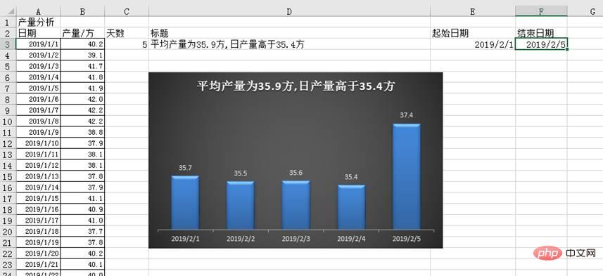
In the production process of an enterprise, it is often necessary to do output analysis. If there is a chart, it can dynamically display the output situation in any time period according to the analyst's choice. And the average and minimum output data of the corresponding time period can also be given through the title bar, which will greatly improve our efficiency. (The effect is shown in the figure below)
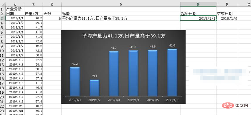
First, let’s analyze the requirements: ① The chart needs to dynamically display the production data of any time period; ② The title bar needs to dynamically display the corresponding time period average and minimum yield data.
When it comes to the word "dynamic" in excel, we have to mention the OFFSET function. When making dynamic charts, you first need to use the OFFSET function to define the dynamic area.
Steps:
① Define two name areas
This example requires creating two The name range is used to define two cell ranges. The range they select is dynamic and can automatically change according to user operations. The data in these two dynamic cell areas will serve as the data source for our charts.
We enter any start date in cell E3 of the worksheet, enter any end date in cell F3, and enter the formula "=F3-E3 1" in cell C3 to get the starting date to end date. Total number of days.
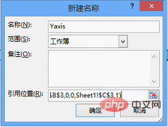
Then click "Define Name" in the "Defined Name" group of the "Formula" tab, and the "New Name" dialog box will pop up. Enter "Yaxis" in the "Name" of the dialog box, and enter the formula "=OFFSET(Sheet1!$B$3,Sheet1!$E$3-Sheet1!$A$3,0,Sheet1!$C$3" in the "Reference Position" ,1)”, this name is used to obtain the production area corresponding to the specified time period. Finally click "OK".
Follow the above steps, open the "New Name" dialog box, enter "Xaxis" in the "Name" of the dialog box, and enter the formula "=" in the "Reference Position" OFFSET(Sheet1!$A$3,Sheet1!$E$3-Sheet1!$A$3,0,Sheet1!$C$3,1)", this name is used to obtain the date range corresponding to the specified time period.
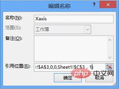
OFFSET function can realize dynamic selection of cell area. The syntax structure is: OFFSET (reference, rows, cols, [height], [width]). Among them, the reference parameter is used to define the starting position of the area, the rows parameter is used to define the row offset, the cols parameter is used to define the column offset, the height parameter is used to define the number of referenced rows, and the width parameter is used to define the referenced Number of columns. Take the first formula "=OFFSET(Sheet1!$B$3,Sheet1!$E$3-Sheet1!$A$3,0,Sheet1!$C$3,1)" as an example, which means starting from cell B3 Position, the number of rows offset from the difference between cell E3 (start date) and cell A3 (January 1, 2019), no column offset, reference to a "C3" row (the data in cell C3 specifies the reference number of rows), 1-column data area.
② Set chart data
After defining the dynamic area, you can then create the chart. Dynamic charts can be realized by specifying the chart's data series and horizontal axis labels as the required dynamic areas.
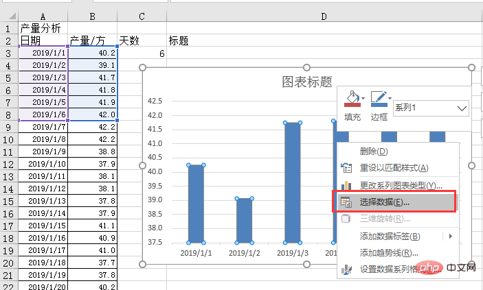
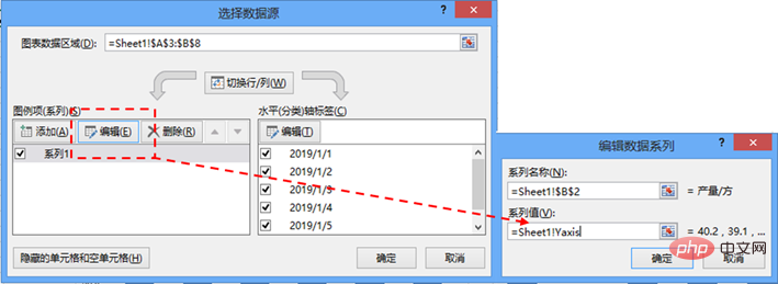
Select the cell range A3:B8 and insert the "Clustered Column Chart". Right-click the chart and click "Select Data" in the context menu that pops up. Select Data Source dialog box.
Click the "Edit" button in the "Legend Item (Series)" column on the left side of the dialog box to pop up the "Edit Data Series" dialog box. In the dialog box, enter "=Sheet1!$B$2" in the "Series Name" field (just click on cell B2 in the table), and enter the formula "=Sheet1!Yaxis" in the "Series Value" field to represent the data. Series is specified as data in the "Yaxis" name area, click the "OK" button to close the dialog box after completing the settings.
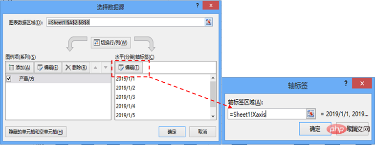
Next, click the "Edit" button in the "Horizontal (Category) Axis Label" column on the right side of the "Select Data Source" dialog box to pop up the "Axis Label" dialog box. Enter the formula "=Sheet1!
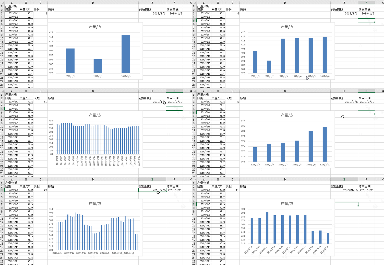
Through the settings of the above steps, you only need to enter any start date and end date in cell E3 and cell F3 respectively, and you can dynamically display the data in the chart. Display the production status of the corresponding time period.
③ Set dynamic title
After completing the first requirement, let’s complete the second one: making the title bar Dynamically display the average and minimum production data of the corresponding time period.
How to make the chart title dynamically display the analysis data? We use a formula to calculate the data in a cell, insert a title in the chart, and then let the title box refer to the cell data.
Enter the formula "="The average output is "&ROUND(AVERAGE(Yaxis),1)&"square"&" in cell D3, and the daily output is higher than "&ROUND(MIN(Yaxis),1) &"square"".

Use the AVERAGE function and the MIN function to find the average and minimum production data in the production area "Yaxis" in the specified time period. Then use the ROUND function to round the result to the specified number of digits. Finally, use the connector "&" to connect each field.
Then add a chart title to the chart, double-click the title, and enter the formula "=Sheet1!$D$3" in the edit bar. Reference the data in cell D3 as the chart title.

In this way, the title bar can dynamically display the data analysis results. Will querying the data become convenient and intuitive?
④ Beautify the chart
Double-click the data series in the chart to pop up the "Format Data Series" dialog box, set the "Category Spacing" in the "Series Options" setting bar is 100%.
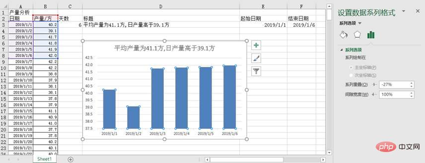
Click "Design" in the "Chart Tools" bar, select your favorite chart style, adjust the title font size appropriately, and delete the grid lines and vertical axis. Add "data label", and the finished chart will look as follows.
Related learning recommendations: excel tutorial
The above is the detailed content of Practical Excel skills sharing: guide you to create a high-end dynamic chart. For more information, please follow other related articles on the PHP Chinese website!
 Compare the similarities and differences between two columns of data in excel
 excel duplicate item filter color
 How to copy an Excel table to make it the same size as the original
 Excel table slash divided into two
 Excel diagonal header is divided into two
 Absolute reference input method
 java export excel
 Excel input value is illegal


