

 Backend Development
Python Tutorial
What are the commonly used Python data visualization libraries?
Backend Development
Python Tutorial
What are the commonly used Python data visualization libraries?
What are the commonly used Python data visualization libraries?


What library would you use for data visualization in Python?
Today I will share with you a powerful member of the Python data visualization library-Altair!
It is very simple, friendly, and built on the powerful Vega-Lite JSON specification. We only need short code to generate beautiful and effective visualizations.
What is Altair
Altair is a statistical visualization Python library that currently has more than 3,000 stars on GitHub.
With Altair, we can focus more energy and time on understanding the data itself and its meaning, and be freed from the complex data visualization process.
Simply put, Altair is a visual grammar and a declarative language for creating, saving and sharing interactive visual designs. It can use JSON format to describe the visual appearance and interaction process, and generate network-based image.
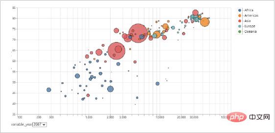
Let’s take a look at the visualization effects made using Altair!
- Declarative Python API based on graphical syntax.
- Generate Altair's Python code based on Vega-Lite's JSON syntax rules.
- Show the statistical visualization process in the started Jupyter Notebook, JupyterLab and nteract.
- You can export the visualization work as a picture in PNG/SVG format, a web page in HTML format that can be run independently, or you can view the running effect in the online Vega-Lite editor.
import altair as alt
import pandas as pd
data = pd.read_excel( "Index_Chart_Altair.xlsx", sheet_name="Sales", parse_dates=["Year"] )
alt.Chart( data )
Quick test - make a bar chartAltair places great emphasis on variables Differentiation and combination of types. The value of a variable is data, and there are differences. It can be expressed in the form of numerical values, strings, dates, etc. Variables are storage containers for data, and data are the contents of the storage units of variables. On the other hand, from the perspective of statistical sampling, the variable is the population and the data is the sample. Samples need to be used to study and analyze the population. Statistical graphs can be generated by combining different variable types with each other to provide a more intuitive understanding of the data. According to the combination of different variable types, the combination of variable types can be divided into the following types.
- Nominal variable Quantitative variable. Time type variable Quantity type variable. Time variable Nominal variable. Quantitative variable Quantitative variable.
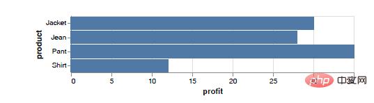
chart = alt.Chart(df).mark_bar().encode(x="profit:Q",y="product:N")Complex graphs are also very simple Let’s demonstrate the average monthly rainfall in different years by partition!
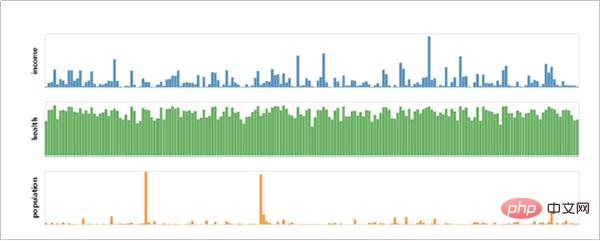
我们可以使用面积图描述西雅图从2012 年到2015 年的每个月的平均降雨量统计情况。接下来,进一步拆分平均降雨量,以年份为分区标准,使用阶梯图将具体年份的每月平均降雨量分区展示,如下图所示。
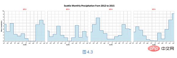
核心的实现代码如下所示。
…
chart = alt.Chart(df).mark_area(
color="lightblue",
interpolate="step",
line=True,
opacity=0.8
).encode(
alt.X("month(date):T",
axis=alt.Axis(format="%b",
formatType="time",
labelAngle=-15,
labelBaseline="top",
labelPadding=5,
title="month")),
y="mean(precipitation):Q",
facet=alt.Facet("year(date):Q",
columns=4,
header=alt.Header(
labelColor="red",
labelFontSize=15,
title="Seattle Monthly Precipitation from 2012 to 2015",
titleFont="Calibri",
titleFontSize=25,
titlePadding=15)
)
0)
…
在类alt.X()中,使用month 提取时间型变量date 的月份,映射在位置通道x轴上,使用汇总函数mean()计算平均降雨量,使用折线作为编码数据的标记样式。
在实例方法encode()中,使用子区通道facet 设置分区,使用year 提取时间型变量date 的年份,作为拆分从2012 年到2015 年每个月的平均降雨量的分区标准,从而将每年的不同月份的平均降雨量分别显示在对应的子区上。使用关键字参数columns设置子区的列数,使用关键字参数header 设置子区序号和子区标题的相关文本内容。
具体而言,使用Header 架构包装器设置文本内容,也就是使用类alt.Header()的关键字参数完成文本内容的设置任务,关键字参数的含义如下所示。
- labelColor:序号标签颜色。
- labelFontSize:序号标签大小。
- title:子区标题。
- titleFont:子区字体。
- titleFontSize:子区字体大小。
- titlePadding:子区标题与序号标签的留白距离。
The above is the detailed content of What are the commonly used Python data visualization libraries?. For more information, please follow other related articles on the PHP Chinese website!

Hot AI Tools

Undress AI Tool
Undress images for free

Undresser.AI Undress
AI-powered app for creating realistic nude photos

AI Clothes Remover
Online AI tool for removing clothes from photos.

Clothoff.io
AI clothes remover

Video Face Swap
Swap faces in any video effortlessly with our completely free AI face swap tool!

Hot Article
Hot Tools

Notepad++7.3.1
Easy-to-use and free code editor

SublimeText3 Chinese version
Chinese version, very easy to use

Zend Studio 13.0.1
Powerful PHP integrated development environment

Dreamweaver CS6
Visual web development tools

SublimeText3 Mac version
God-level code editing software (SublimeText3)


 What are class methods in Python
Aug 21, 2025 am 04:12 AM
What are class methods in Python
Aug 21, 2025 am 04:12 AM
ClassmethodsinPythonareboundtotheclassandnottoinstances,allowingthemtobecalledwithoutcreatinganobject.1.Theyaredefinedusingthe@classmethoddecoratorandtakeclsasthefirstparameter,referringtotheclassitself.2.Theycanaccessclassvariablesandarecommonlyused
 python asyncio queue example
Aug 21, 2025 am 02:13 AM
python asyncio queue example
Aug 21, 2025 am 02:13 AM
asyncio.Queue is a queue tool for secure communication between asynchronous tasks. 1. The producer adds data through awaitqueue.put(item), and the consumer uses awaitqueue.get() to obtain data; 2. For each item you process, you need to call queue.task_done() to wait for queue.join() to complete all tasks; 3. Use None as the end signal to notify the consumer to stop; 4. When multiple consumers, multiple end signals need to be sent or all tasks have been processed before canceling the task; 5. The queue supports setting maxsize limit capacity, put and get operations automatically suspend and do not block the event loop, and the program finally passes Canc
 How to run a Python script and see the output in a separate panel in Sublime Text?
Aug 17, 2025 am 06:06 AM
How to run a Python script and see the output in a separate panel in Sublime Text?
Aug 17, 2025 am 06:06 AM
ToseePythonoutputinaseparatepanelinSublimeText,usethebuilt-inbuildsystembysavingyourfilewitha.pyextensionandpressingCtrl B(orCmd B).2.EnsurethecorrectbuildsystemisselectedbygoingtoTools→BuildSystem→Pythonandconfirming"Python"ischecked.3.Ifn
 How to use regular expressions with the re module in Python?
Aug 22, 2025 am 07:07 AM
How to use regular expressions with the re module in Python?
Aug 22, 2025 am 07:07 AM
Regular expressions are implemented in Python through the re module for searching, matching and manipulating strings. 1. Use re.search() to find the first match in the entire string, re.match() only matches at the beginning of the string; 2. Use brackets() to capture the matching subgroups, which can be named to improve readability; 3. re.findall() returns all non-overlapping matches, and re.finditer() returns the iterator of the matching object; 4. re.sub() replaces the matching text and supports dynamic function replacement; 5. Common patterns include \d, \w, \s, etc., you can use re.IGNORECASE, re.MULTILINE, re.DOTALL, re
 How to build and run Python in Sublime Text?
Aug 22, 2025 pm 03:37 PM
How to build and run Python in Sublime Text?
Aug 22, 2025 pm 03:37 PM
EnsurePythonisinstalledbyrunningpython--versionorpython3--versionintheterminal;ifnotinstalled,downloadfrompython.organdaddtoPATH.2.InSublimeText,gotoTools>BuildSystem>NewBuildSystem,replacecontentwith{"cmd":["python","-
 How to use variables and data types in Python
Aug 20, 2025 am 02:07 AM
How to use variables and data types in Python
Aug 20, 2025 am 02:07 AM
VariablesinPythonarecreatedbyassigningavalueusingthe=operator,anddatatypessuchasint,float,str,bool,andNoneTypedefinethekindofdatabeingstored,withPythonbeingdynamicallytypedsotypecheckingoccursatruntimeusingtype(),andwhilevariablescanbereassignedtodif
 How to pass command-line arguments to a script in Python
Aug 20, 2025 pm 01:50 PM
How to pass command-line arguments to a script in Python
Aug 20, 2025 pm 01:50 PM
Usesys.argvforsimpleargumentaccess,whereargumentsaremanuallyhandledandnoautomaticvalidationorhelpisprovided.2.Useargparseforrobustinterfaces,asitsupportsautomatichelp,typechecking,optionalarguments,anddefaultvalues.3.argparseisrecommendedforcomplexsc
 How to debug a remote Python application in VSCode
Aug 30, 2025 am 06:17 AM
How to debug a remote Python application in VSCode
Aug 30, 2025 am 06:17 AM
To debug a remote Python application, you need to use debugpy and configure port forwarding and path mapping: First, install debugpy on the remote machine and modify the code to listen to port 5678, forward the remote port to the local area through the SSH tunnel, then configure "AttachtoRemotePython" in VSCode's launch.json and correctly set the localRoot and remoteRoot path mappings. Finally, start the application and connect to the debugger to realize remote breakpoint debugging, variable checking and code stepping. The entire process depends on debugpy, secure port forwarding and precise path matching.
