


How to implement a circular loop progress bar in css: 1. Create an outermost parent ring; 2. Draw two semicircles through "clip-path" and absolutely position them to cover the parent circle. ring; 3. When it is less than 50, slowly reveal the color of the parent ring by rotating the right semicircle; 4. When it is greater than 50, set the rotation degree of the right semicircle to 0 and modify its border color to achieve the effect of the first 50. Secondly Then rotate the left semicircle to achieve the effect.

The operating environment of this tutorial: Windows 10 system, CSS3 version, DELL G3 computer
How to implement a circular loop progress bar in css?
clip-path, and absolutely position them to cover the parent ring.
<template>
<div>
<div></div>
<div></div>
<div>
<span>成功率</span>
<span>85%</span>
</div>
</div></template><script>export default {
name: 'CircleProgress',
setup() {
const renderRightRate = (rate: number) => {
if (rate < 50) {
return 'transform: rotate(' + 3.6 * rate + 'deg);';
} else {
return 'transform: rotate(0);border-color: #54c4fd;';
}
};
const renderLeftRate = (rate: number) => {
if (rate >= 50) {
return 'transform: rotate(' + 3.6 * (rate - 50) + 'deg);';
}
};
return {
renderLeftRate,
renderRightRate,
};
},};</script><style>.circle {
width: 80px;
height: 80px;
position: relative;
border-radius: 50%;
left: 200px;
top: 50px;
box-shadow: inset 0 0 0 5px #54c4fd;
.ab {
position: absolute;
left: 0;
right: 0;
top: 0;
bottom: 0;
margin: auto;
}
&_left {
border: 5px solid #546063;
border-radius: 50%;
clip: rect(0, 40px, 80px, 0);
}
&_right {
border: 5px solid #546063;
border-radius: 50%;
clip: rect(0, 80px, 80px, 40px);
}
&_text {
height: 100%;
display: flex;
flex-direction: column;
justify-content: center;
align-items: center;
color: #fff;
.name {
margin-bottom: 4px;
}
}}</style>
cssIn fact, it is the same as static. This example is written at a fixed pace, and you can also change it according to your own needs.
<template>
<div>
<div></div>
<div></div>
<div>
<span>成功率</span>
<span>85%</span>
</div>
</div></template><script>import { onMounted, ref, Ref } from 'vue';export default {
name: 'CircleProgress',
setup() {
const circleLeft: Ref<HTMLElement | null | any> = ref(null);
const circleRight: Ref<HTMLElement | null | any> = ref(null);
let timer = 0;
let percent = 0;
const step = () => {
percent += 1;
if (percent < 50) {
circleRight.value.style.transform = 'rotate(' + 3.6 * percent + 'deg)';
} else {
circleRight.value.style.transform = 'rotate(0)';
circleRight.value.style.borderColor = '#54c4fd';
circleLeft.value.style.transform = 'rotate(' + 3.6 * (percent - 50) + 'deg)';
}
if (percent < 85) {
window.clearTimeout(timer);
timer = window.setTimeout(step, 20);
}
};
onMounted(() => {
step();
});
return {
circleLeft,
circleRight,
};
},};</script>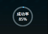
css video tutorial"
The above is the detailed content of How to implement a circular loop progress bar in css. For more information, please follow other related articles on the PHP Chinese website!


![[Web front-end] Node.js quick start](https://img.php.cn/upload/course/000/000/067/662b5d34ba7c0227.png)


