Speaking of charts, the images that pop up in everyone’s mind should be the styles that come with Excel. Not to mention that they are not good-looking, and these built-in templates cannot display data intuitively. It is obvious to hand over such charts to leaders. is inappropriate. The following article will share with you an Excel stacked column chart tutorial to teach you how to make different contrasting column charts, which will amaze everyone when making work reports.

Everyone knows that EXCEL charts have many types, such as column charts, bar charts, line charts, pie charts, etc. Everyone makes the same charts at work, so how do you use the simplest data to make a high-end chart? Today I will share with you an Excel stacked column chart comparison case.
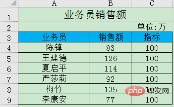
As shown below, this is a sales data of the company's salesmen, listing the sales volume of each salesperson and the indicators that need to be completed.
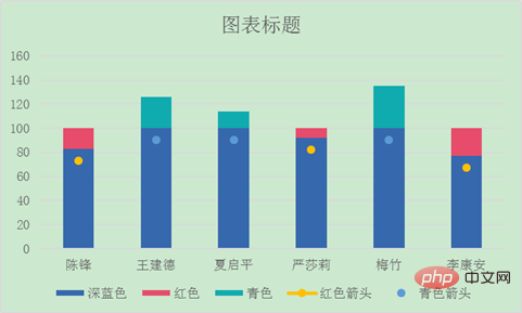
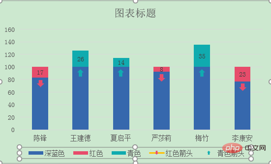
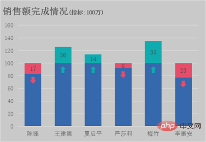
The picture below is the final effect of the chart we are going to learn to make today. The chart is equipped with arrows that clearly list whether each salesperson has completed the target and the gap between the target and the target. The downward arrow indicates that the indicator is below the indicator, and the upward arrow indicates that the indicator is above the indicator. How to make this comparison histogram? Hurry up and learn!

How to use Excel to make a histogram? First we need to make several auxiliary columns based on the source data. Here we will explain to you how to make the auxiliary columns of each series based on the color of the chart series.

means if the sales is less than the target, return the difference otherwise return empty.
means if the sales is less than the target, return the sales minus 10 otherwise return empty.
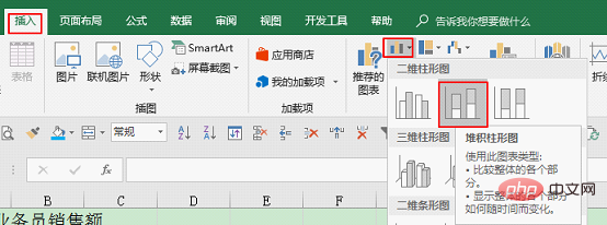
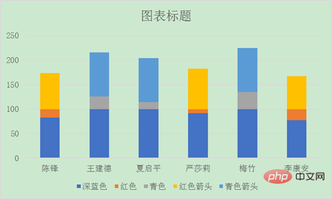

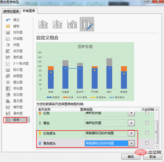
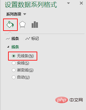
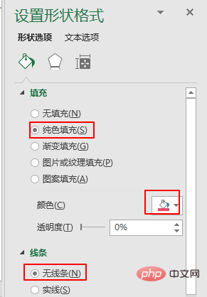
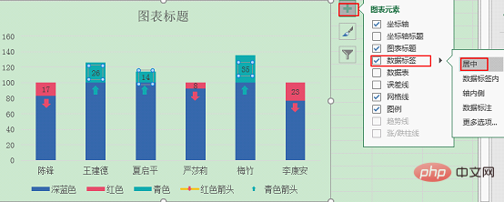
Modify the line chart in the chart with connecting lines to wireless strip.
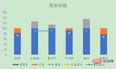
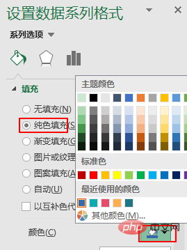
Select the data label with the connecting line, press CTRL 1 or double-click, the "Format Data Series" window will pop up on the right. Select Lines under Series Options—No Lines.


Related learning recommendations: excel tutorial
The above is the detailed content of Excel chart learning: bar chart comparing actual and target. For more information, please follow other related articles on the PHP Chinese website!
 Compare the similarities and differences between two columns of data in excel
 excel duplicate item filter color
 How to copy an Excel table to make it the same size as the original
 Excel table slash divided into two
 Excel diagonal header is divided into two
 Absolute reference input method
 java export excel
 Excel input value is illegal


