In the previous article "Excel Chart Learning: How to Use Controls to Make Bar Charts", we learned how to use controls to make bar charts. Today we continue to share the tutorial on how to make Excel charts. The whole graph is like a bullet, so it is called a bullet chart. If you use this bullet chart to make a performance report, you will wonder whether you will get a promotion or a salary increase! The operation is also very simple, let’s learn how to make an Excel bullet chart together!

#Performance display must be something that everyone often needs to do in their work. Different forms of expression may have completely different effects. Your boss has to review so much work every day. He doesn’t know how much work you have done or how many overtime shifts you have done. He can only see the results of your work from your charts. At this time, if your charts make his eyes shine. , then your promotion will be just around the corner!
For example, using the data in the figure below, most people can use the column chart that comes with excel to complete the task.
#The result is as shown below. The default Excel column chart looks like this.
From the picture, we cannot intuitively see who is excellent, who is up to standard, and who is failing.
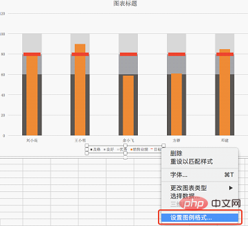
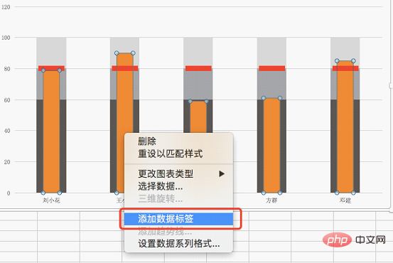
Today we learn to make a powerful chart - making a bullet chart in Excel. When describing the difference between the actual achievement level and the target level, a bullet chart can usually be used as an explanatory chart, which can clearly show the difference between the target, level and actual level.
We will finally complete the following renderings. Such an excellent chart will surely impress your boss.
1. Steps to create Excel charts
1. Process original data
Generally, raw data is not good mapping data. So the first step in making a good chart is to process the raw data into the required charting data.
The original data is still the previous example, as follows:
Finally, we made the table as shown below as mapping data. This table adds 4 types of data to the original data. Everyone's goal is set at 80, reaching 60 is set as passing, and 61-80 is good. Because we are doing a stacked chart, the maximum value of good is 20 higher than passing, as shown in the picture below Just fill in 20, 81-100 is considered excellent, so fill in 20 in the excellent column.
2. Create Excel stacked column chart
Select the area A2:F7, click "Insert" on the menu bar, and select " Column Chart, and then select Stacked Column Chart.
Get the chart below;
The abscissa of the above chart is five data categories, such as sales performance The bars represent the stacked sales performance of each individual. What we need is to use the abscissa of the person's name as a bar for each person.
Select the table, right-click, and click "Select Data" in the pop-up window.
In the pop-up window, click "Switch rows/columns" to get a picture with the abscissa of the person's name.
Each column bar represents a person's data, including sales performance, target, passing, good and excellent data.
3. Set the target horizontal line
How to add a target line on the bar chart? Click to select the "Target" legend, right-click, select "Change Chart Type" in the pop-up window, and select "Line Chart". At this time, the target series becomes a horizontal line;
Click the target horizontal line, right-click, and select "Format Data Series".
In the pop-up window, select the paint bucket option, select "Lines", and click "No Lines";
4. Set up sales performance series
Click to select the sales performance legend, right-click and select "Format Data Series".2. Beautify Excel charts
1. Click the "Pass" legend, right-click, Select Format Data Series.


3. Learning reflection
The main function of the Excel bullet chart we learned today is to visually express the difference between actual and target in one picture, and at the same time know which stage it is at. The main difficulty is the setting of the secondary coordinate axis of sales performance. In order to achieve the narrowing of the sales performance column bar, it must be drawn on the secondary coordinate axis.We can understand the primary coordinate axis and the secondary coordinate axis as two pictures stacked on top of each other. If the chart is drawn on the same coordinate axis, the width of the column chart will be the same because the scale of the coordinate axis is the same. The secondary coordinate axis has been added, the scale can be different from the primary coordinate axis, and its width can be set to achieve the effect of different widths.
Finally, I hope this tutorial on how to make an Excel bullet chart can help you in your daily work and help you get promoted and get a salary increase quickly! ! !
Related learning recommendations: excel tutorial
The above is the detailed content of Excel chart learning: Excel bullet chart that reflects the difference between actual and target. For more information, please follow other related articles on the PHP Chinese website!
 Compare the similarities and differences between two columns of data in excel
 excel duplicate item filter color
 How to copy an Excel table to make it the same size as the original
 Excel table slash divided into two
 Excel diagonal header is divided into two
 Absolute reference input method
 java export excel
 Excel input value is illegal


