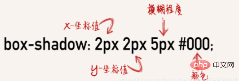
In CSS3, "box-shadow" means "box shadow", which is a new attribute that adds border shadow to elements; this attribute can add one or more shadows to the box, the syntax "box -shadow: horizontal shadow vertical shadow blur distance size color inset;".

The operating environment of this tutorial: Windows 7 system, CSS3&&HTML5 version, Dell G3 computer.

In CSS3, "box-shadow" means "box shadow", which is a new attribute that adds border shadow to elements.

# The box-shadow property adds one or more shadows to the box.
Note: Use border-image-* attributes to construct beautiful scalable buttons!
Syntax:
box-shadow: h-shadow v-shadow blur spread color inset;
box-shadow Adds one or more shadows to the box. This property is a comma-separated list of shadows, each specified by 2-4 length values, an optional color value, and the optional inset keyword. The value for omitted length is 0.
h-shadow Required. The position of the horizontal shadow. Negative values are allowed.
v-shadow Required. The position of the vertical shadow. Negative values are allowed.
blur Optional. Fuzzy distance.
spread Optional. The size of the shadow.
color Optional. The color of the shadow. See CSS color values.
inset Optional. Change the outer shadow (outset) to an inner shadow.
The following are a few small tests I did for everyone:
Running results:
We also practiced Learn how to create "polaroid" photos and rotate pictures. For example:

The pulpit rock in Lysefjorden, Norway.

Monterosso al Mare. One of the five villages in Cinque Terre.
The running result is as follows:

·There are many kinds of box-shadow shadows, such as: inner shadow, outer shadow, three-sided shadow, and two-sided shadow Shadow, single-sided shadow, western stroke...,
means:
 For example:
内阴影示例
3边内影示例
外阴影示例
右下外阴影示例
扩大阴影示例
半透明阴影色示例
css:
.flex{display:flex;flex-wrap:wrap;} .flex-item{margin-right:30px;} .box { background-color: #CCCCCC; border-radius:10px; width: 200px; height: 200px; } .boxshadow1{ box-shadow:inset 0px 0px 5px 1px #000; } .boxshadow2{ box-shadow:inset 0 1px 2px 1px #000; } .boxshadow3{box-shadow:0 0 10px #000;} .boxshadow4{box-shadow:2px 2px 5px #000;} .boxshadow5{box-shadow:0 0 5px 15px #000;} .boxshadow6{box-shadow: 12px 12px 2px 1px rgba(0, 0, 255, .2);}
Running results:

(Learning video sharing:css video tutorial,web front-end Getting Started Tutorial)
The above is the detailed content of What does box-shadow mean in css3. For more information, please follow other related articles on the PHP Chinese website!