


Difference: 1. bootstrap v4 is written in Sass language, v3 is written in Less language; 2. v4 has 5 grid classes, v3 has 4 grid classes; 3. v3 uses px as the unit, v4 Use rem and em as units; 4. v3 uses float layout and v4 uses flexbox layout.

The operating environment of this tutorial: Windows7 system, Bootstrap3&&Bootstrap4 version, DELL G3 computer
| Bootstrap3 | Bootstrap4 |
| Sass language writing | |
| 5 types of grid classes | |
| Use rem and em is the unit (except for some margins and padding that use px) | |
| Offset columns are set by the offset-class | |
| Select the flexible box model (flexbox) |
The new grid layer is adapted to the mobile terminal;
Bootstrap3 cannot be used in Bootstrap4 The hidden-xs, visible-xs classes in
If you want to hide at a certain size in Bootstrap 4, you should refer to the following table It’s worth mentioning What's more, using hidden-sm in B3 will only hide the sm size, and other sizes will be displayed normally. In B4, if you simply specify d-sm-none, the element will be hidden in the sm size, but the size above sm will be hidden. It will also be hidden, and the size under sm will be displayed normally. This involves the issue of upward compatibility, so when you set the sm element to be hidden, you must also set the md size display, as shown in the table above, and so on for others.Hide upward compatibility , showing downward compatibility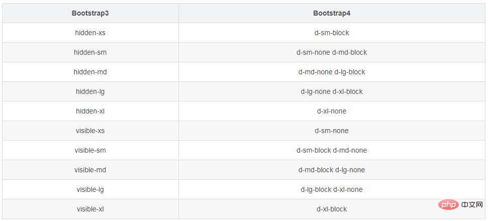
Bootstrap3 horizontal centering
// 文本: class ="text-center" // 图片居中: class = "center-block"
Under flex: For example, p.row
bootstrap usage tutorial
》The above is the detailed content of What is the difference between bootstrap v4 v3. For more information, please follow other related articles on the PHP Chinese website!
 How to return to the home page in html
 What are the Python artificial intelligence frameworks?
 How to set offline status on Douyin
 windows automatic update
 What are the commonly used third-party libraries in PHP?
 Skills required for front-end development
 Unable to locate program input point in dynamic link library
 Windows cannot access shared computer


![[Web front-end] Node.js quick start](https://img.php.cn/upload/course/000/000/067/662b5d34ba7c0227.png)


