How to customize the bottom navigation bar of WeChat applet? The following article will introduce to you the specific implementation method of customizing the bottom navigation bar. I hope it will be helpful to you!

WeChat supports custom navigation bar to achieve flexible bottom navigation bar. A simple description is given in the official document, but it is not too specific. Here I Through step-by-step specific code implementation, we will help you complete the specific implementation of customizing the bottom navigation bar. [Related learning recommendations:小program development tutorial]
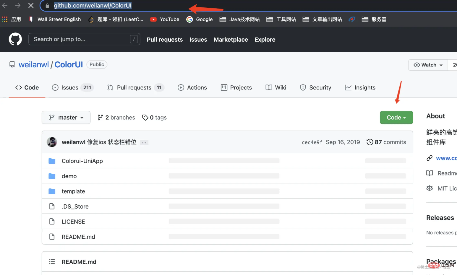
https://github.com/weilanwl/ColorUI
Visit this URL and download the colorui component library

After downloading, put the colorui folder in the demo folder into your applet In the project
Settings are introduced
@import 'colorui/main.wxss'; @import 'colorui/icon.wxss'; @import 'colorui/animation.wxss';
Put the above code into the app.wxss file (Fill in the above code path according to your actual path)
colorui has been introduced successfully. I am using the style component of colorui here. In fact, the same is true for other uses, or you can write the bottom navigation bar yourself. Any style can be used
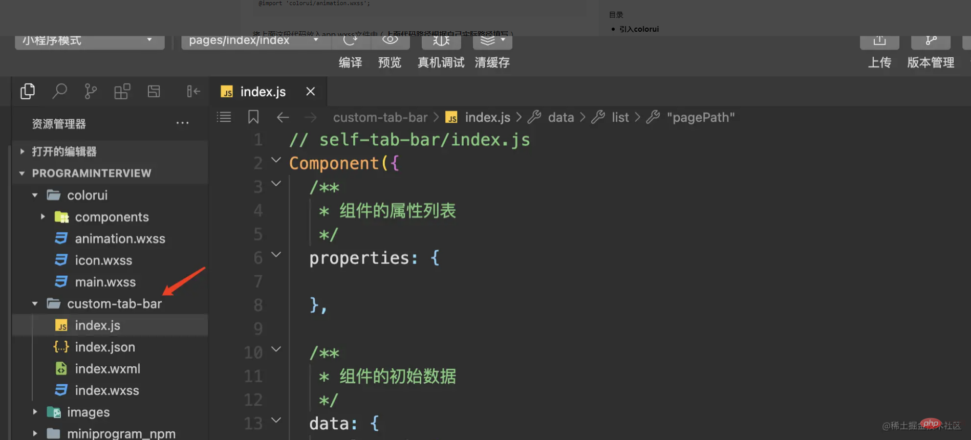
We first create a custom component folder **custom-tab-bar, **Remember, the custom bottom navigation bar The folder name must be this and cannot be changed to anything else, otherwise the applet will not be recognized.

Then we create two pages (home,my) under Pages, which are used as two switching pages for the navigation bar
If you do not use the default navigation bar settings of the mini program, you need to set the custom attribute of the tabBar in the app.json file. For true
The specific code is as follows:
"tabBar": { "custom": true, "list": [ { "pagePath": "pages/home/home", "text": "首页", "iconPath": "images/icon/basics.png", "selectedIconPath": "images/icon/basics_cur.png" }, { "pagePath": "pages/my/my", "text": "我的", "iconPath": "images/icon/component.png", "selectedIconPath": "images/icon/component_cur.png" } ] },
It should be noted here that the list also needs to be set. The pagePath in the list configures the specific tab page you need to configure. Here I only set it There are two tabs, so two are configured. After configuring several tabs, configure a few here. No one is missing. In addition to pagePath, other fields in the list can be increased or decreased according to your own needs.
The specific implementation of the navigation bar component
1. Initial data setting of the component
**// custome-tab-bar/index.js** /** * 组件的初始数据 */ data: { selected: 0, list: [{ "pagePath": "/pages/home/home", "text": "首页", "iconPath": "/images/icon/basics.png", "selectedIconPath": "/images/icon/basics_cur.png" }, { "pagePath": "/pages/my/my", "text": "我的", "iconPath": "/images/icon/component.png", "selectedIconPath": "/images/icon/component_cur.png" } ] }
You can see here that the settings are roughly the same as those in app.json, but the real list data is actually obtained here instead of app.json. This is the key to implementing custom components, so everyone You may have questions, since app.json is not used, why do you need to set it in app.json? I checked here and found that this is the standard requirement of the mini program and we can only comply with it.
2. Component navigation bar page code implementation
{{item.text}}
Here is the colorui style used. We compare the index bit of each data in the list with the selected value to create the button style. Switching effect, realize tab page switching throughswitchTabswitching event.
3. Component switching event code implementation
/** * 组件的方法列表 */ methods: { switchTab(e) { const data = e.currentTarget.dataset const url = data.path wx.switchTab({ url }) this.setData({ selected: data.index }) } }
Call the wx.switchTab method provided by WeChat to complete the url jump, and record the index value selected at the time.
The code for our component has been written here, and then the specific page must also set up the corresponding logic for button switching
4. Implementation of tab specific page code
// pages/my/my.js /** * 生命周期函数--监听页面显示 */ onShow: function () { console.log("onShow") if (typeof this.getTabBar === 'function' && this.getTabBar()) { this.getTabBar().setData({ selected: 1 }) } },
Set the value of selected through the page life cycle function of onShow. Because my page is the second tab, the index value is set to 1. The custom component WeChat has a new getTabBar interface, which can obtain the custom tabBar under the current page. Component instance, you can set the selected value in the component. The home page has the same settings, and the index value can be jumped according to the actual situation.
Through the implementation of the above code, the entire custom bottom navigation bar is realized. In fact, the overall implementation is relatively simple. Let's take a look at the effect
For more programming-related knowledge, please visit:Programming Video! !
The above is the detailed content of Teach you step by step how to customize the bottom navigation bar of WeChat applet. For more information, please follow other related articles on the PHP Chinese website!
 Ripple currency market trend
 How to obtain the serial number of a physical hard disk under Windows
 linux system time
 Windows cannot connect to wifi solution
 svg to jpg
 How to solve devc Chinese garbled characters
 What to do if the CPU usage is too high
 How to recover permanently deleted files on computer