In the previous article "HTML/css to achieve a fun text liquid filling effect" I introduced how to use HTML/css to achieve a fun text liquid filling effect. Interested friends can learn Find out~
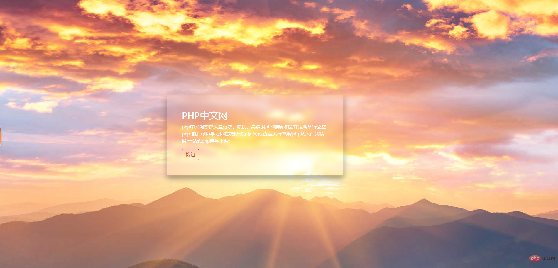
This article will introduce to you how to use HTML and CSS to create a glass/blur effect overlay.
What is the specific effect?
Let’s go directly to the complete code:
<!DOCTYPE HTML>
<html>
<head>
<meta charset="UTF-8">
<title></title>
<link rel="stylesheet" href="https://stackpath.bootstrapcdn.com/bootstrap/4.3.1/css/bootstrap.min.css">
<style>
body {
margin: 0;
padding: 0;
}
section {
position: relative;
background: url(004.jpg);
background-attachment: fixed;
height: 100vh;
}
section .layout {
position: relative;
top: 35%;
left: 30%;
max-width: 600px;
padding: 50px;
box-shadow: 0 10px 20px rgba(0, 0, 0, .5);
color: rgb(255, 254, 254);
}
section .layout::before {
content: '';
position: absolute;
top: 0;
bottom: 0;
left: 0;
right: 0;
background: url(004.jpg);
background-attachment: fixed;
filter: blur(8px);
}
section .layout h2 {
position: relative;
}
section .layout p {
position: relative;
}
section .layout button {
position: relative;
}
</style>
</head>
<body>
<section>
<div class="layout">
<h2>PHP中文网</h2>
<p>
php中文网提供大量免费、原创、高清的php视频教程,并定期举行公益php培训!可边学习边在线修改示例代码,查看执行效果!php从入门到精通,一站式php自学平台!
</p>
<button class="btn btn-outline-danger">
按钮
</button>
</div>
</section>
</body>
</html>The effect is as follows:

Here we mainly need to master the filter attribute and :before selection Filter:
filter attribute:
The filter attribute defines the visual effect (for example: blur and saturation) of the element (usually ).
Note: The non-standard "filter" attribute supported by older versions of Internet Explorer (4.0 to 8.0) has been deprecated. IE8 and lower browsers usually use the opacity attribute.
:before selector:
:before selector inserts content before the content of the selected element. Use the content attribute to specify the content to be inserted.
Note: For :before in IE8 and earlier versions, must be declared.
PHP Chinese website platform has a lot of video teaching resources. Welcome everyone to learn "css video tutorial" and "HTML video tutorial"!
The above is the detailed content of How to make glass/blur effect with HTML and CSS?. For more information, please follow other related articles on the PHP Chinese website!