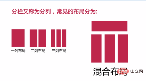
css layout methods include: 1. One-column layout, usually with fixed width and height; 2. Two-column layout, implemented using float; 3. Three-column layout, with fixed width on both sides and adaptive middle; 4. , Mixed layout, based on the one-column layout, retaining the top and foot parts; 5. Other layouts, etc.

The operating environment of this tutorial: Windows 7 system, CSS3&&HTML5 version, Dell G3 computer.
The essence of a web page is the position between blocks. Blocks are next to blocks, blocks are nested within blocks, and blocks are stacked on top of blocks.
Three types of relationships: adjacent, nested, and overlapping.
The following introduces several common methods of web page layout

1. One-column layout:
Generally, the width and height are fixed. margin: 0 auto to center horizontally, used for displaying prominent titles on the interface, etc.;
        .main{
            width: 200px;
            height: 100px;
            background-color: grey;
            margin: 0 auto;
}<p class="main"></p>
2. Two-column layout:
Speaking of two-column layout, the most common one is to use float. accomplish. The disadvantage of float layout is that it will cause text wrapping and other effects after floating, and the float needs to be cleared in time.
Set left-left floating, or set left-right floating (this requires determining the width of the parent element)
If the parent element does not set a height, you need to set overflow:hidden to clear the floating generation The influence of
For the influence of clearing and floating adjacent elements, use: clear: both;

    <p class="main">
        <p class="left">left</p>
        <p class="right">right</p>
</p> .main{
width: 400px;
background: red;
overflow: hidden;
}
.left{
background: yellow;
float: left;
}
.right{
background: green;
float: left;
}3. Three-column layout:
Fixed width on both sides and adaptive in the middle
First set the width of the parent element, you can set floating left and right. Then set margin in the middle to adjust the spacing. You can also set them to float left, set margin, and adjust the spacing. Also pay attention to the effects of clearing floats!

    <p class="main">
        <p class="left">left</p>
        <p class="middle">middle</p>
        <p class="right">right</p>
</p> .main{
width: 100%;
background: red;
overflow: hidden;
}
.left{
background: yellow;
float: left;
width: 100px;
}
.middle{
background: rosybrown;
float: left;
width: cacl(100%-200px);
}
.right{
background: green;
float: right;
width: 100px%;
}Or set the relative attribute for the parent element, then set the absolute attribute for the child element, and then position and adjust the spacing separately.

<p class="parent" style="">
    <p class="left" style="">
        <p>left</p>
    </p>
    <p class="center" style="">
        <p>center</p>
        <p>center</p>
    </p>
    <p class="right"  style="">
        <p>right</p>
    </p>
</p><style>
p{margin: 0;}
.parent{position: relative;height:40px;}
.left,.right,.center{position: absolute;}
.left{left: 0;width:100px;}
.right{right: 0;width: 100px;}
.center{left: 120px; right: 120px;}
</style>4. Mixed layout:
Based on the one-column layout, retain the top and foot parts, and transform the middle main part into two columns or With a three-column layout, small modules can be divided level by level in the same way.

    <p class="main">
        <p class="left">left</p>
        <p class="right">right</p>
    </p>
        .top{
            height: 100px;
            background: teal;
        }
        .footer{
            height: 100px;
            background: wheat;
        }
        .main{
            width: 100%;
            background: red;
            overflow: hidden;
        }
        .left{
            background: yellow;
            float: left;
            width: 50%;
        }
        .right{
            background: green;
            float: right;
            width: 50%;
}5. Extensions (such as equal distribution, etc.)

    <p class="parent">
        <p class="child"></p>
        <p class="child"></p>
        <p class="child"></p>
        <p class="child"></p>
</p> body{margin: 0;}
.parent{
border: 1px solid red;
overflow: hidden;
margin-right: -10px;
}
.child {
width: calc(25% - 10px);
height: 100px;
background: green;
float: left;
margin-right: 10px;
}Recommended learning: css video Tutorial
The above is the detailed content of What are the css layout methods?. For more information, please follow other related articles on the PHP Chinese website!