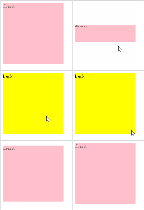
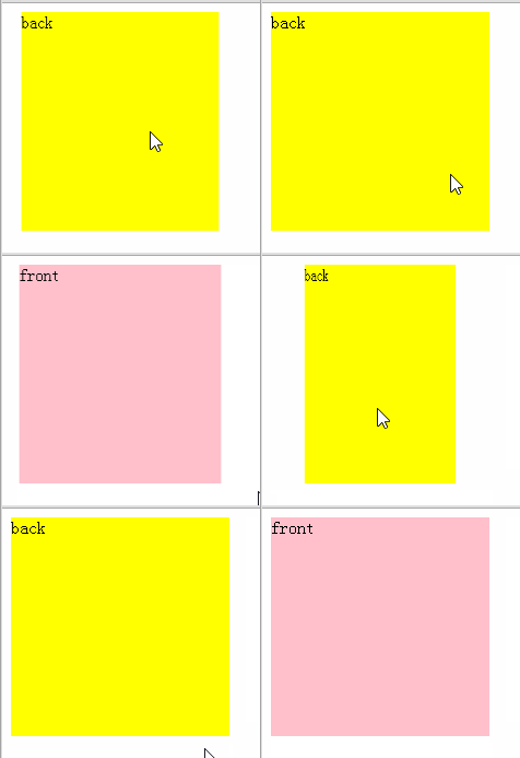
Animation effect


.container,.flipare prepared to achieve animation effects..front,.backEach package contains one picture.The HTML to achieve this effect is as follows:
.frontand.backrelative to.flipso that they overlap at the same position.The code for the layout part is as follows:
.container,.front,.back{width:380px;height:270px;} .flip{position:relative;} .front,.back{position:absolute;top: 0px;left: 0px;}
.backis above.front, so.frontSet.fornt{z-index:2;}
Note: Do not set theoverflowattribute to prevent elements from overflowing, this will cause 3D effects cannot be achieved.
The following CSS property values require the user agent to create a flattened representation of the descendant elements before they can be applied, and therefore force the used value of transform-style to flat:2. Implementation of animation effects (1) In order to achieve animation effects, first set the following attributes to the ancestor elements
- overflow: any value other than visible.
- opacity: any value less than 1.
- filter: any value other than none.
- clip: any value other than auto.
.container,.flipto trigger the 3D effect And set animation:
.container{perspective:1000;transform-style:preserve-3d;} .flip{transition:0.6s;transform-style:preserve-3d;}
backface-visibility to.front,.backAttributes:
.front,.back{backface-visibility:hidden;}
transform:rotateY(-180deg)to the element on the back, then we will not be able to see.back.
.containercontaining block,.flipflips 180 degrees, so that.frontFlip 180 degrees, because the back side ishidden, so it cannot be seen; and.back, after flipping 180 degrees, returns to 0 degrees, showing the front side, so that we can see the back side .
.container{perspective:1000;transform-style:preserve-3d;} .container,.front,.back{width:380px;height:270px;} .flip{position:relative;transition:0.6s;transform-style:preserve-3d;} .front,.back{position:absolute;top: 0px;left: 0px;backface-visibility:hidden;} .front{z-index:2;} .back{transform:rotateY(-180deg);} .container:hover .flip{transform:rotateY(180deg);}
Please note: In the above CSS code, I did not set the width and height for
.flip, so when applyingtransform:rotateY(180deg) to.flip, according to the defaulttransform-originvalue, the center point of the element is used as the basic point for flipping. The height of.fliphere is 0, so of course it is flipped based on the top line. So there are two solutions:
- Set the same width for
.flip
as.front,.backhigh. - Set the
transform-origin:100% 135px/*half the height*/
attribute to.flip.OK, then you will find that vertical flipping is the effect you want!
perspectiveto achieve 3D effect.(2) When the mouse slides over the outermost element, the second wrapping layer flips 180 degrees and sets the transition speed.
(3) The two flip blocks are absolutely positioned to achieve superposition at the same position. Also set
backface-visibilityto avoid exposing the backside when implementing animation effects.(4) Set the
z-indexattribute to.frontso that it is in front when writing code and displaying.(5) Let
.backturn 180 degrees at the beginning to show people from the back.
2. Problems encountered:
(1) In order to make two pictures of different sizes the same size in the package block, theoverflowattribute is used, and the 3D effect cannot be achieved. . Solution: Setwidth:100%;height:100%;forimg
(2) Did not realize that the height of.flipis 0, Therefore, the standard point error causes different effects when flipping vertically.
(3) Only by writing more can you find more errors, and then you will know how to find errors and how to solve them.


![[Web front-end] Node.js quick start](https://img.php.cn/upload/course/000/000/067/662b5d34ba7c0227.png)


