css清除浮动的方法:1、在父标签结尾处,添加具有“clear:both”样式的空div标签;2、父级div标签定义伪类“:after”和zoom属性;3、父级div元素定义“overflow:hidden”样式。
本教程操作环境:windows7系统、CSS3&&HTML5版、Dell G3电脑。
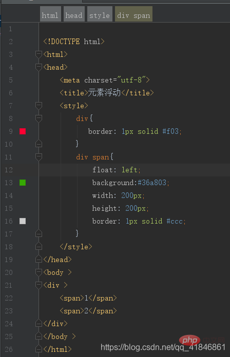
使用了float之后,父级盒子的高度变为0了。我们来写一个例子来看一下,创建一个父级div,并设置border属性,然后下边创建两个子元素span,并设置浮动。
具体代码如下所示:
立即学习“前端免费学习笔记(深入)”;
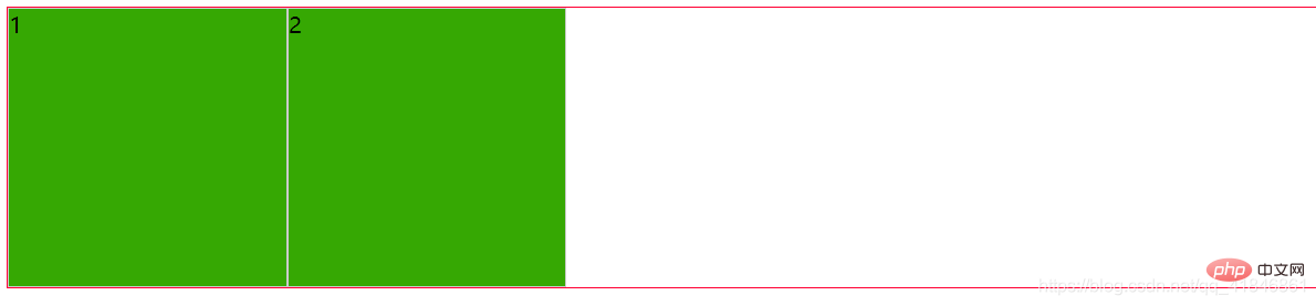
效果:
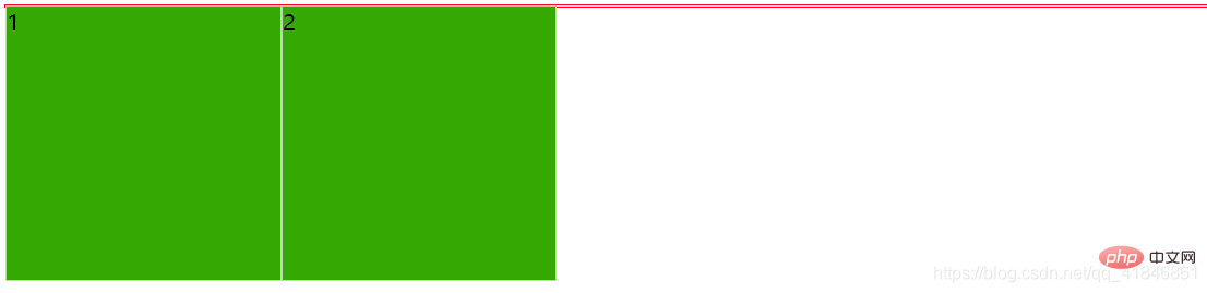
由上图可以看出,在给span添加了float之后,父级元素div的高度就变成了0(红色框)。我们有以下几种方式来解决这个问题
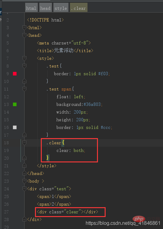
1、在标签结尾处加空div标签 clear:both
源代码:
效果:
原理: 添加一个空div,利用css提高的clear:both清除浮动,让父级div能自动获取到高度。
优点: 简单、代码少、浏览器支持好、不容易出现怪问题
缺点: 不少初学者不理解原理;如果页面浮动布局多,就要增加很多空div,不利于页面的优化。
(学习视频分享:css视频教程)
2、父级div定义 伪类:after 和 zoom
源代码:
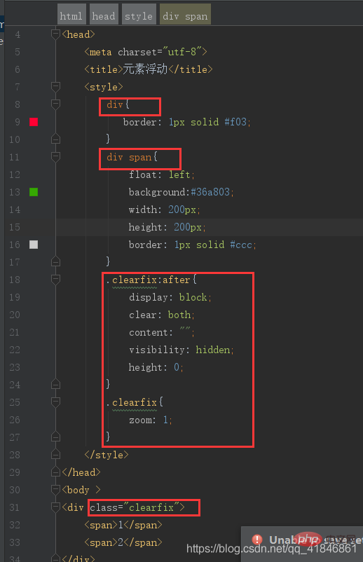
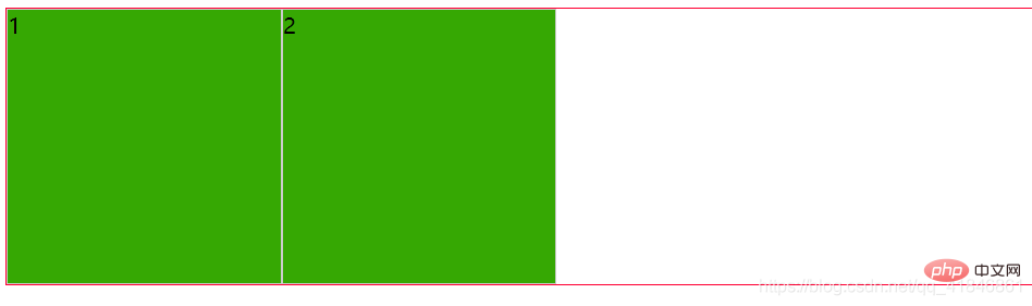
效果:
原理: 元素生成伪类的作用和效果相当于方法2中的原理,但是IE8以上和非IE浏览器才支持:after,zoom(IE转有属性)可解决ie6,ie7浮动问题
优点: 浏览器支持好、不容易出现怪问题,写法是固定的,不理解也可以直接复制使用;(小编大力推荐使用此种方法,简单便捷,只需添加一个class即可解决问题)
缺点: css代码多、不少初学者不理解原理,要两句代码结合使用才能让主流浏览器都支持。
3、父级div定义 overflow:hidden
源代码:
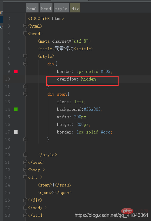
效果:
优点: 简单、代码少、浏览器支持好
缺点: 不能和position配合使用,因为超出的尺寸的会被隐藏。(不建议使用此种方式,可能会影响页面元素布局)
源代码: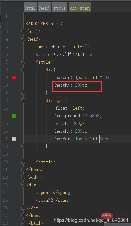
效果:
原理: 如果父级元素没有定义高度,父元素的高度完全由子元素撑开时,父级div手动定义height,就解决了父级div无法自动获取到高度的问题。
优点: 简单、代码少、容易掌握。
缺点: 只适合高度固定的布局,要给出精确的高度,如果高度和父级div不一样时,会产生问题。对于响应式布局会有很大影响。
更多编程相关知识,请访问:编程视频!!

每个人都需要一台速度更快、更稳定的 PC。随着时间的推移,垃圾文件、旧注册表数据和不必要的后台进程会占用资源并降低性能。幸运的是,许多工具可以让 Windows 保持平稳运行。

 广告
广告
 收藏
收藏
 收藏
收藏
 收藏
收藏
Copyright 2014-2025 //m.sbmmt.com/ All Rights Reserved | php.cn | 湘ICP备2023035733号


 439
439