


Bootstrap provides a responsive, mobile-first fluid grid system. As the screen or viewport size increases, the system It will be automatically divided into up to 12 columns. There is no official definition of the grid system, but according to various descriptions on the Internet, it can be defined as a regular grid array to guide and standardize the layout and information distribution in web pages. This article will introduce in detail the implementation principle of the Bootstrap grid system
The implementation principle of the grid system is very simple, just by defining the container size and dividing it into 12 equal parts (there are also Divide it into 24 parts or 32 parts (but 12 parts is the most common), then adjust the inner and outer margins, and finally combine it with media queries to create a powerful responsive grid system. The grid system in the Bootstrap framework divides the container into 12 equal parts
The grid system is used to create a page layout through a series of combinations of rows and columns, and content can be placed in these Created layout. Here's an introduction to how the Bootstrap grid system works:
1. "Row" must be contained in .container (fixed width) or .container-fluid (100% width) in order to Give appropriate alignment and padding
<div>
    <div></div>
</div>
2. Create a group of "columns" in the horizontal direction through "row"
3. Content should be placed within "column", and only "column" can be a direct child element of row"
4. Similar to .row and .col-xs-4 This predefined class can be used to quickly create a grid layout. The mixin defined in the Bootstrap source code can also be used to create a semantic layout
<div>
  <div>
    <div>.col-md-4</div>
    <div>.col-md-8</div>
  </div>
</div>
5. By setting padding for "column" Attribute, thereby creating a gap (gutter) between columns. By setting a negative value margin for the .row element to offset the padding set for the .container element, which is indirectly the "column" contained in the "row" (column)" offsets the padding
6. The columns in the grid system represent the range they span by specifying a value from 1 to 12. For example, three equal-width columns can use three. col-xs-4 to create
<div>
  <div>
    <div>.col-md-4</div>
    <div>.col-md-4</div>
    <div>.col-md-4</div>
  </div>
</div>
7. If the "column" contained in a "row" is greater than 12, the elements where the extra "column" is located will be Arrange as a whole in a new line
8. The grid class is suitable for devices with a screen width greater than or equal to the dividing point size, and the grid class is overridden for small screen devices. Therefore, apply any . The col-md-* raster classes work on devices with screen widths greater than or equal to the breakpoint size, and the raster classes are overridden for small screen devices. Therefore, applying any .col-lg-* on an element does not also affect Large screen devices
Related recommendations: "bootstrap tutorial"
In the grid system, we are Use the following media query in a Less or Sass file to create key breaking point thresholds.
/* 小屏幕(平板,大于等于 768px) */
@media (min-width: @screen-sm-min) { ... }

/* 中等屏幕(桌面显示器,大于等于 992px) */
@media (min-width: @screen-md-min) { ... }

/* 大屏幕(大桌面显示器,大于等于 1200px) */
@media (min-width: @screen-lg-min) { ... }We occasionally include max-width in the media query code to limit the impact of CSS to a smaller Within the range of screen sizes
@media (max-width: @screen-xs-max) { ... }
@media (min-width: @screen-sm-min) and (max-width: @screen-sm-max) { ... }
@media (min-width: @screen-md-min) and (max-width: @screen-md-max) { ... }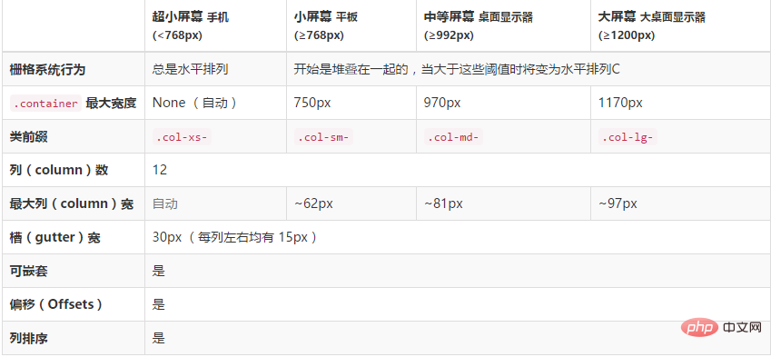
@media (min-width: @screen-lg-min) { ... }Use the following table to see in detail how Bootstrap’s grid system works on a variety of screen devices
lg in English is large, which means large; md The English word is middle, which means medium; the English word sm is small, which means small; the English word xs is extra small, which means extra small. It also corresponds to the clothing size
The grid system is used for layout, which is actually a combination of columns
The simple understanding of column combination is to change the number to merge the columns (principle: the total number of columns cannot exceed 12), which is somewhat similar to the colspan attribute of the table
The column combination method is very simple and only involves two CSS Features: Floating and width percentage
.col-md-1, .col-md-2, .col-md-3, .col-md-4, .col-md-5, .col-md-6, .col-md-7, .col-md-8, .col-md-9, .col-md-10, .col-md-11, .col-md-12 {
    float: left;
}.col-md-12 {
width: 100%;
}
.col-md-11 {
width: 91.66666667%;
}
.col-md-10 {
width: 83.33333333%;
}
.col-md-9 {
width: 75%;
}
.col-md-8 {
width: 66.66666667%;
}
.col-md-7 {
width: 58.33333333%;
}
.col-md-6 {
width: 50%;
}
.col-md-5 {
width: 41.66666667%;
}
.col-md-4 {
width: 33.33333333%;
}
.col-md-3 {
width: 25%;
}
.col-md-2 {
width: 16.66666667%;
}
.col-md-1 {
width: 8.33333333%;
}<div> <div> <div>.col-xs-4</div> <div>.col-xs-8</div> </div> <div> <div>.col-xs-4</div> <div>.col-xs-4</div> <div>.col-xs-4</div> </div> <div> <div>.col-xs-3</div> <div>.col-xs-6</div> <div>.col-xs-3</div> </div> </div>
【Fluid layout container】
Change the outermost layout element .container to .container-fluid, You can convert a fixed-width grid layout to a 100% width layout
.container-fluid {
    padding-right: 15px;
    padding-left: 15px;
    margin-right: auto;
    margin-left: auto;
}Using column offset is very simple, just add the column element Add the class name "col-md-offset-*" (where the asterisk represents the number of column combinations to be offset), then the column with this class name will be offset to the right. For example, adding "col-md-offset-4" to the column element means that the column is moved to the right by the width of 4 columns
The implementation principle is very simple, using one-twelfth (1/12) margin-left. There are as many margin-left
as there are offsets..col-md-offset-12 {
margin-left: 100%;
}
.col-md-offset-11 {
margin-left: 91.66666667%;
}
.col-md-offset-10 {
margin-left: 83.33333333%;
}
.col-md-offset-9 {
margin-left: 75%;
}
.col-md-offset-8 {
margin-left: 66.66666667%;
}
.col-md-offset-7 {
margin-left: 58.33333333%;
}
.col-md-offset-6 {
margin-left: 50%;
}
.col-md-offset-5 {
margin-left: 41.66666667%;
}
.col-md-offset-4 {
margin-left: 33.33333333%;
}
.col-md-offset-3 {
margin-left: 25%;
}
.col-md-offset-2 {
margin-left: 16.66666667%;
}
.col-md-offset-1 {
margin-left: 8.33333333%;
}
.col-md-offset-0 {
margin-left: 0;
}不过有一个细节需要注意,使用”col-md-offset-*”对列进行向右偏移时,要保证列与偏移列的总数不超过12,不然会致列断行显示
<div>
  <div>
    <div>.col-xs-4</div>
    <div>.col-xs-4 .col-xs-offset-4</div>
  </div>
  <div>
    <div>.col-xs-2</div>
    <div>.col-xs-4 .col-xs-offset-4</div>
    <div>.col-xs-4</div>
  </div>
</div>
列排序其实就是改变列的方向,就是改变左右浮动,并且设置浮动的距离。在Bootstrap框架的网格系统中是通过添加类名“col-md-push-*”和“col-md-pull-*” (其中星号代表移动的列组合数)。
Bootstrap仅通过设置left和right来实现定位效果
.col-md-pull-12 {
    right: 100%;
  }
  .col-md-pull-11 {
    right: 91.66666667%;
  }
  .col-md-pull-10 {
    right: 83.33333333%;
  }
  .col-md-pull-9 {
    right: 75%;
  }
  .col-md-pull-8 {
    right: 66.66666667%;
  }
  .col-md-pull-7 {
    right: 58.33333333%;
  }
  .col-md-pull-6 {
    right: 50%;
  }
  .col-md-pull-5 {
    right: 41.66666667%;
  }
  .col-md-pull-4 {
    right: 33.33333333%;
  }
  .col-md-pull-3 {
    right: 25%;
  }
  .col-md-pull-2 {
    right: 16.66666667%;
  }
  .col-md-pull-1 {
    right: 8.33333333%;
  }
  .col-md-pull-0 {
    right: 0;
  }

  .col-md-push-12 {
    left: 100%;
  }
  .col-md-push-11 {
    left: 91.66666667%;
  }
  .col-md-push-10 {
    left: 83.33333333%;
  }
  .col-md-push-9 {
    left: 75%;
  }
  .col-md-push-8 {
    left: 66.66666667%;
  }
  .col-md-push-7 {
    left: 58.33333333%;
  }
  .col-md-push-6 {
    left: 50%;
  }
  .col-md-push-5 {
    left: 41.66666667%;
  }
  .col-md-push-4 {
    left: 33.33333333%;
  }
  .col-md-push-3 {
    left: 25%;
  }
  .col-md-push-2 {
    left: 16.66666667%;
  }
  .col-md-push-1 {
    left: 8.33333333%;
  }
  .col-md-push-0 {
    left: 0;
}<div> <div> <div>.col-md-9 .col-md-push-3</div> <div>.col-md-3 .col-md-pull-9</div> </div> </div>

为了使用内置的栅格系统将内容再次嵌套,可以通过添加一个新的 .row 元素和一系列 .col-sm-* 元素到已经存在的 .col-sm-* 元素内。被嵌套的行(row)所包含的列(column)的个数不能超过12
<div>
    <div>
        <div>
        我的里面嵌套了一个网格
            <div>
            <div>col-xs-6</div>
            <div>col-xs-6</div>
          </div>
        </div>
    <div>col-xs-4</div>
    </div>
    <div>
        <div>.col-xs-4</div>
        <div>
        我的里面嵌套了一个网格
            <div>
              <div>col-xs-4</div>
              <div>col-xs-4</div>
              <div>col-xs-4</div>
            </div>
        </div>
    </div>
</div>

在bootstrap中,.col-xs-应用于(
而.col-xs-、.col-sm-、.col-md-、.col-lg-是可以用混合使用的
比如,要实现≥992px的时候分四列一排,(≥768px and
nbsp;html>
<meta>
<title>Document</title>
<link>
<style>
.row div{border:1px solid black;}
</style>
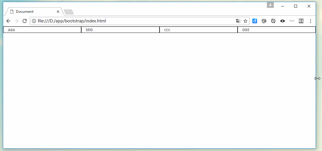
<div>
<div>
<div>aaa</div>
<div>bbb</div>
<div>ccc</div>
<div>ddd</div>
</div>
</div>
为了加快对移动设备友好的页面开发工作,利用媒体查询功能并使用下面这些工具类可以方便的针对不同设备展示或隐藏页面内容
形如.visible-*-*的类针对每种屏幕大小都有三种变体,每个针对 CSS 中不同的display属性,如下所示
因此,以超小屏幕(xs)为例,可用的 .visible-*-* 类是:.visible-xs-block、.visible-xs-inline 和 .visible-xs-inline-block
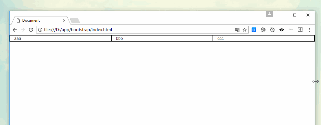
比如,要实现≥992px时存在三列,(≥768px and
nbsp;html>


<meta>
<title>Document</title>
<link>
<style>
.row div{border:1px solid black;}
</style>


<div>
    <div>
      <div>aaa</div>
      <div>bbb</div>
      <div>ccc</div>
    </div>
</div>
更多编程相关知识,请访问:编程视频!!
The above is the detailed content of Let's take a look at the grid system in Bootstrap. For more information, please follow other related articles on the PHP Chinese website!


![[Web front-end] Node.js quick start](https://img.php.cn/upload/course/000/000/067/662b5d34ba7c0227.png)


