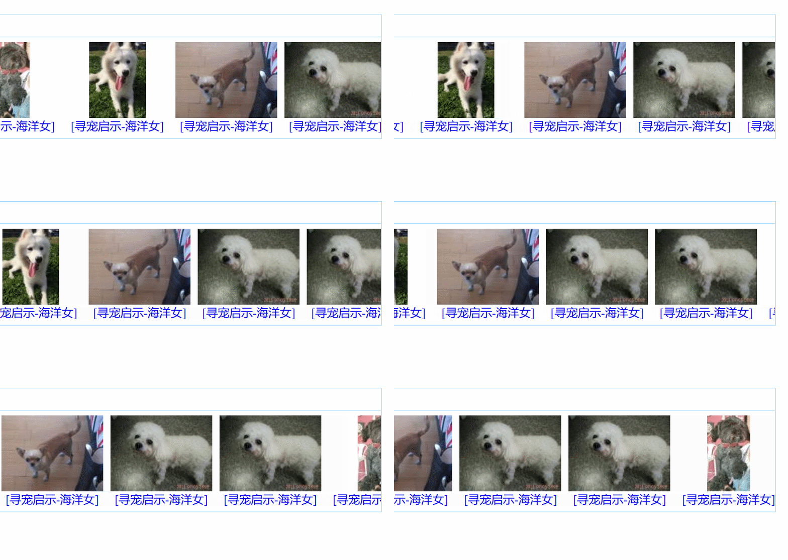

This article mainly introduces the sample code of flex layout to achieve seamless scrolling and shares it with everyone. The details are as follows:
Demonstration of the case

flex layout
The so-called flex layout is the flexible box layout. This layout is more commonly used on mobile terminals, but with the development of browsers The version is updated, and flex layout is becoming more and more commonly used due to its own advantages.
Idea:
First analyze the structure of this small demo, the upper and lower structures, we can use a container to wrap it (the so-called big box).
The top is a navigation, and the top is a ul. Below we can use two ps, 100% of the width, and customized height.
Next we will open the model and remember a certain parent box! display:flex;, then how to divide it up and down? Continue to add flex-wrap: wrap; which separates the upper and lower parts. Isn’t it very convenient?
The next step is the lower part. ul is nested in p, and the height of ul is easy to understand. It is the height of p. So how wide is ul? , can be infinitely wide! ! ! Let's make the width of ul 3000px
Let's put li next. As you see, the inside of li also has a top-down structure, so, hehe! Does li also need to enable flex? flex-wrap: wrap;. The p at the top is for img, and the a tag at the bottom.
Remember, li needs to float! And consider overflow: hidden put there
animation effect
We have five pictures, and we now make them move from right to left. Then we call ul movement, is it possible to drive li movement?
We use @keyframes to change the left value of ul, but here comes the problem. I put five pictures and ul moves, and the right side is gone and blank. What to do? ? ?
Can we make another copy of the five li and put it at the back? The answer is yes! ! When our left just removes the first group of li, then the second group just doesn't come up. Then we use animation: run 20s linear infinite; is it okay to loop infinitely?
css partial code
* { margin: 0; padding: 0; } a { text-decoration: none; } .box-big { position: absolute; display: flex; left: 50%; top: 50%; border: 1px solid #9FD6FF; transform: translate(-50%, -50%); width: 707px; height: 170px; /* background-color: pink; */ flex-wrap: wrap; overflow: hidden; } .box-top { width: 707px; height: 30px; border-bottom: 1px solid #9FD6FF; background-color: #FEFEFE; } .p-bottom { width: 707px; height: 136px; /* background-color: darkgoldenrod; */ overflow: hidden; } .st-icon-android { display: inline-block; width: 15px; height: 15px; background-image: url(../img/hd.gif); margin: 8px; } h5 { position: absolute; top: 6PX; left: 30px; color: #307DD1; } ul { position: absolute; left: 90px; width: 3000px; height: 100%; animation: run 20s linear infinite; } li { list-style: none; float: left; width: 140px; height: 100%; margin: 0 5px 0 5px; /* background-color: gold; */ flex-wrap: wrap; } .photo { margin-top: 5px; width: 140px; height: 105px; text-align: center; /* background-color: springgreen; */ } p { text-align: center; } img { cursor: pointer; } @keyframes run { 0% { left: 0; } 100% { left: -745px; } }
Recommended tutorial: "CSS Tutorial"
The above is the detailed content of CSS Flex layout for seamless scrolling. For more information, please follow other related articles on the PHP Chinese website!
 flex tutorial
 Which key should I press to recover when I can't type on my computer keyboard?
 How to switch between full-width and half-width
 wayos soft routing
 How to activate computer windows
 How to open nrg file
 The main components that make up the CPU
 Introduction to the usage of sort() function in python