
The first is the idea:
We use thetag to achieve this effect.
The selected and unselected features of the checkbox correspond to the on and off of the switch
on:on off:off
Effect:

(Recommended tutorial:CSS Introduction Tutorial)
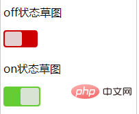
Start drawing the sketch of the off and on states
Here I will explain, using position to achieve positioning. Students who don’t understand can open MDN to view relevant knowledge
off状态草图
 on状态草图    .toggle{ display:inline-block; position:relative; height:25px; width:50px; border-radius:4px; background:#CC0000; } .cookie{ position:absolute; left:2px; top:2px; bottom:2px; width:50%; background:rgba(230,230,230,0.9); border-radius:3px; } .toggle2{ display:inline-block; position:relative; height:25px; width:50px; padding:2px; border-radius:4px; background:#66CC33; } .cookie2{ position:absolute; right:2px; top:2px; bottom:2px; width:50%; background:rgba(230,230,230,0.9); border-radius:3px; }
Effect:

Then we put these two sketches into the label
Effect:

Combined label and checkbox to organize and optimize css
.toggle-finish{ cursor:pointer; display:inline-block; position:relative; height:25px; width:50px; border-radius:4px; background:#CC0000; } .cookie-finish{ position:absolute; left:2px; top:2px; bottom:2px; width:50%; background:rgba(230,230,230,0.9); border-radius:3px; } input:checked + .toggle-finish{ background:#66CC33; } input:checked + .toggle-finish .cookie-finish{ left:auto; right:2px; }
Effect:

So far, the function of a switch has been basically implemented. Remember to hide the input.
Recommended related video tutorials:css video tutorial
The above is the detailed content of How to achieve switch effect in css. For more information, please follow other related articles on the PHP Chinese website!