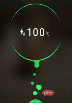
Step by step, see what kind of charging animation effect you can create using only CSS.

Of course, to charge the battery, you must first use CSS to draw a battery. This is not difficult, just make one:

European, barely this is it. Now that you have the battery, let’s just charge it. The simplest animation is to fill the entire battery with color.
There are many methods, and the code is also very simple. Just look at the effect:

It has an internal flavor. If the requirements are not high, this can barely be enough. . The power is represented by a blue gradient, and the charging animation is realized through the displacement animation of the color block. But it always felt like something was missing.
If you want to continue optimizing, you need to add some details.
We know that when the battery is low, the battery is usually indicated in red, and when the battery is high, it is indicated in green. Then add some shadow changes and a breathing feeling to the entire color block to make the charging effect look really moving.

At this point, there is actually only one knowledge point:
We cannot directly animate a gradient color. Here we adjust the hue through a filter, thereby realizing the gradient color transformation animation.
Complete Demo of the above example: CodePen Demo -- Battery Animation One
ok, just counted one Small milestone, next step. The top of the battery is a straight line, which feels a bit dull. Here we will transform it. If we can change the top straight line to wavy rolling, the effect will be more realistic.
The effect after the transformation:

Using CSS to achieve this wavy scrolling effect is actually just a blinding method. The specifics can be what I wrote earlier. This article:
Pure CSS to achieve wave effect!
One of the knowledge points here is the above-mentioned use of CSS to achieve a simple wave effect, which is achieved through blindness. You will understand it by looking at the picture:

Complete Demo of the above example: CodePen Demo -- Battery Animation Two
OK, at this point, the above effects plus digital changes have been It can be considered a relatively good effect. Of course, the above effect still looks very CSS, but at first glance, I feel that it can be done using CSS.
What about the following one?

# Students who use Android phones must be familiar with it. This is the effect of Android phones when charging. When I saw this, I was curious, can it be done using CSS?
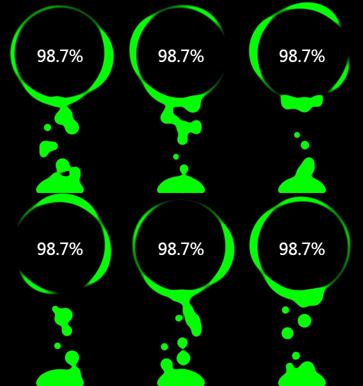
After some attempts, I found that using CSS can also simulate this animation effect very well:

The above Gif recorded renderings are completely using CSS simulated effects.
Complete Demo of the above example: HuaWei Battery Charging Animation
Dismantle the knowledge points, the most important thing is actually the use of filter: contrast() and filter : blur() These two filters can achieve this fusion effect very well.
Take out the two filters separately. Their functions are:
However, when they "fitted together", a wonderful fusion phenomenon occurred.
Let’s look at a simple example first:

Look carefully at the process of intersecting two circles. When the edges touch each other, a boundary fusion effect will be produced. Use the contrast filter to remove the blurred edges of Gaussian blur, and use Gaussian blur to achieve the fusion effect.
Of course, this effect has been mentioned many times in previous articles. For more details, you can take a look:
Of course, you can also add color transformation here to achieve the best effect Also very good:

Complete Demo of the above example: HuaWei Battery Charging Animation
By adjusting the values of filter: blur() and filter: contrast() attributes, the animation effect will actually change to a great extent. Good effects require constant debugging. Of course, experience also plays a very important role in it. In the final analysis, you still need to try more.
The several charging animations given in this article have gradually enhanced effects. This article only points out the core knowledge points. However, there are many small details in the actual output process that are not mentioned in this article. Interested students should still click on the Demo to take a closer look at the source code or implement it by themselves.
This article comes from the PHP Chinese website,CSS tutorialcolumn, welcome to learn
The above is the detailed content of Use CSS to implement cool charging animations. For more information, please follow other related articles on the PHP Chinese website!