
The content this article brings to you is about interesting CSS magic and layout (code). It has certain reference value. Friends in need can refer to it. I hope it will be helpful to you. .
Foreword: Layout and style are required courses for every front-end. In daily work, you will also encounter the layout requirements of some specific scenes. By matching the styles, you can achieve some magical effects. I have collected some layouts that I encounter in daily development, as well as magical special effects writing methods that I happened to find when browsing major websites, and I would like to share them here.
Due to space reasons, it will be divided into 2 articles. Today, I will first introduce some interesting and practical layout writing methods. The next article will show the magic of style.
Lazy loading placeholder image adaptive
When displaying product images in the mall, if there are many images, a better experience is: there will be a placeholder image first, the purpose is In order to make the page jitter-free, it is the so-called lazy loading effect of images. However, it is a headache when it comes to adaptation, especially when switching between horizontal and vertical screens of mobile phones. If it is calculated through JavaScript, jitter may occur.
Based on the principle of using CSS instead of JS, we have the following solution:
<div>
    <img  alt="Fun CSS magic and layout (code)" >
</div>
.img-ratio {
    width: 100%;
    position: relative;
    padding-top: 75%;
}

.img-ratio > img {
    width: 100%;
    height: 100%;
    position: absolute;
    top: 0;
    left: 0;
}It can adapt to different screens, as long as the UI provides a 4:3 Just use a placeholder image. The picture below shows two pictures with different widths and heights but the same proportions, both of which can be perfectly centered.
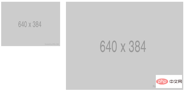
The principle is:
Mobile terminal interface, every inch of space is precious. Sometimes in order to control the scrolling length of the screen, some modules are arranged horizontally. However, arranging them horizontally creates some layout issues.
For example, the scroll bar style on the mobile terminal depends on the mobile browser and is different. One solution is to hide the scroll axis, but not overflow-x:hidden;, otherwise it will not be able to scroll. Then calculate the width of each horizontal block so that part of the rightmost block is exposed, so that the user knows that there is content outside the screen on the right and can be slid horizontally.
And if the width of horizontal scrolling is unknown, because the number of horizontal modules may change according to business needs, then float cannot be used for horizontal arrangement. Because floating is used, it is necessary to know the width of the entire horizontal scrolling. The entire width is wider than the cumulative width of the floating blocks, so as to ensure that floating does not wrap.
So, there is the following writing method:
<div>
    <ul>
        <li>1</li>
        <li>2</li>
        <li>3</li>
        <li>4</li>
        <li>5</li>
        <li>6</li>
    </ul>
</div>
.wrapper {
    width: 340px;
    height: 80px;
    overflow: hidden;
}

.wrapper ul {
    height: 96px;
    width: 100%;
    white-space: nowrap;
    overflow-x: scroll;
    padding: 0;
    margin: 0;
}

.wrapper li {
    display: inline-block;
    width: 80px;
    height: 80px;
    background-color: #ddd;
    line-height: 80px;
    text-align: center;
    font-size: 20px;
    margin-right: 10px;
}The idea is: ul sets white-space:nowrap;, li sets display:inline-block;. The outermost p uses the height difference to hide the horizontal scroll bar.

Some official websites have a top navigation bar, and the content area of the navigation bar often needs to be displayed in the center, with both sides Then leave it blank, and there may be a root line or shadow below the navigation bar to distinguish the top from the main content.
.center-float {
    float: left;
    position: relative;
    left: 50%;
}

.center-float > ul {
    position: relative;
    left: -50%;
}This is a method of floating in the center, combined with relative positioning.
When the main content area of the page is not high enough, the footer is still displayed at the bottom. Of course this does not mean position: fixed, the footer is immediately below the content area. There are 2 ways.
html structure is as follows:
        <div>....</div>
        <div>....</div>
html, body {
    height: 100%;
}
$footer-height: 30px;

#content {
    min-height: 100%;
    margin-bottom: -$footer-height;
    padding-bottom: $footer-height;
}

#footer {
    line-height: $footer-height;
    text-align: center;
}$footer-height: 30px;
html {
height: 100%;
}
body {
min-height: 100%;
display: flex;
flex-direction: column;
}
#content {
flex: 1;
}
#footer {
line-height: $footer-height;
text-align: center;
}Some traditional portal websites have a classic width such as 980px or 1000px in their main content area. Sometimes, a wider picture will be used as the overall background image and placed in the center without horizontal scrolling. You can do this:
.wrapper {
    min-width: 1000px;
    height: 800px;
    background: url(test.jpg) no-repeat center top;
}

.mainContent {
    position: relative;
    width: 1000px;
    margin: 0 auto;
}Pseudo elements also Can it be used to achieve centering? When I saw it, I thought it was quite magical. Look at the following example:
<div>
    <img  alt="Fun CSS magic and layout (code)" >
</div>
.wrapper {
    width: 300px;
    height: 300px;
    border: 1px solid #ccc;

    text-align: center;
}

.wrapper::after {
    content: '';
    display: inline-block;
    vertical-align: middle;
    height: 100%;
}

.wrapper > img {
    vertical-align: middle;
}The horizontal direction is easy to understand. In the vertical direction, it can be understood as ::after pulling the img down to the middle.
This article has ended here. For more other exciting content, you can pay attention to the CSS Video Tutorial column of the PHP Chinese website!
The above is the detailed content of Fun CSS magic and layout (code). For more information, please follow other related articles on the PHP Chinese website!
