This article brings you an introduction to the CSS Paint API of the CSS drawing board. It has certain reference value. Friends in need can refer to it. I hope it will be helpful to you. .
1. Use Canvas image as CSS background image
CSS Paint API can be simply understood as (actually not equivalent) using Canvas canvas as the background image of ordinary elements.
That is, the background-image of CSS is a Canvas. We can use most of the Canvas APIs to draw various complex and interesting graphic effects, enriching the visual presentation of web page elements in a more efficient way. For example, the blue button not only has a blue background, but also has the effect of white clouds floating on it, which is great when you think about it!
2. A simple case to understand CSS Paint API
For example, we want to create a transparent image background. Similar to the following:

The complete CSS code and JS part of the code are as follows:
.box {
width: 180px; height: 180px;
/* transparent-grid自己命名 */
background-image: paint(transparent-grid);
}Then the JS for drawing graphics must be introduced as a module, for example, build A file named paint-grid.js is introduced on the page:
if (window.CSS) {
CSS.paintWorklet.addModule('paint-grid.js');
}The paint-grid.js file code is as follows:
// transparent-grid命名和CSS中的对应
registerPaint('transparent-grid', class {
paint(context, size) {
// 这里就是绘制的代码了…
}
});The above is the fixed routine used by the CSS Paint API:
paint(abc) in CSS;
JS add module CSS.paintWorklet.addModule('xxx.js');
The code routine in xxx.js is fixed, as follows Just write the drawing code at the comment position;
registerPaint('abc', class {
paint(context, size, properties) {
// 绘制代码在这里…
}
});The two parameters in paint (context, size) can be briefly introduced:
context
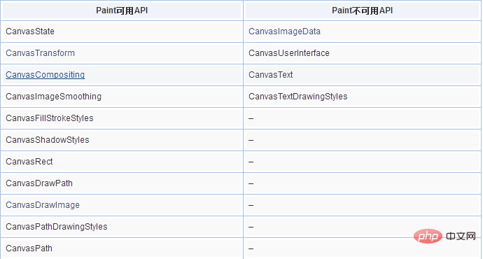
is the drawing context, the full name It is PaintRenderingContext2D, which is a close relative of CanvasRenderingContext2D. The APIs are all from Canvas and are exactly the same. However, due to security restrictions, some APIs in Canvas cannot be used. The available and unavailable APIs are shown in the table below:

size
size is an object containing the drawing size. The data structure is as follows: The size of
{
width: 180,
height: 180
}size is affected by the size of the background-size attribute. Therefore, For repeated backgrounds, you can use background-repeat to perform tile loops without having to loop in the drawn JS code. For example, the demo effect that will be shown below can also be achieved in this way, the CSS part:
.box {
width: 180px; height: 180px;
background-image: paint(transparent-grid);
background-size: 16px 16px;
}Then, paint-grid.js only needs to be filled with white-grey-grey-white, 4 grids are enough. , no need to loop.
properties
can be used to obtain the obtained CSS properties and attribute values, including CSS variable values; and some other parameters.
Seeing is believing, you can click here: CSS Paint API draws transparent grid as background demo (currently only available in Chrome)
Transparent grid effect demo
paint-grid.js中的完整绘制代码如下:
registerPaint('transparent-grid', class {
paint(context, size) {
// 两个格子颜色
var color1 = '#fff', color2 = '#eee';
// 格子尺寸
var units = 8;
// 横轴数轴循环遍历下
for (var x = 0; x < size.width; x += units) {
for (var y = 0; y < size.height; y += units) {
context.fillStyle = (x + y) % (units * 2) === 0 ? color1 : color2;
context.fillRect(x, y, units, units);
}
}
}
});Supplement:
Repeating backgrounds such as grids can use background-repeat to perform tiling loops. There is no need to loop in the drawing JS code, but you need to use the background-size attribute to help change the drawing size. For example, the above demo effect can also be achieved like this, CSS part:
.box {
width: 180px; height: 180px;
background-image: paint(transparent-grid);
background-size: 16px 16px;
}Then, paint-grid.js only needs to be filled with white-grey-grey-white, 4 grids are enough, no need to loop.
registerPaint('transparent-grid', class {
paint(context, size) {
// 两个格子颜色
var color1 = '#fff', color2 = '#eee';
// 两个白色格子
context.fillStyle = color1;
context.fillRect(0, 0, 8, 8);
context.fillRect(8, 8, 8, 8);
// 两个灰色格子
context.fillStyle = color1;
context.fillRect(0, 4, 8, 8);
context.fillRect(4, 0, 8, 8);
}
});Be more understandable.
3. CSS variables make the Paint API shine
The above case shows the basic use of the CSS Paint API. However, although it looks trendy, it does not reflect the CSS Paint API. What's so special about it.
Think about it, I directly use JS plus Canvas API to draw a grid pattern, convert it to Base64, and display it directly as the background image of the element. It has the same effect and has better compatibility (IE9 supports it) , all Canvas APIs can be used without restrictions. By comparison, there is no reason to use CSS Paint API!
Yes! If we just need a static background, it is better to draw it directly on Canvas and then convert it into a Base64 image (
toDataURL() method) or a Blob image (toBlob() method).
The advantage of CSS Paint API is that as a CSS property value, the rendering is real-time and automatically redraws with the browser. Therefore, as long as our drawing is associated with CSS variables, all rendering The effects will be refreshed and redrawn in real time, which is awesome!
Still with the transparent grid example above, we can extract the color and size of the grid as CSS variables, as follows:
.box {
width: 180px; height: 180px;
--color1: #fff;
--color2: #eee;
--units: 8;
background: paint(custom-grid);
}We can use these defined variables when drawing Obtained, the diagram is as follows:
registerPaint('custom-grid', class {
// 获取3个变量
static get inputProperties() {
return [
'--color1',
'--color2',
'--units'
]
}
paint(context, size, properties) {
// 两个格子颜色
var color1 = properties.get('--color1')。toString();
var color2 = properties.get('--color2')。toString();
// 格子尺寸
var units = Number(properties.get('--units'));
// 绘制代码,和之前一样…
}
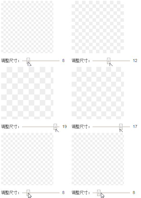
});However, if we modify the variable value defined in the CSS code, we can see the real-time change effect of the Paint background image.

Dimensional changes after changing variables in real time
Seeing is believing, you can click here: CSS variables plus Paint API Drawing transparent grid demo
No need for additional timers, rendering in real time, very convenient to control.
配合CSS Properties & Values API,把--units等变量全部注册为合法的CSS属性,则,我们就能使用transition和animation属性纯CSS控制Paint背景图的运动和动画了,按钮上云朵漂漂的效果完全不在话下。
四、Houdini,兼容与其他
本文介绍的CSS Paint API是CSS Houdini的一部分,最后提到的CSS Properties & Values API也是,是目前Chrome已经支持的一部分API。CSS houdini可以自定义CSS属性,布局等,未来不可限量。
由于兼容性的问题,如果想要在实际项目中使用CSS Paint API,还需要做兼容处理,例如:
.box {
width: 180px; height: 180px;
background: url(data:image/png;base64,iVBORw0KGgoAAAANSUhEUgAAABAAAAAQCAYAAAAf8/9hAAAAMElEQVQ4T2P8////fwY84P379/ikGRhHDRgWYfDu3Tu86UBQUBB/Ohg1gIFx6IcBABlfVjmYTYi7AAAAAElFTkSuQmCC);
background: paint(transparent-grid, whatever);
}CSS Paint API更适用于动态场景,适合实现需要实时绘制渲染的需求;如果是纯静态展示,直接就用JS加Canvas实现得了,没必要为了技术而技术。
最后,再说点其它你可能感兴趣的东西。对于本文的透明格子效果,其实最好的实现方法是直接CSS background绘制,利用线性渐变和CSS3多背景。
代码如下:
.box {
width: 180px; height: 180px;
background-color: #fff;
background-image: linear-gradient(45deg, #eee 25%, transparent 25%, transparent 75%, #eee 75%, #eee), linear-gradient(45deg, #eee 25%, transparent 25%, transparent 75%, #eee 75%, #eee);
background-size: 16px 16px;
background-position: 0 0, 8px 8px;
}尺寸控制非常方便,天然支持animation动画。
以上就是对CSS届的绘图板CSS Paint API简介的全部介绍,如果您想了解更多有关CSS3教程,请关注PHP中文网。
The above is the detailed content of Introduction to CSS Paint API. For more information, please follow other related articles on the PHP Chinese website!