The content of this article is about how to use the box-orient attribute in CSS3 to layout the direction? (Code tutorial) has certain reference value. Friends in need can refer to it. I hope it will be helpful to you.
In the CSS3 flexible box model, we can use the box-orient attribute to define the arrangement direction of "child elements" inside the flexible box. That is, whether the child elements inside the box are arranged horizontally or vertically.
The value of the box-orient attribute is as follows:
horizontal The flexible box displays its "child elements" on a horizontal line "from left to right"
vertical Flexible box" Display its "child elements" in a vertical line from top to bottom
inline-axis The flex box displays its "child elements" "along the inline axis" (default value)
block-axis Flexible box displays its "child elements" "along the block axis"
Note: Before use, the user must first set the display attribute of the parent element to box or inline-box. Flexible The box model will take effect.
Example:
<!DOCTYPE html>
<html xmlns="http://www.w3.org/1999/xhtml">
<head>
    <title>CSS3 box-orient属性</title>
    <style type="text/css">
        body
        {
            display:-webkit-box;    /*定义元素为盒子显示,注意书写*/
            -webkit-box-orient:horizontal;   /*定义盒子元素内的元素从左到右流动显示*/
        }
        div{height:100px;}
        #box1{background:red;}
        #box2{background:blue;}
        #box3{background:yellow;}
    </style>
</head>
<body>
    <div id="box1">盒子1</div>
    <div id="box2">盒子2</div>
    <div id="box3">盒子3</div>
</body>
</html>
Analysis:
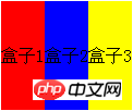
In CSS2.1, the direction of HTML document flow is "top to bottom" , but after using the flexible box model, we can redefine the direction of the document flow to "left to right". If we want to enable the flexible box model, we must set the display attribute value of the parent element to box (or inline-box).
In the traditional layout mode, if the three column blocks defined to be displayed side by side are displayed as inline blocks (display:inline-block;) or inline elements (display:inline;), the same can be achieved. design effect, but the display technology is completely different.
"display:-webkit-box;" is compatible with webkit kernel browser. If it is a moz kernel browser, it needs to be written as "display:-moz-box;". Note that it is "display: -moz-box;" rather than "-moz-display: box;".
In this example, the width of the "child elements" inside the flexible box is expanded by the content. If there is no content, the "child element" will not have width. Of course, we can also define a certain width for "child elements".
The above is about how to use the box-orient attribute in CSS3 to layout the direction? (Code tutorial) full introduction, if you want to know more about CSS3 video tutorial, please pay attention to the PHP Chinese website.
The above is the detailed content of How to use the box-orient property in CSS3 to determine layout direction? (code tutorial). For more information, please follow other related articles on the PHP Chinese website!