The content of this article is about how to lay out the flexbox flexible box? The detailed tutorial has certain reference value. Friends in need can refer to it. I hope it will be helpful to you.
In the CSS3 flexible box model, we can use the box-flex attribute to define whether the child elements inside the flexible box have flexible space. If the child element has flexible space, when the size of the flexible box (parent element) is enlarged or reduced, the size of the child element with flexible space will also be enlarged or reduced. Whenever the flexbox has extra space, the child element with the flexspace will also expand its size to fill that space.
Description:
The value of the box-flex attribute is an integer or decimal, it cannot be a negative number, and the default value is 0.
When the box contains multiple sub-elements with the box-flex attribute defined, the browser will add the box-flex attribute values of these sub-elements, and then use their respective values to account for the total value. Use columns to allocate the remaining space in the box.
Note that the box-flex attribute is only effective when the width or height of the flexible box is determined. That is to say, the width or height attribute value must be defined for the parent element first.
Use flexible space settings so that the total width and height of the elements inside the flexible box are always equal to the width and height of the flexible box. However, the flex space of the child element only takes effect when the flex box has a certain width or height.
Example:
<!DOCTYPE html>
<html xmlns="http://www.w3.org/1999/xhtml">
<head>
    <title>CSS3 box-flex属性</title>
    <style type="text/css">
        body
        {
            display:-webkit-box;
            -webkit-box-orient:horizontal;   /*定义盒子元素内的元素从左到右流动显示*/
            width:200px;
            height:150px;
        }
        #box1
        {
            background:red;
            -webkit-box-flex:1.0;
        }
        #box2
        {
            background:blue;
            -webkit-box-flex:2.0;
        }
        #box3
        {
            background:orange;
            -webkit-box-flex:1.0;
        }
    </style>
</head>
<body>
    <div id="box1"></div>
    <div id="box2"></div>
    <div id="box3"></div>
</body>
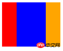
</html>The preview effect in the browser is as follows:

Analysis:
Use "box- "orient:horizontal;" defines the horizontal arrangement of sub-elements inside the flexible box, and specifies a width of 200px for the flexible box. After that, we only need to use the box-flex attribute to specify a value for each child element, and the browser will automatically calculate the proportion of each child element and automatically divide the width.
The above is how to layout the flexbox flexible box? All detailed tutorials are introduced. If you want to know more about CSS3 video tutorial, please pay attention to the PHP Chinese website.
The above is the detailed content of How to lay out flexbox? Detailed tutorial. For more information, please follow other related articles on the PHP Chinese website!
 Solution to the problem that win10 download software cannot be installed
 How to solve the problem that the hard disk partition cannot be opened
 update statement usage
 Free website domain name
 Delete redundant tables in the table
 What does wifi deactivated mean?
 How to optimize a single page
 What are the methods to change IP in dynamic vps instantly?