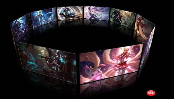
The content of this article is about how to implement a 3D photo wall with JavaScript (with code). It has certain reference value. Friends in need can refer to it. I hope it will be helpful to you.
The case I will share with you today is a cool 3D photo wall


This case is mainly through CSS3 and It is implemented using native JS. Next, I will share with you the process of achieving this effect. I don’t know how to put local videos on the blog, so I can only put two screenshots of the effects.
1. Realize static spread effect pictures
HTML content:
<div id="perspective">
        <div id="wrap">
            <img src="img2/1.jpg"></img>
            <img src="img2/2.jpg"></img>
            <img src="img2/3.jpg"></img>
            <img src="img2/4.jpg"></img>
            <img src="img2/5.jpg"></img>
            <img src="img2/6.jpg"></img>
            <img src="img2/7.jpg"></img>
            <img src="img2/8.jpg"></img>
            <img src="img2/9.jpg"></img>
            <img src="img2/10.jpg"></img>
        </div>
</div><style>
*{margin:0;padding: 0;}
body{background: #000;}
#perspective{perspective: 800px;}
#wrap{
width: 245px;
height: 125px;
border:1px solid red;
margin: 200px auto;
position: relative;
transform-style: preserve-3d;
transform: rotateX(-10deg)
}
#wrap img{
width: 100%;
height: 100%;
position: absolute;
left: 0;
top: 0;
border-radius: 1px;
box-shadow: 0 0 2px #fff;
}
</style>JS
<script>
var oWrap=document.getElementById("wrap");
var oImgs=oWrap.getElementsByTagName('img');
var deg=360/(oImgs.length);
for(var i=0;i<oImgs.length;i++){
oImgs[i].style.transform='rotateY('+i*deg+'deg) translateZ(400px)';
}
</script>There are several points to note in this part
(1) After positioning the image to the same div, set the transform-style attribute of the div to preserve-3d , and then place the picture along its y The axis rotates a certain angle. The sum of the rotation angles of these pictures must be 360 degrees, so as to form a circle; after the rotation angle, it is actually to change the z-axis direction of each picture (z The axis is always perpendicular to the picture), and then it can be displaced along the z-axis, which is equivalent to spreading the div, similar to a carousel in an amusement park. Finally, a scattered rendering will be formed.
(2) To build a 3D environment effect, mainly rely on transform-style in CSS3: preserve-3d;perspective:800px;here perspective The attribute is placed in the outer p so that when the div with the ID of wrap is rotated, it will not appear that the front picture is large and the back picture is small; it may be difficult to understand here, perspective It is the depth of the scene. After setting this attribute, the pictures in the back will look small and the pictures in the front will look big, similar to the big-ass TVs of the past. If the scene depth is placed in the p of wrap here, when rotating, it will be like rotating the entire TV instead of rotating the content in the scene.
2. Realize the rotation of the photo wall
The effect of this part is that when the mouse is pressed and moved, the photo wall will also rotate in the direction you move, and the faster you move, The faster it spins.
Implementation ideas:
(1) Determine the speed of movement based on the distance of the point change during mouse movement
(2) Can be obtained through the event parameter of the time function Event-related information
Event.clientX: Indicates the distance between the current mouse and the left side of the page
Event.clinetY: Indicates the distance between the current mouse and the top of the page
(3) Mouse During the movement, these two values will keep changing, so the photo wall can be rotated based on the difference between these two values. The larger the difference, the faster the rotation.
JS to realize rotation
<script>
var nowX,nowY,lastX,lastY,minusX,minusY;
var roX=-10,roY=0;
document.onmousedown=function(ev){
ev = ev || window.event;
lastX=ev.clientX;
lastY=ev.clientY;
this.onmousemove=function(ev){
ev = ev || window.event;
//当前鼠标距离页面左边的距离
nowX=ev.clientX;
//当前鼠标距离页面上边的距离
nowY=ev.clientY;
//X方向上的差值
minusX=nowX - lastX;
//Y方向上的差值
minusY=nowY - lastY;
//X轴的旋转角度(乘0.1是防止旋转过快)
roX-=minusY*0.1;
//y轴的旋转角度(乘0.2是防止旋转过快)
roY+=minusX*0.2;
oWrap.style.transform='rotateX('+roX+'deg) rotateY('+roY+'deg)';
lastX=nowX;
lastY=nowY;
}
this.onmouseup=function(){
//鼠标抬起,结束鼠标移动事件
this.onmousemove=null;
}
return false;
}
</script>3.CSS3 to realize reflection
<style>
#wrap img{
            width: 100%;
            height: 100%;
            position: absolute;
            left: 0;
            top: 0;
            border-radius: 1px;
            box-shadow: 0 0 2px #fff;
            -webkit-box-reflect: below 5px -webkit-linear-gradient(top,rgba(0,0,0,0) 40%,rgba(0,0,0,0.5) 100%);
        }
</style>4.Rotation Inertia implementation
Idea: When the mouse is lifted, it rotates with a smaller and smaller value, implemented through a timer
JS implementation of inertia
timer=setInterval(function(){
                    minusX*=0.95;
                    minusY*=0.95;
                    roY+=minusX*0.2;
                    roX-=minusY*0.1;
                    oWrap.style.transform='rotateX('+roX+'deg) rotateY('+roY+'deg)';
                    if(Math.abs(minusX)<0.5 && Math.abs(minusY)<0.5){
                        clearInterval(timer);
                    }
},13)In Add the above code to the onmouseup event function.
5. Add entrance animation
The last picture comes out first, the first picture comes out last, the transform animation is delayed accordingly, and the JS code is modified as follows

The above is a rough description of this case.
The above is the detailed content of How to implement a 3D photo wall with javascript (with code). For more information, please follow other related articles on the PHP Chinese website!