What this article brings to you is what are the new features of CSS3? This summary of the new features of CSS3 has certain reference value. Friends in need can refer to it. I hope it will be helpful to you.
Cascading Style Sheets (CSS) are a simple mechanism for adding style (e.g., fonts, colors, spacing) to web documents.
CSS3 is the latest development of the CSS language and aims to extend CSS2.1. It brings many new features and additions like rounded corners, shadows, gradients, transitions or animations, and new layouts like multi-column, flexible box or grid layouts.
Selector is the core of CSS. Originally, CSS allowed matching elements by type, class and/or ID. CSS2.1 added pseudo-elements, pseudo-classes and combinators. Using CSS3, we can use a variety of selectors to target almost any element on the page.
CSS2 introduces several attribute selectors. These allow matching elements based on their attributes. CSS3 extends those attribute selectors. Three attribute selectors were added in CSS3; they allow substring selection.
Matches any element whose attribute attr begins with the value val. In other words, val matches the beginning of the attribute value.
E[attr^=val] eg. a[href^='http://sales.']{color: teal;}
Matches any element whose attribute attr ends with val E. In other words, val matches the end of the attribute value.
E[attr$=val] eg. a[href$='.jsp']{color: purple;}
Match attribute attr matches any element E of val anywhere in the attribute. It is similar to E[attr~ = val], where val can It can be a word or a part of a word.
E[attr*=val] eg. img[src*='artwork']{ border-color: #C3B087 #FFF #FFF #C3B087; }
You may already be familiar with some user interaction pseudo-classes, namely :link, :visited, :hover, :active and :focus.
Added some pseudo-class selectors in CSS3. One is: the root selector, which allows designers to point to the root element of the document. In HTML, it would be . Because :root is generic, it allows designers to select the root element of an XML document without having to know its name. To allow scrollbars when needed in the document, this rule will work.
:root{overflow:auto;}
As a supplement to: first-child selector, added: last-child. With it, it is possible to select the last element named by the parent element.
p.article > p:last-child{font-style: italic;}
Added a new user interaction pseudo-class selector: target target selector. To draw the user's attention to a piece of text when they click on a link on the same page, a rule like the first line below works well; the link looks like the second line, and the highlighted span looks like the third line.
span.notice:target{font-size: 2em; font-style: bold;} Section 2 ...
A functional notation has been created for selecting specified elements that fail the test. Negated pseudo-class selectors: cannot be coupled to almost any other selector implemented. For example, to place a border around an image that doesn't have one specified, use a rule like this.
img:not([border]){border: 1;}
CSS3 brings support for some new ways of describing colors. Before CSS3, we almost always declared colors using hexadecimal format (#FFF or #FFFFFF for white). Colors can also be declared using rgb() notation, providing integers (0-255) or percentages.
The list of color keywords has been expanded in the CSS3 Color module to include 147 additional keyword colors (generally well supported), CSS3 also gives us many other options: HSL, HSLA and RGBA. The most notable change with these new color types is the ability to declare translucent colors.
RGBA works similarly to RGB, except it adds a fourth value: alpha, opacity level, or alpha transparency level. The first three values still represent red, green and blue. For alpha values, 1 means fully opaque, 0 means fully transparent, and 0.5 means 50% opaque. You can use any number between 0 and 1.
background: rgba(0,0,0,.5) //在这里0.5的0可以省略
HSL stands for Hue, Saturation and Lightness. Unlike RGB, where you need to manipulate the saturation or brightness of a color by changing all three color values consistently, with HSL you can adjust the saturation or brightness while maintaining the same base hue. The syntax for HSL includes integer values for hue, and percentage values for saturation and brightness.
The hsl() declaration accepts three values:
Hue from 0 to 359 degrees. Some examples are: 0 = red, 60 = yellow, 120 = green, 180 = cyan, 240 = blue, 300 = magenta.
Saturation is a percentage, 100% is normal. 100% saturation will be the full hue, saturation 0 will give you a shade of gray.
Basically causes the hue value to be ignored.
Saturation is a percentage, 100% is normal. 100% saturation will be the full hue, saturation 0 will give you a shade of gray>
basically causes the hue value to be ignored.
Mild percentage, 50% is the norm. A brightness of 100% is white, 50% is the actual hue, and 0% is black.
a in hsla() is also the same function as in rgba()
except that transparency is specified using HSLA and RGBA colors (and soon, eight-bit ten In addition to hexadecimal values), CSS3 also provides us with the opacity property. Opacity sets the opacity of the element on which it is declared, similar to alpha.
我们来看一个例子:
div.halfopaque { background-color: rgb(0, 0, 0); opacity: 0.5; color: #000000; } div.halfalpha { background-color: rgba(0, 0, 0, 0.5); color: #000000; }
尽管alpha和不透明度符号的使用看似相似,但是当你看它时,它们的功能有一个关键的区别。
虽然不透明度为元素及其所有子元素设置不透明度值,但半透明RGBA或HSLA颜色对元素的其他CSS属性或后代没有影响。
border-radius属性允许您创建圆角而无需图像或其他标记。要在我们的框中添加圆角,我们只需添加即可
border-radius: 25px;
border-radius属性实际上是一种速记。对于我们的“a”元素,角落大小相同且对称。如果我们想要不同大小的角落,我们可以声明最多四个唯一值
border-radius: 5px 10px 15px 20px;
CSS3提供了使用box-shadow属性向元素添加阴影的功能。此属性允许您指定元素上一个或多个内部和/或外部阴影的颜色,高度,宽度,模糊和偏移。
box-shadow: 2px 5px 0 0 rgba(72,72,72,1);
text-shadow为文本节点中的单个字符添加阴影。在CSS 3之前,可以通过使用图像或复制文本元素然后定位它来完成。
text-shadow: topOffset leftOffset blurRadius color;
W3C添加了使用CSS3生成线性渐变的语法。
Syntax: background: linear-gradient(direction, color-stop1, color-stop2, ...); e.g. #grad { background: linear-gradient(to right, red , yellow); }

你甚至可以用度数指定方向,例如在上面的例子中,60deg而不是右边。
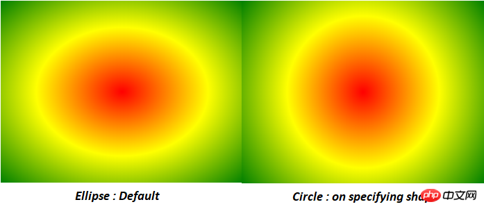
径向渐变是圆形或椭圆形渐变。颜色不是沿着直线前进,而是从所有方向的起点混合出来。
Syntax : background: radial-gradient(shape size at position, start-color, ..., last-color); e.g. #grad { background: radial-gradient(red, yellow, green); }//Default #grad { background: radial-gradient(circle, red, yellow, green); }//Circle

在CSS3中,不需要为每个背景图像包含一个元素;它使我们能够向任何元素添加多个背景图像,甚至伪元素。
background-image: url(firstImage.jpg), url(secondImage.gif), url(thirdImage.png);
这些是新实现的CSS3功能,还有其他未实现的功能可以参考css3学习手册。
相关推荐:
总结CSS3新特性(Transform篇)_html/css_WEB-ITnose
The above is the detailed content of What are the new features of css3? Summary of new features of css3. For more information, please follow other related articles on the PHP Chinese website!