<p style="background-color:green">
      <p style="width:40px;height:30px;background-color:red;">

      </p>
      <p style="width:40px;height:30px;background-color:red;">

      </p>
      <p style="width:40px;height:30px;background-color:red;">

      </p>
</p>

At this time we use inline-block for layout, and the magic happens
<p style="background-color:green;">
      <p style="width:40px;height:30px;background-color:red;display:inline-block;">

        </p>
      <p style="width:40px;height:30px;background-color:red;display:inline-block;">

        </p>
      <p style="width:40px;height:30px;background-color:red;display:inline-block;">

        </p>
    </p>

The original three p's are side by side. Because the three p's have become inline elements, they should also be side by side, but...
appears here Two questions: There is a gap between
p
There is a gap between the child p and the parent p A 4px spacing 
The reason why this problem occurs here is because the horizontally rendered elements of inline-block are displayed with line breaks or separated by spaces. In some cases, there will be a gap between
One method I tried here is to set margin-right to a negative value,
<p style="background-color:green">
      <p style="width:40px;height:30px;background-color:red;display:inline-block;margin-bottom:-4px;margin-right:-4px">

      </p>
      <p style="width:40px;height:30px;background-color:red;display:inline-block;margin-bottom:-4px;margin-right:-4px">

      </p>
      <p style="width:40px;height:30px;background-color:red;display:inline-block;margin-bottom:-4px;margin-right:-4px">

      </p>
    </p>

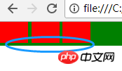
Here we can see that the first p and the second p still have a 1px spacing, while the second and third have no spacing, the child p and the parent There is no spacing between p, which shows that our problem is not here.
I was referring to Zhang Xuxin’s blog and I was deeply impressed and thought that this method is the best:
font-size:0
-webkit-text-size-adjust:none;
po code
<p style="background-color:green;font-size:0;-webkit-text-size-adjust:none;">

        <p style="width:40px;height:30px;background-color:red;display:inline-block;">

        </p>

        <p style="width:40px;height:30px;background-color:red;display:inline-block;">

        </p>

        <p style="width:40px;height:30px;background-color:red;display:inline-block;">

        </p>

So there is another question, what is -webkit-text-size-adjust?? ??
Haha, this solves our problem
Finally, let’s talk about the compatibility of inline-block: refer to this article
-->
IE6 and IE7 do not recognize inline-block but can trigger block elements. Other mainstream browsers support inline-block. This is enough. IE6 and 7 will not be considered. You know the reason...
Related recommendations:
display: inline-block and float in css Differences used when making elements line up
css: block, inline and inline-block usage and differences
css solution display:inline- block; method of laying out the gaps created
The above is the detailed content of About the pitfalls encountered by CSS3 inline-block. For more information, please follow other related articles on the PHP Chinese website!


