

<!doctype html><html lang="en">
<head>
<meta charset="UTF-8">
<title>CSS制作立体导航</title>
<link rel="stylesheet" href="http://www.w3cplus.com/demo/css3/base.css">
<style>
body{
background: #ebebeb;
}
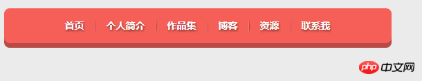
.nav{
width:560px;
height: 50px;
font:bold 0/50px Arial;
text-align:center;
margin:40px auto 0;
background: #f65f57;
/*制作导航圆角*/
border-radius: 8px;
/*制作导航立体效果*/
box-shadow: 0 7px 0 #ba4a45;
}
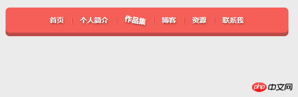
.nav a{
display: inline-block;
/* a元素的过渡属性:1、设置所有a标签过渡;2、过渡时间;3、速度曲线:以慢速开始的过渡效果 */
-webkit-transition: all 0.2s ease-in;/* Safari 和 Chrome */
-moz-transition: all 0.2s ease-in;/* Firefox */
-o-transition: all 0.2s ease-in;/* Opera */
-ms-transition: all 0.2s ease-in;/* IE 9 */
transition: all 0.2s ease-in;
}
.nav a:hover{
/* 鼠标移上时的效果;定义2D旋转10度 */
-webkit-transform:rotate(10deg);
-moz-transform:rotate(10deg);
-o-transform:rotate(10deg);
-ms-transform:rotate(10deg);
transform:rotate(10deg);
}
.nav li{
position:relative;
display:inline-block;
padding:0 16px;
font-size: 14px;
text-shadow:1px 2px 4px rgba(0,0,0,.5);
list-style: none outside none;
}
/*制作导航分隔线效果*/
.nav li::before,
.nav li::after{
content:"";
position:absolute;
top:14px;
height: 25px;
width: 1px;
}
.nav li::after{
right: 0;
/* 线性渐变 */
background: -moz-linear-gradient(top, rgba(255,255,255,0), rgba(255,255,255,.2) 50%, rgba(255,255,255,0));
background: -webkit-linear-gradient(top, rgba(255,255,255,0), rgba(255,255,255,.2) 50%, rgba(255,255,255,0));
background: -o-linear-gradient(top, rgba(255,255,255,0), rgba(255,255,255,.2) 50%, rgba(255,255,255,0));
background: -ms-linear-gradient(top, rgba(255,255,255,0), rgba(255,255,255,.2) 50%, rgba(255,255,255,0));
background: linear-gradient(top, rgba(255,255,255,0), rgba(255,255,255,.2) 50%, rgba(255,255,255,0));
}
.nav li::before{
left: 0;
background: -moz-linear-gradient(top, #ff625a, #9e3e3a 50%, #ff625a);
background: -webkit-linear-gradient(top, #ff625a, #9e3e3a 50%, #ff625a);
background: -o-linear-gradient(top, #ff625a, #9e3e3a 50%, #ff625a);
background: -ms-linear-gradient(top, #ff625a, #9e3e3a 50%, #ff625a);
background: linear-gradient(top, #ff625a, #9e3e3a 50%, #ff625a);
}
/*删除导航第一个导航项左边的分隔线*/
.nav li:first-child::before{
background: none;
}
/*删除导航最后一个导航右边的分隔线*/
.nav li:last-child::after{
background: none;
}
.nav a,
.nav a:hover{
color:#fff;
text-decoration: none;
}
</style>
</head>
<body>
<ul class="nav">
<li><a href="">首页</a></li>
<li><a href="">个人简介</a></li>
<li><a href="">作品集</a></li>
<li><a href="">博客</a></li>
<li><a href="">资源</a></li>
<li><a href="">联系我</a></li>
</ul>
</body></html>Rendering:
1
The difference between::before and :before
::) followed by the name of the pseudo-element.
:: notation is introduced by the current document in order to establish a discrimination between pseudo-classes and pseudo-elements. For compatibility with existing style sheets, user agents must also accept the previous one-colon notation for pseudo-elements introduced in CSS levels 1 and 2 (namely, :first-line, :first-letter, :before and :after). This compatibility is not allowed for the new pseudo-elements introduced in CSS level 3. composition. The double colon was introduced in the current specification to distinguish pseudo-classes from pseudo-elements. However, the browser needs to support the old existing pseudo-element writing methods at the same time, such as: first-line, :first-letter, :before, :after, etc., while the new pseudo-elements introduced in CSS3 are not allowed
Now you can fully answer the question in the title. For the pseudo-elements that existed before CSS2, such as :before, the single colon and double colon are written in::beforeThe effect is the same.
Therefore, if your website only needs to be
compatible with webkit, firefox, opera and other browsers, it is recommended to use double colon writing for pseudo elements. If it must be compatible In IE browser, it is safer to use CSS2 single colon writing method.The above is the detailed content of How to create a three-dimensional navigation bar with CSS. For more information, please follow other related articles on the PHP Chinese website!


![[Web front-end] Node.js quick start](https://img.php.cn/upload/course/000/000/067/662b5d34ba7c0227.png)


