Outer shadow: box-shadow: X axis Y axis Rpx color;
Attribute description (corresponding order): The X-axis of the shadow (negative values can be used) The Y-axis of the shadow (negative values can be used) Shadow blur value (size) Shadow color
Inner shadow: box-shadow: X axis Y axis Rpx color inset;
Default is outer shadow Inner shadow: inset can be set to inner shadow
Note (PS): This attribute is used for box models such as (p, p, h1, h2, h3, h4, h5, h6, etc.) and is not used to set text shadow. Ifset text shadow, please refer to the knowledge point: text-shadow (Similarly)
Because it is a new attribute, in order to be compatible with major browsers and support lower versions of these major browsers, when using the box-shadow attribute on mainstream browsers, we The name of the attribute needs to be written in the form -webkit-box-shadow. Firefox browser needs to be written in the form of -moz-box-shadow
#In order to better understand the characteristics of box-shadow, do a few small tests: (For the convenience of nesting styles directly within tags)
Test 1:
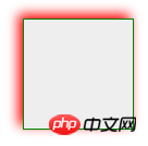
<p style="box-shadow: 0 0 10px #f00; border:1px solid green">
</p>  box-shadow: 0 0 10px #f00
(Because the X-axis and Y-axis movement settings are not set, the radius range and color will be affected)

<p style="box-shadow:4px 4px 10px #f00; border:1px solid green">
</p> box-shadow:4px 4px 10px #f00;
Positive value (Positive value goes to the right and down) So it becomes like this
Test 3:

<p   style="max-width:90%">
</p> box-shadow:-4px -4px 10px #f00;
##The difference from test 2 is that the X axis and Y The axis changed to negative value (negative value goes left and up) so it becomes like this

#Similarly: You can test the effect of the next positive value and the next negative value, but I won’t do the test here. . . . . . . .
Test 4: <p style="box-shadow:-10px 0px 10px red, /*左边阴影*/
0px -10px 10px #000, /*上边阴影*/
10px 0px 10px green,
/*右边阴影*/
0px 10px 10px blue;"
/*下边阴影*/
></p>
##You will feel very messy when you see this code, but after seeing the effect picture, you will understand how it is done. It is just a matter of changing the X-axis and Y-axis positions and color values. Shadow value sizes, (separated by commas) just practice a few times 测试5:--内阴影 
<p style="box-shadow: 0px 0px 10px red inset; border:1px solid green">
</p> box-shadow: 0px 0px 10px red inset;
与上面写法相同 唯一不同的是添加了一个inset 其它属性与外阴影相同

百变不离其宗,练习就能熟悉,懂了就知道原理,随意改写,在配合css3的动画效果, 闪光层(字)都很简单实现。。希望对你有帮助。。
The above is the detailed content of Detailed explanation of examples of box-shadow outer shadow and outer glow in css3 (picture). For more information, please follow other related articles on the PHP Chinese website!


