


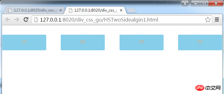
Method 1: Use box-pack's justify implementation: Use the display: flex elastic box model to implement adaptive width according to the window size. The code is as follows:
<!DOCTYPE html>
<html>
	<head>
		<meta charset="UTF-8">
		<title></title>
			<meta content="width=device-width,initial-scale=1.0,maximum-scale=1.0,user-scalable=no" name="viewport">
		<style>
			*{
				margin: 0;
				padding: 0;
			}
			.container{
				display: -webkit-box;
				display: -webkit-flex;
				display: -ms-flexbox;
				display: flex;
				margin-top: 30px;
			    -webkit-box-pack: justify;
			    -webkit-justify-content: space-between;
			    -ms-flex-pack:justify ;
			    justify-content: space-between;
			}
		   .container a{
		   	width:20%;
		   	display: block;
		   	height: 50px;
		   	line-height: 45px;
		   	text-align: center;
		   	border 1px solid red;
		   	color: sandybrown;
		   	font-size: 16px;
		   	margin-bottom: 5px;
		   	border-radius: 3px;
		   	background-color: skyblue;
		    text-decoration: none;
		   }
		</style>
	</head>
	<body>
		<p class="container">
			<a class="link" href="#">10</a>
			<a class="link" href="#">20</a>
			<a  class="link" href="#">30</a>
			<a class="link" href="#">50</a>

		</p>
	</body>
</html>The effect is as follows:
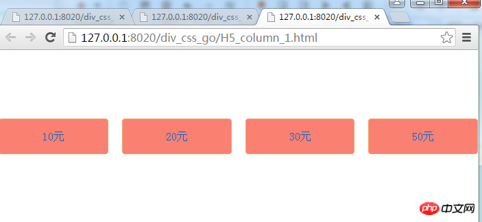
Method 2: Use column multi-column layout to implement, the specific code is as follows :
<!DOCTYPE html>
<html>
	<head>
		<meta charset="UTF-8">
				<meta content="width=device-width,initial-scale=1.0,maximum-scale=1.0,user-scalable=no" name="viewport">
		<title></title>
		<style>
			*{margin: 0;padding: 0;}
		  .container{
		  	-webkit-column-count: 4;-moz-column-count: 4;column-count: 4;
		  	-webkit-column-gap: 20px;-moz-column-gap: 20px;column-gap: 20px;
		  	 	margin-top: 100px;
		  }
		  .container a{

		  	display: block;
		  	height: 50px;

		  	line-height: 50px;
		  	text-align: center;
		  	border: 1px solid sandybrown;
		  	color: #0066CC;
		  	font-size: 16px;
		  	margin-bottom: 5px;
		  	border-radius: 4px;
		  	background-color: salmon;
		  	text-decoration: none;
		  }
		</style>
	</head>
	<body>
		 <p class="container">
	 <a class="link" href="#none">10元</a>
    <a class="link" href="#none">20元</a>
    <a class="link" href="#none">30元</a>
    <a class="link" href="#none">50元</a>
		 </p>
	</body>
</html>The effect is as follows:
The above is the detailed content of Sharing of image and text code to achieve both-end alignment in CSS3. For more information, please follow other related articles on the PHP Chinese website!


![[Web front-end] Node.js quick start](https://img.php.cn/upload/course/000/000/067/662b5d34ba7c0227.png)


