


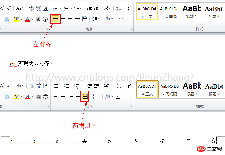
Speaking of aligning at both ends, everyone is familiar with it. In the interface navigation such as word, powerpoint, outlook, etc., there is actually a button for aligning at both ends (dispersed alignment). It is not commonly used. We are more accustomed to it. Align text or modules on the page using left, center, or right alignment.
Since the emergence of responsive web design, percentage cloth adaptive layout is more used, especially on the mobile side, the way the two ends are aligned appears more and more important. So, how to use CSS to achieve alignment at both ends? I believe many students will know text-align:justify for text alignment. This is one of the methods I will talk about today. There are also two more exciting implementation methods. Please read below~
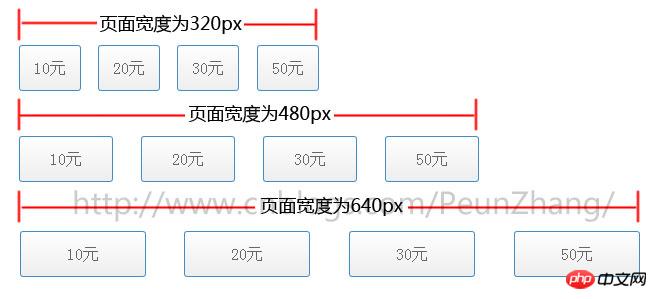
The following picture is the demo that needs to be implemented, taking screenshots with widths of 320px, 480px, and 640px respectively. In other words, as the width of the browser window is adjusted, the height of the button menu remains unchanged and the width will be proportional. Automatically adapt, and align the left and right ends:
, but the implementation will be more complicated and smells like a hack
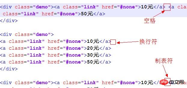
text-align:justify attribute is fully compatible. Use it to achieve alignment on both ends. You need to pay attention toAdd [space/newline/tab] between modules to work. Similarly, to achieve text alignment, you need to add [space/newline/tab] between words. will work
 ##HTML:
<p>模块内的元素之间为 分隔,只支持webkit和Gecko内核浏览器</p><br /><p class="demo"><a class="link" href="#none">10元</a> <a class="link" href="#none">20元</a> <a class="link" href="#none">30元</a> <a class="link" href="#none">50元</a></p><br /><p>模块内的元素之间为换行符</p><br /><p class="demo">
    <a class="link" href="#none">10元</a>
    <a class="link" href="#none">20元</a>
    <a class="link" href="#none">30元</a>
    <a class="link" href="#none">50元</a></p><br /><p>模块内的元素之间为空格符</p><br /><p class="demo"><a class="link" href="#none">10元</a> <a class="link" href="#none">20元</a> <a class="link" href="#none">30元</a> <a class="link" href="#none">50元</a></p><br /><p>模块内的元素之间为无分隔符,justify不起作用</p><br /><p class="demo"><a class="link" href="#none">选项1</a><a class="link" href="#none">选项2</a><a class="link" href="#none">选项3</a><a class="link" href="#none">选项4</a></p><br />
CSS:
{:;:;}{:;:;:;:;
}{:;
}{:;:;:;:;:;:;
}{:;:;:;:;:;:;:;:;:;:;:;:;:;:;
}
Method 2: Use justify-content:space-between
box-pack is a new attribute of CSS3. It depends on display:box (old version of flexible layout) and is affected by box-orient. Box-pack determines the horizontal alignment of sub-tags. The optional values are start | end | center | justify . Using box-pack:justify to align both ends is very simple and requires less code. In order to keep pace with the future, display:flex (the new version of flexible layout) is also written in~If you are doing webapp development based on the webkit kernel and winphone IE10 and above, then everything will be easy~Regarding the introduction of the box model layout, here is an article "CSS box-flex attribute, and then an introduction to the flexible box model". It is well written and recommended to everyone~
HTML:
<p class="demo">
    <a class="link" href="#none">10元</a>
    <a class="link" href="#none">20元</a>
    <a class="link" href="#none">30元</a>
    <a class="link" href="#none">50元</a></p>
CSS:
*{margin:0;padding:0;}/*
 说明:
 display:box定义布局为盒模型后,可使用盒模型下的box-pack:justify属性*/.demo{
    display:-webkit-box;
    display:-webkit-flex;
    display:-ms-flexbox;
    display:flex;
    -webkit-box-pack:justify;
    -webkit-justify-content:space-between;
    -ms-flex-pack:justify;
    justify-content:space-between;
}.demo a{
     width:20%;
     display:block;
     height:44px;
     line-height:44px;
     text-align:center;
     border:1px solid #428cc8;
     color:#666;
     font-size:16px;
     margin-bottom:5px;
     border-radius:3px;
     background-color:#fefefe;
     background-image:-webkit-gradient(linear,left top,left bottom,color-stop(0,#fefefe),color-stop(1,#eee));
     color:#666;
     text-decoration:none;
}
Method 3: Use column (multi-column layout)
HTML:
##
<p class="demo">
    <a class="link" href="#none">10元</a>
    <a class="link" href="#none">20元</a>
    <a class="link" href="#none">30元</a>
<a class="link" href="#none">50元</a></p>CSS:
*{margin:0;padding:0;}/*
 说明:
 1.column-count定义了对象的列数,例子中有4个模块,那么定义为4列
 2.column-gap定义了对象中列与列的间距,间距不能设置为百分比,显得不够灵活*/.demo{
     -webkit-column-count:4;-moz-column-count:4;column-count:4;
     -webkit-column-gap:20px;-moz-column-gap:20px;column-gap:20px;
}.demo a{
     display:block;
     height:44px;
     line-height:44px;
     text-align:center;
     border:1px solid #428cc8;
     color:#666;
     font-size:16px;
     margin-bottom:5px;
     border-radius:3px;
     background-color:#fefefe;
     background-image:-webkit-gradient(linear,left top,left bottom,color-stop(0,#fefefe),color-stop(1,#eee));
     color:#666;
     text-decoration:none;
}The above is the detailed content of Example analysis of three methods to achieve alignment at both ends in CSS. For more information, please follow other related articles on the PHP Chinese website!


![[Web front-end] Node.js quick start](https://img.php.cn/upload/course/000/000/067/662b5d34ba7c0227.png)


