
The navigation menu of the website is the most important indicator for users to learn more about other parts of the website after reading the web page, and is crucial to retaining users. There are many ways to design a navigation menu, and every website must have its own navigation menu. To design an excellent navigation menu, designers must break through traditional limitations to express their creativity. Website navigation is one of the main factors that determine the usability of the site. If visitors can find what they are looking for easily and effortlessly, they will be more likely to stay on your site rather than leaving. Effective navigation can help a website increase page views, improve user experience, and even increase sales and profits.
Tips: Common prototyping tools for designing navigation bar menus: Axure, Mockplus, UXPin, Sketch
Design an excellent navigation menu and It’s not that difficult, but you still need to grasp the following key points:
1. Easy to find
It should be easy to distinguish visually and make it easy to find. For users to find it at a glance, don’t use the same color, font, and size for navigation text as your body text. Navigation text should be prominent and visible. For menu buttons, use high-contrast colors and clear text. The navigation area should be kept to a certain size so that it is easy for users to find it. The location of navigation should use the usual location, such as the top of the page, the left side, etc.
2. Simple
It must be simple and easy to use, helping your users quickly see what information is available and where to find it. What to look for. Users need to be able to predict how your website will work without having to learn how! If they need to think about what to do, you've lost them! Avoid having users click on a small inverted triangle to expand a secondary menu, which they may not find at all.
3. Clickable
Make sure all navigation elements are clickable. When using multiple categories in the navigation, all title elements should be clickable links. Even with a drop-down menu, clicking on a subcategory link may be a visitor's natural inclination. Don’t think this is ridiculous, I often find that the navigation of some websites cannot jump after clicking.
4. Consistency
Try to use the same navigation pattern across all pages. This is very important because there is no consistent design. , the user may think he is on another website. Make sure to use the same navigation pattern so users can easily access your site without getting lost.
5. Be clear
Your menu text must be clearly described, using simple and clear terms, and don’t make the user think about what the text here means. What, keep your text short, descriptive and to the point. If it takes more than five seconds to think about the meaning of the text before clicking the link, it will create a poor user experience.
6. Keep it simple
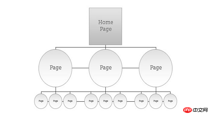
You can add more information to the vertical navigation There are many items, but there should not be too many items in the main menu that will distract the user. It is generally best not to exceed 8 items.
7. Interaction
Feedback is crucial to any interaction. When people click or mouse over a menu item, make sure to provide instructions for what to do next. Giving users timely feedback on any operation can make users more willing to click on navigation. You can make a link different from other content by changing its text color, background color, or making it bold.
8. Sorting
It is necessary to determine the main functions provided by the website, what is the most important, and place the most important items according to their importance. In the primary navigation, secondary items can be placed in the secondary navigation.
9. Style
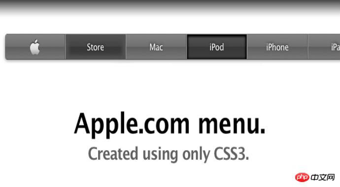
Minimalism is still a trend in web design. A unique visual style will make your menu look cool. But make sure it matches the overall design of the entire website.
10. Accessibility
Website Accessibility is always an important criterion for measuring the quality of a website. Please make sure it is friendly to people with disabilities. If you want to use a lot of cool CSS technologies, please also consider compatibility with screen reading technologies, etc.
The following is a navigation design checklist. You can check your navigation menu according to the following table:
1. Navigation location It is easy to find on the page
2. Just use the mouse to slide over and click the mouse to operate the entire navigation menu
3. Every All menu items can be clicked and jumped normally
4. The navigation text is short and clear
5. Only one navigation is used for the entire website Menu
6. When the mouse is moved over the corresponding menu item, the corresponding item can be highlighted
7. The number of navigation menu items should not exceed 8
8. Navigation menu items have been sorted by importance
9. The style of navigation is consistent with the overall style of the website
10. Navigation menu items can be correctly recognized by screen readers
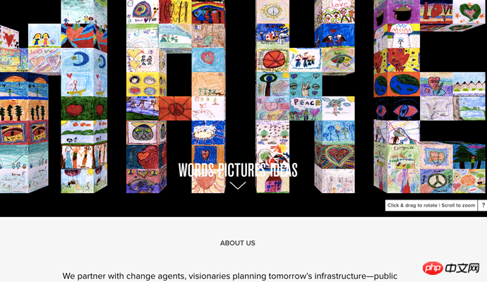
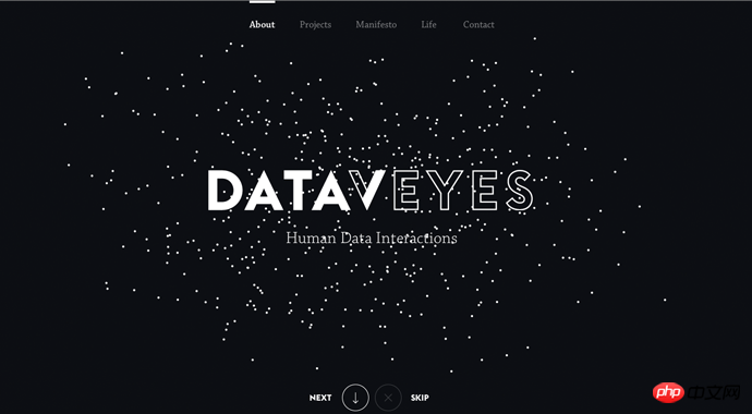
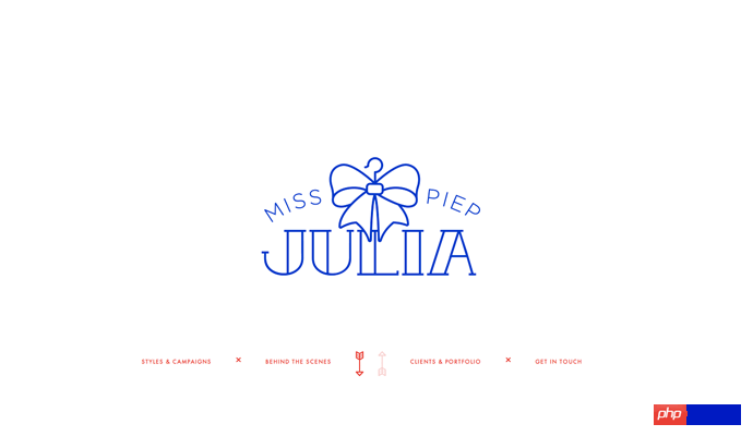
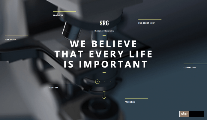
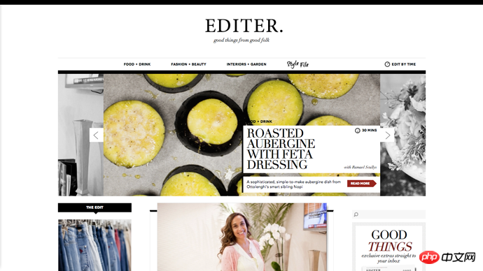
We We will display 6 different websites with exquisite navigation menus. Their styles and design methods are different. I hope you can get some inspiration from them and design a navigation menu with your own characteristics. Tip: You can click on the following navigation menus one by one to see how they work on the browser.
The prototyping tools used are: Axure, Mockplus, UXPin, Sketch.

The above is the detailed content of 10 principles of web navigation menu design. For more information, please follow other related articles on the PHP Chinese website!


