


1. Basic form: For the basic form, Bootstrap did not do much customized effect design, only customized the fieldset, legend, and label tags in the form.


fieldset { min-width: 0; padding: 0; margin: 0; border: 0; } legend { display: block; width: 100%; padding: 0; margin-bottom: 20px; font-size: 21px; line-height: inherit; color: #333; border: 0; border-bottom: 1px solid #e5e5e5; } label { display: inline-block; margin-bottom: 5px; font-weight: bold; }
2. Horizontal form class name “form-horizontal”


 ##
##
.form-horizontal .control-label, .form-horizontal .radio, .form-horizontal .checkbox, .form-horizontal .radio-inline, .form-horizontal .checkbox-inline { padding-top: 7px; margin-top: 0; margin-bottom: 0; } .form-horizontal .radio, .form-horizontal .checkbox { min-height: 27px; } .form-horizontal .form-group { margin-right: -15px; margin-left: -15px; } .form-horizontal .form-control-static { padding-top: 7px; } @media (min-width: 768px) { .form-horizontal .control-label { text-align: right; } } .form-horizontal .has-feedback .form-control-feedback { top: 0; right: 15px; }


 Example
1.Input box input: for To make the control style correct in various form styles, you need to add the class name "form-control". Each form control below can be added.


nbsp;html>表单控件——输入框input

 Example
 Example

3.内联表单 类名“form-inline”


ea:添加了类名“form-control”类名,则无需设置cols属性。


示例
4.复选框checkbox和单选择按钮radio:水平排列加类名“checkbox-inline”||类名“radio-inline”


4.复选框checkbox和单选择按钮radio:水平排列加类名“checkbox-inline”||类名“radio-inline”


nbsp;html>表单控件——表单控件大小


.radio, .checkbox { display: block; min-height: 20px; padding-left: 20px; margin-top: 10px; margin-bottom: 10px; } .radio label, .checkbox label { display: inline; font-weight: normal; cursor: pointer; } .radio input[type="radio"], .radio-inline input[type="radio"], .checkbox input[type="checkbox"], .checkbox-inline input[type="checkbox"] { float: left; margin-left: -20px; } .radio + .radio, .checkbox + .checkbox { margin-top: -5px; }


.radio-inline, .checkbox-inline { display: inline-block; padding-left: 20px; margin-bottom: 0; font-weight: normal; vertical-align: middle; cursor: pointer; } .radio-inline + .radio-inline, .checkbox-inline + .checkbox-inline { margin-top: 0; margin-left: 10px; }
5.控件大小:类名input-sm:让控件比正常大小更小;类名input-lg:让控件比正常大小更大;宽度配合Bootstrap的网格系统


.input-sm { height: 30px; padding: 5px 10px; font-size: 12px; line-height: 1.5; border-radius: 3px; } select.input-sm { height: 30px; line-height: 30px; } textarea.input-sm, select[multiple].input-sm { height: auto; } .input-lg { height: 46px; padding: 10px 16px; font-size: 18px; line-height: 1.33; border-radius: 6px; } select.input-lg { height: 46px; line-height: 46px; } textarea.input-lg, select[multiple].input-lg { height: auto; }
6.表单控件状态(焦点状态):类名form-control


.form-control:focus { border-color: #66afe9; outline: 0; -webkit-box-shadow: inset 0 1px 1pxrgba(0,0,0,.075), 0 0 8px rgba(102, 175, 233, .6); box-shadow: inset 0 1px 1pxrgba(0,0,0,.075), 0 0 8px rgba(102, 175, 233, .6); }
7.表单控件状态(禁用状态):form-control别忘记加①在需要禁用的表单控件上加上“disabled”;②fieldset设置了disabled属性,整个域都将处于被禁用状态。


.form-control[disabled], .form-control[readonly], fieldset[disabled] .form-control { cursor: not-allowed; background-color: #eee; opacity: 1; }
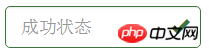
8.表单控件状态(验证状态):1、.has-warning:警告状态(黄色) 2、.has-error:错误状态(红色) 3、.has-success:成功状态(绿色)


 :需要类名has-feedback +
9.表单提示信息:"help-block"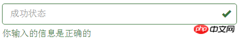


.help-block { display: block; margin-top: 5px; margin-bottom: 10px; color: #737373; }
按钮
建议使用button或a标签来制作按钮
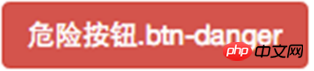
1.基本按钮:类名“btn”


.btn { display: inline-block; padding: 6px 12px; margin-bottom: 0; font-size: 14px; font-weight: normal; line-height: 1.42857143; text-align: center; white-space: nowrap; vertical-align: middle; cursor: pointer; -webkit-user-select: none; -moz-user-select: none; -ms-user-select: none; user-select: none; background-image: none; border: 1px solid transparent; border-radius: 4px; }
2.默认按钮: 类名“btn” + 类名“btn-default” 


.btn-default { color: #333; background-color: #fff; border-color: #ccc; }


4.按钮大小: .btn-lg:大型按钮 .btn-sm:小型按钮 .btn-cs:超小型按钮


.btn-lg, .btn-group-lg> .btn { padding: 10px 16px; font-size: 18px; line-height: 1.33; border-radius: 6px; } .btn-sm, .btn-group-sm> .btn { padding: 5px 10px; font-size: 12px; line-height: 1.5; border-radius: 3px; } .btn-xs, .btn-group-xs> .btn { padding: 1px 5px; font-size: 12px; line-height: 1.5; border-radius: 3px; }
5.块状按钮: 类名“btn-block”
6.禁用状态: 使用disabled类或disabled属性
图像1.img-responsive:响应式图片,主要针对于响应式设计 2.img-rounded:圆角图片 3.img-circle:圆形图片 4.img-thumbnail:缩略图片


img { vertical-align: middle; } .img-responsive, .thumbnail>img, .thumbnail a >img, .carousel-inner > .item >img, .carousel-inner > .item > a >img { display: block; max-width: 100%; height: auto; } .img-rounded { border-radius: 6px; } .img-thumbnail { display: inline-block; max-width: 100%; height: auto; padding: 4px; line-height: 1.42857143; background-color: #fff; border: 1px solid #ddd; border-radius: 4px; -webkit-transition: all .2s ease-in-out; transition: all .2s ease-in-out; } .img-circle { border-radius: 50%; }
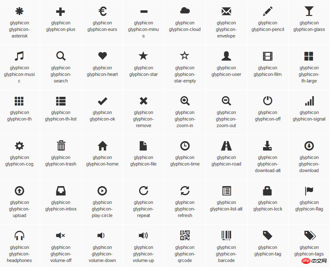
图标
:查看全部图标

@font-face { font-family: 'Glyphicons Halflings'; src: url('../fonts/glyphicons-halflings-regular.eot'); src: url('../fonts/glyphicons-halflings-regular.eot?#iefix') format('embedded-opentype'), url('../fonts/glyphicons-halflings-regular.woff') format('woff'), url('../fonts/glyphicons-halflings-regular.ttf') format('truetype'), url('../fonts/glyphicons-halflings-regular.svg#glyphicons_halflingsregular') format('svg'); } .glyphicon { position: relative; top: 1px; display: inline-block; font-family: 'Glyphicons Halflings'; font-style: normal; font-weight: normal; line-height: 1; -webkit-font-smoothing: antialiased; -moz-osx-font-smoothing: grayscale; } .glyphicon-asterisk:before { content: "\2a"; }

The above is the detailed content of Example code for forms in bootstrap. For more information, please follow other related articles on the PHP Chinese website!


![[Web front-end] Node.js quick start](https://img.php.cn/upload/course/000/000/067/662b5d34ba7c0227.png)


