


Overview of the latest version of flexbox layout in CSS 3 In CSS 3, the CSS Flexible Box module is a very important module, which is used to implement page layout processing in a very flexible way. Although other CSS style properties can be used to implement page layout processing, if you use the flexible box layout technology defined in the CSS Flexible Box module, the display mode of each local area in the page can be automatically adjusted according to the screen size or browser window size, that is, Very flexible layout handling. Although the CSS Flexible Box module has been announced for several years, the content defined in the module has undergone several major revisions since its initial release. The currently announced official version is ◦CSS Flexible Box Layout Module - W3C Candidate Recommendation, 18 September 2012. So far, Opera 12.10 or above, IE 11 or above, Chrome 21 version
1.The latest version of flexible box layout in CSS3

Introduction: In CSS 3, the CSS Flexible Box module is a very important module, which is used to implement page layout processing in a very flexible way. Although other CSS style properties can be used to implement page layout processing, if you use the flexible box layout technology defined in the CSS Flexible Box module, the display mode of each local area in the page can be automatically adjusted according to the screen size or browser window size, that is, Very flexible layout handling. Although the CSS Flexible Box module has been announced for several years, the content defined in the module has undergone several major revisions since its initial release. The currently announced official version is ◦CS
2.Detailed explanation of the CSS flex-flow property of the Flexible flexible box model

Introduction: This article introduces the detailed explanation of the CSS flex-flow property of the Flexible elastic box model
3.CSS flex-direction attribute of Flexible flexible box model

##Introduction: This article introduces the Flexible flexible box model CSS flex-direction property
4.Flexible Flexible Box Model CSS align-items property

Introduction: This article mainly introduces the CSS align-items property of the Flexible flexible box model
5.Flexible Flexible Box Model CSS align-self attribute
6.
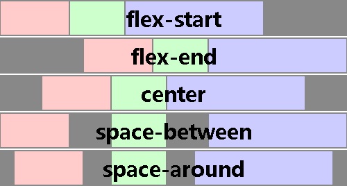
Flexible Flexible Box Model CSS justify-content attribute
7.
Flexible flexible box model CSS order attribute

8.

Introduction: In CSS 3, the CSS Flexible Box module is a very important module, which is used to implement page layout processing in a very flexible way. Although other CSS style properties can be used to implement page layout processing, if you use the flexible box layout technology defined in the CSS Flexible Box module, the display mode of each local area in the page can be automatically adjusted according to the screen size or browser window size, that is, Very flexible layout handling. Although the CSS Flexible Box module has been announced for several years, the content defined in the module has undergone several major revisions since its initial release. The currently announced official version is ◦CSS
##9.CSS box model CSS3 scalable box attribute (Flexible Box)_html/css_WEB-ITnose
Introduction: CSS3 Flexible Box attribute of CSS box model (Flexible Box)
10.Microsite-Use flexible.js to implement mobile terminal Device Adaptation_html/css_WEB-ITnose
Introduction: Microsite-Using flexible.js to implement mobile device adaptation
[Related Q&A recommendations]:
css - mobile rem adaptation issues
ios - What are the Cocoa libraries you can’t live without? ? What are the usage scenarios and reasons?
javascript - How to make a single-page WeChat game
javascript - The problem of shrinking under iphone5
javascript - flexible.js source code question
The above is the detailed content of 10 course recommendations about Flexible. For more information, please follow other related articles on the PHP Chinese website!


![[Web front-end] Node.js quick start](https://img.php.cn/upload/course/000/000/067/662b5d34ba7c0227.png)


