

Brief Tutorial
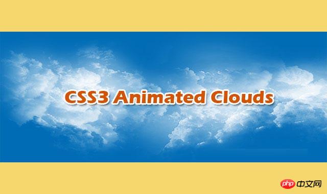
This is a very cool pure CSS3 realistic multi-layered cloud animation special effect. This special effect uses multiple transparent cloud PNG images as background images, and uses CSS animation to create the horizontal floating animation effect of clouds.
##View source Download plug-in
How to use
HTML structure
The HTML structure of this multi-layered cloud animation effect is very simple: use a p.sky as the background layer of the antenna, and place multiple subtitles inside it.
As a cloud container.
<p class="sky">
    <p class="clouds_one"></p>
    <p class="clouds_two"></p>
    <p class="clouds_three"></p>
</p>## CSS style
As the sky background, the .sky element sets a fixed height, uses relative positioning, and uses overflow: hidden; to hide out-of-range elements. element. Start by setting the sky color to a lighter blue #007fd5. Then a sky_background CSS3 animation is set for the sky background. This animation transitions the color of the sky background from light blue to dark blue within 50 seconds. The animation-timing-function of the animation is ease-out, and the iteration of the animation The number of times animation-iteration-count is an infinite loop.
In this special effect, each element is set with the transform: translate3d(0, 0, 0) attribute. Used to turn on the 3D effect of the GPU and improve display performance.
.sky {
    height: 480px;
    background: #007fd5;
    position: relative;
    overflow: hidden;
    -webkit-animation: sky_background 50s ease-out infinite;
    -moz-animation: sky_background 50s ease-out infinite;
    -o-animation: sky_background 50s ease-out infinite;
    animation: sky_background 50s ease-out infinite;
    -webkit-transform: translate3d(0, 0, 0);
    -ms-transform: translate3d(0, 0, 0);
    -o-transform: translate3d(0, 0, 0);
    transform: translate3d(0, 0, 0);
  }
  @keyframes sky_background {
    0% {
      background: #007fd5;
      color: #007fd5
    }
    50% {
      background: #000;
      color: #a3d9ff
    }
    100% {
      background: #007fd5;
      color: #007fd5
    }
}Cloud layer 1 uses the first cloud PNG image as the background image. Use absolute positioning, aligned left relative to the sky container. The height is equal to the sky and the width is 3 times the sky container. and perform cloud_one CSS3 animation. This animation modifies the left property of the cloud layer so that the clouds move horizontally.
.clouds_one {
    background: url("img/cloud_one.png");
    position: absolute;
    left: 0;
    top: 0;
    height: 100%;
    width: 300%;
    -webkit-animation: cloud_one 50s linear infinite;
    -moz-animation: cloud_one 50s linear infinite;
    -o-animation: cloud_one 50s linear infinite;
    animation: cloud_one 50s linear infinite;
    -webkit-transform: translate3d(0, 0, 0);
    -ms-transform: translate3d(0, 0, 0);
    -o-transform: translate3d(0, 0, 0);
    transform: translate3d(0, 0, 0);
  }
  @keyframes cloud_one {
    0% {
      left: 0
    }
    100% {
      left: -200%
    }
  }
The above is the detailed content of Pure CSS3 creates realistic multi-layered cloud animation special effects. For more information, please follow other related articles on the PHP Chinese website!


![[Web front-end] Node.js quick start](https://img.php.cn/upload/course/000/000/067/662b5d34ba7c0227.png)


