


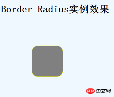
The 10 top-level commands that you must know in CSS3 are all good effect implementation codes. Friends who like them can save them1. Border rounded corners (Border Radiuas)
This is something we commonly use in daily life. When I used p-round corners in the past, it was very painful, whether I used CSS to draw round corners orpictureto draw circles. It is not easy to create corners, but now it is better. In CSS3, you only need the following code to create a beautiful rounded corner effect~~~
The code is as follows:
#box1 { border: 1px solid #699; /* for Mozilla Firefox */ -moz-border-radius: 20px; /* for Safari & Google Chrome */ -webkit-border-radius: 20px; }
Example renderings:
2. Box Shadow (Box Shadow)
is to allow a p to produce a shadow effect. The code is as follows:
The code is as follows:
#box1 { border: 1px solid #699; -moz-box-shadow: 5px -5px 5px #b6ebf7; -webkit-box-shadow: 5px -5px 5px #b6ebf7; width: 100px; height: 100px; margin-left: 100px; margin-top: 100px; background-color:Gray; border-color:Yellow; }
It should be noted that it has 4 parameters:
The first parameter: horizontal offset position, it has a positive or negative number. If it is a positive number, it means that the right (right) side of the border will produce a shadow; otherwise, if it is a negative number, then its left (left) frame will produce a shadow effect.
The second parameter: the vertical offset position. It can also have positive or negative numbers. If it is a positive number, it means that the bottom (bottom) border has a shadow; otherwise, if it is a negative number, then its top (top) border has a shadow.
The third parameter: the size of the shadow
The fourth parameter: color, this is easy to understand.
Example renderings:
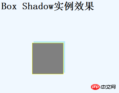
Note above, for the second parameter, I use a negative number.
There is box shadow, and there is also aattributewhich istext-shadow, which is mainly used for text.
The code is as follows:
Welcome to my home!Welcome to my home!Welcome to my home!Welcome to my home!
Example renderings:
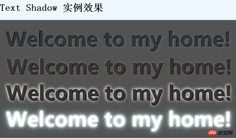
How cool!
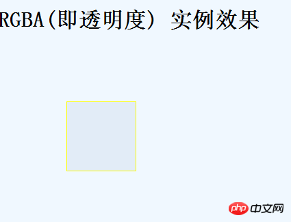
3. Transparency (Transparency or RGBA)
Setting the transparency of elements has always been a tricky problem, and different browsers have different uses. method.
For example, I used to set transparency as follows: [Note: This method is not recommended]
CSS transparency under Firefox, Safari, Chrome and Opera
#myElement{opacity:.7; }
CSS transparency under IE
#myElement{filter:alpha(opacity=40); }
The CSS transparency method syntax of IE8 is as follows
The code is as follows :
#myElement { filter: progid:DXImageTransform.Microsoft.Alpha(opacity=40); /* 第一行在IE6, IE7和IE8下有效 */ -ms-filter: "progid:DXImageTransform.Microsoft.Alpha(opacity=40)"; /*第二行仅在IE8下有效 */ }
Transparency settings required for old versions of Firefox and Safari:
The code is as follows:
#myElement { -khtml-opacity: .5; -moz-opacity: 0.5; }
Isn’t it particularly tricky! ~~.
Fortunately, we are now living in an era that is beginning to be perfect. After CSS 3 came out, there was a new term called transparency (transparency) attribute.
The code is as follows:
#box3 { background-color: rgba(110, 142, 185, .5); }
There are 4 parameters in it. The first 3 parameters are particularly easy to understand, which are rgb colors (don’t tell me, I don’t know what rgb color values are yet, I don’t know) Pull him out and spank him), the most important thing is the fourth value. Its value is between 0 and 1, with larger values indicating more opacity.
However, don’t be too happy. There is still a special example here. You may also think of it, which is Microsoft’s IE. Microsoft always likes to do things that are completely different from others, and it is us programmers who are exhausted.
IE understands the above statement and directly understands it as the background color, not rgba. In order to ensure perfect compatibility in all browsers during development, we need to make the following corrections:
The code is as follows:
#box3 { /* For all browsers */ background-color: #6e8eb9; } body:last-child #box3 { /* Exclude all IE browsers using :last-child */ background-color: rgba(110, 142, 185, .5)!important; }
:last-child is Pseudo selectors, selectors have been used in CSS since CSS2. IE doesn't know this, so it won't execute the code behind it.
So, the above achieves perfect compatibility.
Example renderings:
4. Columns layout
means that the content inside the frame can be divided into several columns.
First go to the code:
The code is as follows:
#box1 { border: 1px solid #699; /* for Mozilla Firefox */ -moz-column- count : 2; -moz-column-gap: 20px; -moz-column-rule: 1px solid #6e8eb9; /* for Safari & Google Chrome */ -webkit-column-count: 2; -webkit-column-gap: 20px; -webkit-column-rule: 1px solid #6e8eb9; margin-left: 100px; margin-top: 100px; border-color: Yellow; background-color:Gray; }
-moz-column-count: indicates the number of columns, such as 2, then it means that 2 is divided into 2 columns.
-moz-column-rule: Indicates the style of the middle dividing line.
Example renderings:
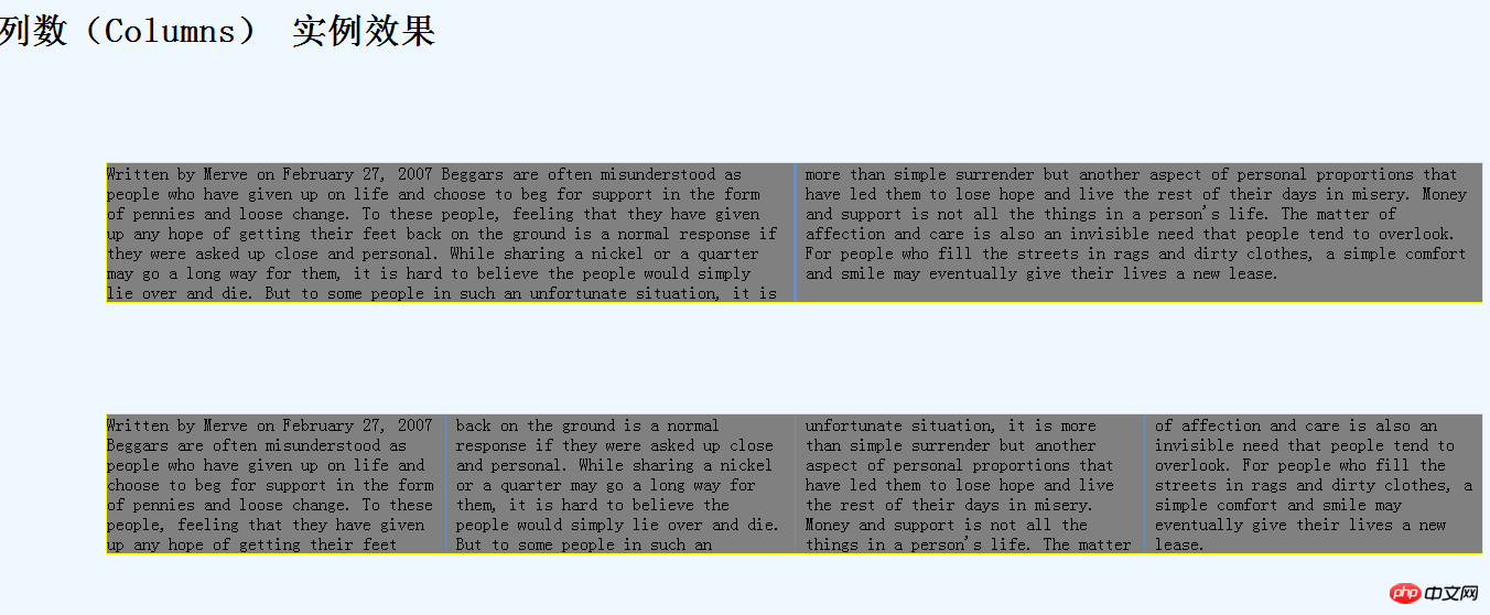
上面第一个我分层2列,而第二个我是分成3列的。
还有就是第一个的 -webkit-column-rule: 3px solid #6e8eb9;我这样设置,所以它的分割线就是加粗的。
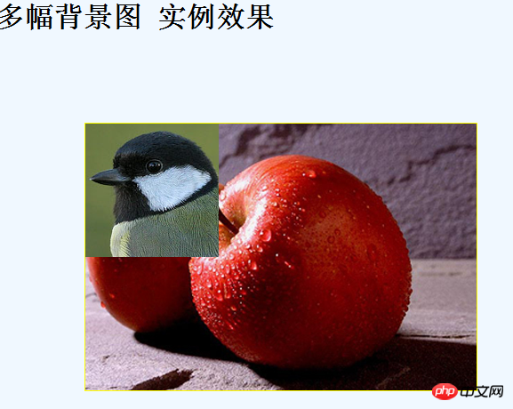
5.显示多个背景图片
你可以在一个标签元素里应用多个背景图片。代码类似与css2.0版本的写法,但引用图片之间需用“,”逗号隔开。第一个图片是定位在元素最上面的背景,后面的背景图片依次在它下面显示,如下:
代码如下:
background-image : url(top-image.jpg), url(mid dl e-image.jpg), url(bottom-image.jpg);
代码如下:
border: 1px solid #699; background: url(/Nature/bird1-thumb.png) no-repeat 0 0, url(/Nature/apple.jpg) no-repeat 100% 0; border: 1px solid #699; padding: 0 20px; margin-left: 100px; margin-top: 100px; border-color: Yellow; background-color: Gray; width:400px; height: 300 px;
实例效果图:
但是,这里还是别高兴的太早,又是微软那孩子没事干,又在这里搞一个不兼容性,所以你 不得下下面代码,为了兼容所以浏览器:
代码如下:
#box5 blockquote { /* 用在所有的浏览器*/ background: url(/i/quotel.gif) 0 0 no-repeat; padding: 0 20px; } body:last-child #box5 blockquote{ /* 用在除了IE 之外的浏览器:last-child */ background: url(/i/quotel.gif) no-repeat 0 0, url(/i/quoter.gif) no-repeat 100% 0; }
这样子才OK.
6.轮廓(outlines)
也就是在框在的内部在画一个框。
代码如下:
#box1 { border: 1px solid #000; outline: 1px solid #699; outline-off set : -20px; border: 1px solid #699; padding: 0 20px; margin-left: 100px; margin-top: 100px; border-color: Yellow; background-color: Gray; width: 400px; height: 300px; }
参数很好理解: outline: 1px solid #699; 这个画框;
outline-offset 这个表示里面的偏移量,通俗点说 就是距离。
实例效果图: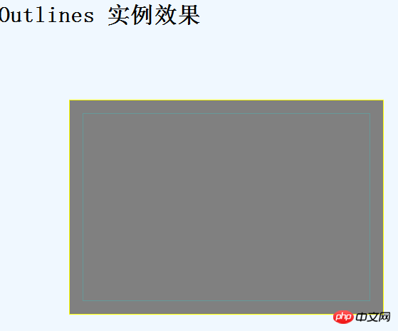
7.背景渐变(Background Gradients)
顾名思义,渐变就是颜色慢慢的开始变淡。在CSS3中,渐变效果非常非常的灵活,而且运用也很方便。
不过,这里需要注意的一点是在Firfox和chrome浏览器之间的设定没有和上面的那么简单。
Firfox 的代码:
background: -moz-linear-gradient(bottom,#b6ebf7, #fff 50%);
Chrome or safari的代码:
background: -webkit-gradient(linear, left bottom, left top,color-stop(0, #b6ebf7), color-stop(0.80, #fff));
参数解释下,比如在firfox中,
第一个参数:bottom 表示运用的位置,bottom表示在顶部,当然你也可以有其他地方,比如left表示在方框的左边,right在方便的右边,top就是在顶部啦!~。
而在chrome中,color-stop:用来表示开始和结束的值以及里面的颜色。其余参数和上面一样。
实例效果图: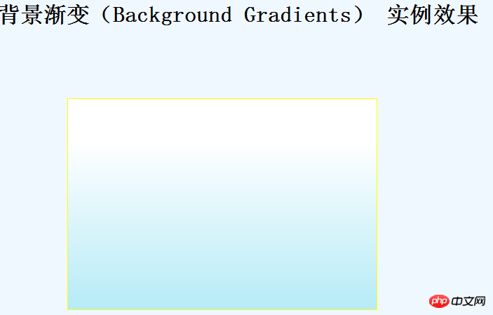
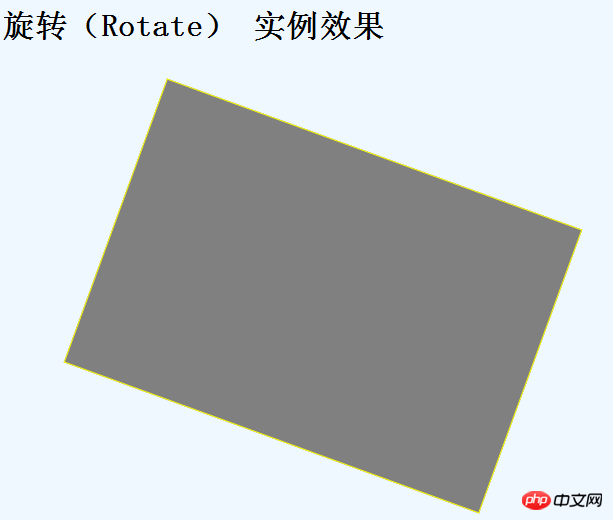
8.旋转(Rotate)
旋转,顾名思义就是转动元素的角度,很好理解。
代码:
代码如下:
#box1 { border: 1px solid #000; -moz-transform: rotate(20deg); -webkit-transform: rotate(20deg); border: 1px solid #699; padding: 0 20px; margin-left: 100px; margin-top: 100px; border-color: Yellow; background-color: Gray; width: 400px; height: 300px; }
rotate(角度)里面的数组就是角度的意思,deg是英文单词degree的缩写 度数的意思。
实例效果图:
注意:
如果是负数的话,那么它会向相反方向转动。
如果是超过360度的话,那么会和360进行求余运算,比如你写 rotate(380deg),那么它的值等效于rotate(20deg)。
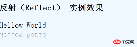
9.反射(reflect)
反射,其实也就是倒影效果。
代码如下:
#myFont { -webkit-box-reflect: below 10px -webkit-gradient(linear, left top, left bottom, from(transparent), to(rgba(255, 255, 255, 0.51))); font-size: 30px; }
实例效果图:
10.转换(Transitions)注:次内容来自zhangxinxu的博客 。谢谢他的努力。
其作用是:平滑的改变CSS的值。无论是点击事件,焦点事件,还是鼠标hover,只要值改变了,就是平滑的,就是动画。于是乎,只要一个整站通用的class,就可以很轻松的渐进增强地实现动画效果,超有实用价值的说。
transition有下面些具体属性:
transition-property :* //指定过渡的性质,比如transition-property:backgrond 就是指backgound参与这个过渡
transition-duration:*//指定这个过渡的持续时间
transition-delay:* //延迟过渡时间
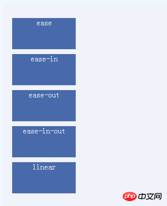
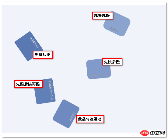
transition-timing-function:*//指定过渡类型,有ease | linear | ease-in | ease-out | ease-in-out | cubic-bezier
上面的主要用在transition-timing-function里面的参数。表示速度的快慢。
代码:
ease
ease-in
ease-out
ease-in-out
linear
CSS代码:
代码如下:
此主要实现的效果是从左边移动到右边!~~。根据参数的不同,进行速度的不同。
实例效果图:初始化时:
After the example renderings:
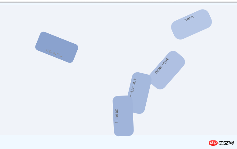
Some friends may not be familiar with these 5 functions, so their speed is as shown below:
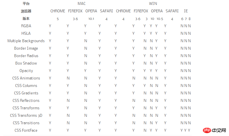
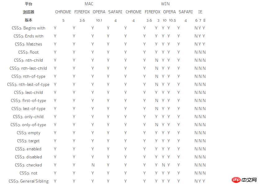
Finally, 2 useful pictures:
CSS Properties
CSS Selector
【Related recommendations】
2.Share 22 styles H5 and CSS3 help tools
4.Detailed explanation of examples of selectors in CSS3
5.Detailed explanation of examples of content attributes in CSS3
The above is the detailed content of Detailed explanation of the 10 top commands in CSS3. For more information, please follow other related articles on the PHP Chinese website!


![[Web front-end] Node.js quick start](https://img.php.cn/upload/course/000/000/067/662b5d34ba7c0227.png)


