


Page layout has always been the focus of web application style design
Our traditional layout methods are based on the utilization of the box model
Layout with display, position, and float has certain limitations
For example, to implement adaptive vertical centering
With the popularity of responsive layout, CSS3 has introduced a more flexible elastic layout model
Using flexible layout can effectively allocate the space of a container
Even if the size of our container element changes
The elements inside it can adjust its size to fit the space
If you want to turn an element into a flexible box
It's very simple
.demo { /*块级元素*/
display: flex;}.demo { /*行级元素*/
display: inline-flex;}After setting the flex layout, the float, clear and vertical- alignAttributewill be invalid
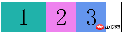
A small example
<p class="flex-box">
    <p class="flex-item">1</p>
    <p class="flex-item">2</p>
<p class="flex-item">3</p></p>.flex-box { width: 500px; height: 100px; border: 1px solid black;}.flex-item { width: 100px; height: 100px; font-size: 80px; line-height: 100px; text-align: center;}.flex-item:nth-child(1) { background-color: lightseagreen;}.flex-item:nth-child(2) { background-color: violet;}.flex-item:nth-child(3) { background-color: cornflowerblue;}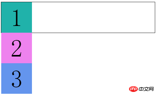
Under normal circumstances, the child element p By default, they occupy one row, so they can only be arranged vertically
Now we use elastic layout
.flex-box {    display: flex; /*增*/
    width: 500px;    height: 100px;    border: 1px solid black;}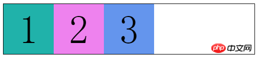
We find that child elements are rendered within the parent element Row arrangement
It looks like the child element has appliedfloatfloat
But this property is far from that simple
It’s just the beginning (⊙▽⊙)
Before talking about those properties, let’s take a look at someBasic concepts
The elements that set the flex layout are called "flex containers", referred to as "containers"
Its child elements are called "flex items", referred to as "project"
Here I introduce a picture (forgive me for stealing the picture, I am too lazy to draw it... )

There are two vertical coordinate axes in the "container"
The horizontal one is called main axis
The vertical one is called cross Axis
The left and right sides of the main axis are called The starting point of the main axis and The end point of the main axis
The upper and lower sides of the cross axis are called The starting point of the cross axis and End point of cross axis
"Project" also has two nouns
The width and height of each project are called Main axis size and Cross axis size
This time we can understand why the child elements are arranged in rows after using flexible layout
Items in the container are arranged along the main axis
Flexible box layout "container" has the following properties
flex-flow: flex-direction, flex-wrap
##justify-content
.flex-box { display: flex; width: 500px; height: 100px; border: 1px solid black; flex-direction: row-reverse; /*增*/}I don’t need to explain much about other attributes. It’s easy to understand 
This  picture
corresponds to column-reverse, column, row, row-reverseflex-wrap
For example, if I add more items
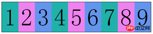 I did not change the width of the items
.flex-box {    ......
flex-wrap: wrap; /*增*/} flex-wrap: wrap allows us to specify whether to wrap when the container "cannot fit" the item
前两个我们都理解了
第三个属性值wrap-reverse
换行的项目会排在上面像这样 
flex-flow是flex-direction和flex-wrap的复合属性
两个属性都是必写的
就不多解释了
justify-content属性定义了项目在主轴上的对齐方式
属性值如下:
flex-start:左对齐(默认)
flex-end:右对齐
center:居中
space-between:两端对齐(项目间间隔相同)
space-around:两端间隔对齐(项目间间隔是项目与边框间隔的2倍)
flex-start : 
flex-end: 
center: 
space-between: 
space-around: 
align-items属性定义项目在交叉轴上如何对齐
属性值如下:
stretch:未设置高度(或height: auto)的项目占满整个容器高度(默认)
flex-start :交叉轴起点对齐
flex-end:交叉轴终点对齐
center:交叉轴中点对齐
baseline:项目第一行文字的基线对齐
flex-start: 
flex-end: 
center: 
baseline: 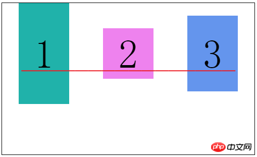
align-content属性定义多根轴线的对齐方式
这个属性只有在容器有多条主轴是才有效,一条主轴无效
类似于justify-content属性
属性值如下:
stretch:轴线占满整个交叉轴(默认值)
flex-start:与交叉轴的起点对齐
flex-end:与交叉轴的终点对齐
center:与交叉轴的中点对齐
space-between:与交叉轴两端对齐,轴线间间隔相等
space-around:每根轴线两侧的间隔都相等
flex-start: 
flex-end: 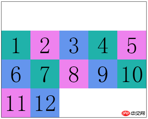
center: 
space-between: 
space-around: 
弹性盒布局“项目”有如下属性
order
flex:flex-grow、flex-shrink、flex-basis
align-self
order允许我们自定义项目的排列顺序
默认为0,属性值是数字,数值越小越靠前
有点类似我们优先队列中的优先级
.flex-item:nth-child(1) {    ......
    order: 99;}.flex-item:nth-child(2) {    ......
    order: -1;}.flex-item:nth-child(3) {    ......
}
flex-grow定义项目的放大比例
默认是0,就是如果没有占满容器整行,也不放大项目,就像上面的图片
.flex-item:nth-child(1) {    ......
    flex-grow: 1; <--
}
.flex-item:nth-child(2) {
    ......
    flex-grow: 2; <--
}
.flex-item:nth-child(3) {
    ......
    flex-grow: 3; <--
}
这就相当于三个项目把剩下的空间“切成”6块
项目一拿走1块,项目二拿走2块,项目三拿走3块
flex-shrink定义项目的缩小比例
默认是1,就是如果空间不足,该项目将等比缩小
通过这个属性我们可以控制各个项目缩小的比例
.flex-item:nth-child(1) {    ......
    flex-shrink: 1; <--
}
.flex-item:nth-child(2) {
    ......
    flex-shrink: 2; <--
}
.flex-item:nth-child(3) {
    ......
    flex-shrink: 3; <--
}
这样各个项目缩小的比例就是 1:2:3
从而保证所有项目总宽度和容器宽度相等
flex-basis定义在分配多余空间之前,项目占据的主轴空间
默认auto,就是项目本来的宽度
我们可以手动设置长度
.flex-item:nth-child(1) {    ......
    flex-basis: 150px; <--
}
.flex-item:nth-child(2) {
    ......}.flex-item:nth-child(3) {    ......
}
flex是flex-grow、flex-shrink、flex-basis的复合属性
默认值:0 1 auto,后两个属性可选
可以写关键字:auto (1 1 auto) 和 none (0 0 auto)
align-self属性允许个别项目拥有与众不同的对齐方式
就是会覆盖align-items设置的对齐属性
默认值auto,继承弹性容器的align-items属性值
属性值除了auto外,和align-items一样,就不多解释了
auto
stretch
flex-start
flex-end
center
baseline
.flex-box {    ......
    align-items: center;}.flex-item:nth-child(2) {    ......
    align-self: flex-end;}
弹性盒的全部属性就是这些了
其实这些都是最新的语法
在此之前浏览器的实现都不一致,了解一下就好了
2009年规范语法: display: box
2011年非官方规范语法: display: flexbox
最新版本规范语法: display: flex
The above is the detailed content of A detailed introduction to the CSS3 flexible box flex layout model of responsive layout. For more information, please follow other related articles on the PHP Chinese website!
 css3 tutorial
 What are the css3 gradient properties?
 Python online playback function implementation method
 Linux batch modification file name suffix
 What are the five types of aggregate functions?
 The difference between JD.com's self-operated and official flagship stores
 Windows cannot complete formatting hard disk solution
 What software is flash?


![[Web front-end] Node.js quick start](https://img.php.cn/upload/course/000/000/067/662b5d34ba7c0227.png)


