
With the continued emphasis on separating the semantic importance of HTML elements from their performance impact, CSS plays an increasingly important role in the layout of HTML5 elements.
1. Positioning content
The simplest way to control content is through positioning, which allows you to use the browser to change the way elements are laid out.

1.1 Set the positioning type
The position attribute sets the positioning method of the element.

# Different values for the position attribute specify different elements for which the element is positioned. When using the top, bottom, left and right attributes to set the offset of an element, it refers to the offset relative to the element specified by the position attribute.
<!DOCTYPE html>
<html lang="en">
<head>
    <meta charset="UTF-8">
    <title>Example</title>
    <style type="text/css">
        img {top: 15px; left: 150px; border: medium double black; width: 150px;}
    </style>
</head>
<body>
<p>
    There are lots of different kinds of fruit - there are over 500 varieties of banana alone.
    By the time we add the countless types of apples, oranges, and other well-know fruit, we are faced with thousands of choices.
</p>
<p>
    One of the most interesting aspects of fruit is the variety available in each country.
    I live near London, in an area which is know for its apples.
</p>
<img src="imgs/banana.png" id="banana" alt="small banana" />
<p>
    When travelling Asia, I was struck by how many different kinds of banana were available
    - many of which had unique flavours and which were only available within a small region.
</p>
<p>
    <button>Static</button>
    <button>Relative</button>
    <button>Absolute</button>
    <button>Fixed</button>
</p>
<script>
    var buttons = document.getElementsByTagName("button");
    for( var i = 0; i < buttons.length; i++){
        buttons[i].onclick = function(e){
            document.getElementById("banana").style.position = e.target.innerHTML;
        }
    }
</script>
</body>
</html>In the above code, a small script is added to the page, which can change the value of the position attribute of the img element based on the button that is pressed. Here, the left attribute is set to 150px and the top attribute is set to 5px, which means that as long as the position value is not set to static, the img element will be offset by 150 pixels along the horizontal axis and 15 pixels along the vertical axis. The image below shows the position value changing from static to relative.
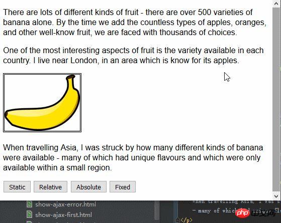
relative value applies top, bottom, left and right attributes to the element, repositioning the element relative to the position determined by the static value. As you can see from the figure, the values of the left attribute and top attribute cause the img element to move to the right and downward.
The absolute value positions the element based on the position of the nearest ancestor element whose position value is not static. There is no such element in this example, which means that the element is positioned relative to the body element, as shown below:

Note that if you scroll the browser page , the img element will move with the remaining content. You can compare this situation with the fixed value. The following figure shows the fixed value positioning effect:
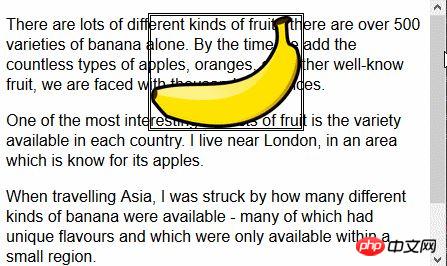
Using the fixed value, the element is positioned relative to the browser window. This means that the element always occupies the same position, regardless of whether the remaining content scrolls up or down.
1.2 Set the stacking order of elements
The z-index attribute specifies the stacking order of element display.
The value of the z-index attribute is a numerical value, and negative values are allowed. The smaller the value, the further it goes in the stacking order. This property only comes in handy if elements overlap.
<!DOCTYPE html>
<html lang="en">
<head>
    <meta charset="UTF-8">
    <title>Example</title>
    <style type="text/css">
        img {border: medium double black; background-color: lightgray; position: fixed;}
        #banana { z-index: 1; top: 15px; left: 150px; }
        #apple { z-index: 2; top: 25px; left: 120px; }
    </style>
</head>
<body>
<p>
    There are lots of different kinds of fruit - there are over 500 varieties of banana alone.
    By the time we add the countless types of apples, oranges, and other well-know fruit, we are faced with thousands of choices.
</p>
<p>
    One of the most interesting aspects of fruit is the variety available in each country.
    I live near London, in an area which is know for its apples.
</p>
<img src="imgs/banana-small.png" id="banana" alt="small banana" />
<img src="imgs/apple.png" id="apple" alt="small apple" />
<p>
    When travelling Asia, I was struck by how many different kinds of banana were available
    - many of which had unique flavours and which were only available within a small region.
</p>
</body>
</html>In this example, two fixed-position img elements are created, and their top and left values are set so that part of the image overlaps. The z-index value of the img element with the id value apple is greater than the z-index value of the element with the id value banana, so the apple image is displayed on top of the banana image.

#The default value of the z-index attribute is 0, so the browser displays the image on the p element by default.
2. Create a multi-column layout
The multi-column feature allows content to be laid out in multiple vertical columns, similar to the layout of a newspaper.

<!DOCTYPE html>
<html lang="en">
<head>
    <meta charset="UTF-8">
    <title>Example</title>
    <style type="text/css">
        div {
            column-count: 3;
            column-fill: balance;
            column-rule: medium solid black;
            column-gap: 1.5em;
        }
        img {
            float: left;
            border: medium double black;
            background-color: lightgray;
            padding: 2px;
            margin: 2px;
        }
    </style>
</head>
<body>
<div>
    There are lots of different kinds of fruit - there are over 500 varieties of banana alone.
    By the time we add the countless types of apples, oranges, and other well-know fruit, we are faced with thousands of choices.
    <img src="imgs/banana-small.png" id="banana" alt="small banana" />
    One of the most interesting aspects of fruit is the variety available in each country.
    I live near London, in an area which is know for its apples.
    <img src="imgs/apple.png" id="apple" alt="small apple" />
    When travelling Asia, I was struck by how many different kinds of banana were available
    - many of which had unique flavours and which were only available within a small region.

    And, of course, there are fruits which are unique
    - I am put in mind of the durian, which is widely consumed in SE Asia and is know as the "king of fruits".
    The durian is largely unknow in Europe and the USA
    - if it is know at all, it is for the overwhelming smell, which is compared to a combination of almonds,
    rotten onions and gym socks.
</div>
</body>
</html>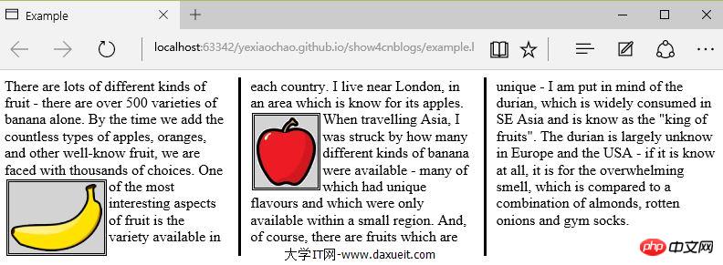
PS: Temporarily found that IE, Edge, Opera browser display is valid, Firefox and Google are not supported.
As you can see from the picture above, the content in the div element flows from one column to another, much like the layout in a newspaper. In this example, the float attribute is applied to the img element so that the text content in the div element can wrap smoothly around the image.
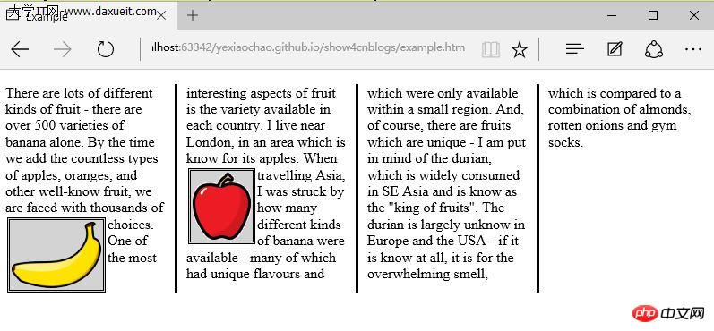
The above example uses the column-count attribute to divide the page layout into three columns. If the window is resized, the browser adjusts the width itself, thus preserving the number of columns in the layout. Another method is to specify the column width.
<style type="text/css">
    p {
        column-width: 10em;
        column-fill: balance;
        column-rule: medium solid black;
        column-gap: 1.5em;
    }
    img {
        float: left;
        border: medium double black;
        background-color: lightgray;
        padding: 2px;
        margin: 2px;
    }
</style>If the column-width attribute is applied, the browser will maintain the specified width by adding or removing columns.
3. Create a flexible box layout
弹性盒布局(也称伸缩盒)在CSS3中得到了进一步加强,为display属性添加了一个新值(flexbox),并定义了其他几个属性。使用弹性布局可以创建对浏览器窗口调整响应良好的流动页面。这是通过在包含元素之间分配容器块中未使用的空间来实现的。规范为弹性布局定义了如下新属性:
* flex-align
* flex-direction
* flex-order
* flex-pack
不过建议规范和实现之间还有差异,顶定义一下弹性盒要解决的问题。下面代码展示了一个有问题的简单布局。
<!DOCTYPE html>
<html lang="en">
<head>
    <meta charset="UTF-8">
    <title>Example</title>
    <style type="text/css">
        p {
            float: left;
            width: 150px;
            border: medium double green;
        }
    </style>
</head>
<body>
<div>
    <p id="first">
        There are lots of different kinds of fruit - there are over 500 varieties of banana alone.
        By the time we add the countless types of apples, oranges, and other well-know fruit, we are faced with thousands of choices.
    </p>
    <p id="second">
        One of the most interesting aspects of fruit is the variety available in each country.
        I live near London, in an area which is know for its apples.
    </p>
    <p id="third">
        When travelling Asia, I was struck by how many different kinds of banana were available
        - many of which had unique flavours and which were only available within a small region.
    </p>
</div>
</body>
</html>在上面代码中,div元素包含了三个p元素。将p元素显示在水平行中,用float属性很容易就能做到这一点。
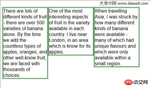
这里能使用弹性盒解决的问题是处理页面上p元素右边的空间块。解决这个问题有很多方式。在这个例子中,可以使用百分比宽度,但弹性盒解决方案更优雅,页面看起来流动性也会好很多。下表列出了实现弹性盒核心功能的三个 -webkit 属性(简单起见,表中省略了-webkit前缀):

3.1 创建简单的弹性盒
可以使用 display属性创建弹性盒。标准值是 flexbox, 不过在标准完成和实现之前,必须使用 -webkit-box 。 使用 box-flex 属性告诉浏览器如何分配元素之间的未使用空间。 display 属性的新值和 box-flex 属性如下面代码所示:
<!DOCTYPE html>
<html lang="en">
<head>
    <meta charset="UTF-8">
    <title>Example</title>
    <style type="text/css">
        p {
            width: 150px;
            border: medium double green;
            background-color: lightgray;
            margin: 2px;
        }
        #container{ display: -webkit-box;}
        #second {-webkit-box-flex: 1;}
    </style>
</head>
<body>
<div id="container">
    <p id="first">
        There are lots of different kinds of fruit - there are over 500 varieties of banana alone.
        By the time we add the countless types of apples, oranges, and other well-know fruit, we are faced with thousands of choices.
    </p>
    <p id="second">
        One of the most interesting aspects of fruit is the variety available in each country.
        I live near London, in an area which is know for its apples.
    </p>
    <p id="third">
        When travelling Asia, I was struck by how many different kinds of banana were available
        - many of which had unique flavours and which were only available within a small region.
    </p>
</div>
</body>
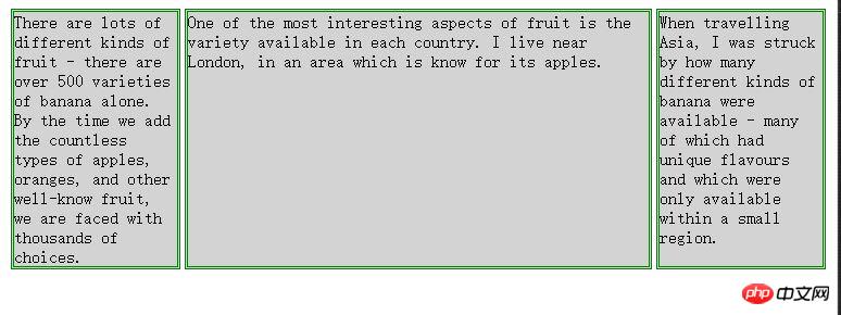
</html>display 属性会应用到弹性盒容器。弹性盒容器是具有多余空间,且想对其中的内容应用弹性布局的元素。box-flex 属性会应用到弹性盒容器内的元素,告诉浏览器当容器大小改变时哪些元素的尺寸是弹性的。在这个例子中,选择了id值为second的p元素。
PS:从p元素样式声明中删除了float属性。可伸缩元素不能包含浮动元素。
可以从下图看出浏览器如何伸缩选择元素的尺寸:
3.2 伸缩多个元素
应用box-flex 告诉浏览器伸缩多个元素的尺寸。设置的值决定了浏览器分配空间的比例。修改前面例子的CCS文件如下:
<style type="text/css">
    p {
        width: 150px;
        border: medium double green;
        background-color: lightgray;
        margin: 2px;
    }
    #container{ display: -webkit-box;}
    #first { -webkit-box-flex: 3;}
    #second {-webkit-box-flex: 1;}
</style>这里将box-flex 属性应用到了id值为first的p元素。此处box-flex属性的值是3,意思是浏览器为其分部的多余空间是为id值为second的p元素的三倍。当创建此类比例时,指的是元素的可伸缩性。只是使用这个比例来分配多余的空间,或者减少元素的尺寸,而不是改变它的首选尺寸。从下图可以看到这个比例时怎么应用到元素的。

3.3 处理垂直空间
box-align 属性告诉浏览器如何处理多余的垂直空间。默认情况下垂直拉伸元素以填充多余的空间。上面的例子就是这种情况,前两个p元素的尺寸是调整过的,内容下面多出了空的空间。

下面的代码展示了元素样式变为应用box-align属性。注意这个属性应用到可伸缩容器上,而不是内容元素。
p {
    width: 150px;
    border: medium double green;
    background-color: lightgray;
    margin: 2px;
}
#container{
    display: -webkit-box;
    -webkit-box-direction: reverse;
    -webkit-box-align: end;
}
#first { -webkit-box-flex: 3;}
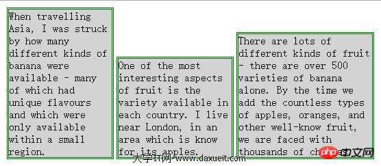
#second {-webkit-box-flex: 1;}此例中,使用了 end 值,这代表内容元素会沿着容器元素的底边放置,垂直方向任何多余的空间都会显示到内容元素上方。其呈现效果如下图所示:
3.4 处理最大尺寸
弹性盒伸缩时不会超过内容元素的最大尺寸。如果存在多余空间,浏览器会伸展元素,知道达到最大允许尺寸。box-pack属性定义了在所有的可伸缩元素均可达到最大尺寸的情况下,多余空间仍未分配完毕时应该如何处理。

修改前面示例的CSS文件如下:
p {
    width: 150px;
    max-width: 250px;
    border: medium double green;
    background-color: lightgray;
    margin: 2px;
}
#container{
    display: -webkit-box;
    -webkit-box-direction: reverse;
    -webkit-box-align: end;
    -webkit-box-pack: justify;
}
#first { -webkit-box-flex: 3;}
#second {-webkit-box-flex: 1;}这属性的效果如下图所示。在可伸缩p元素达到最大宽度后,浏览器开始在元素之间分配多余空间。注意,多余空间只是分配到元素与元素之间,第一个元素之前或者最后一个元素之后都没有分配。

4. 创建表格布局
使用 table 元素如此普遍的原因是它解决了一种常见的布局问题:创建承载内容的简单网格。幸好,我们可以使用CCS表格布局特性来设置页面布局,这很像使用 table 元素,但不会破坏语义重要性。创建CSS表格布局使用display属性。下表列出了跟这个特性相关的值。表中的每个值都与一个HTML元素对应。

其中几个值的用法如下面代码所示:
<!DOCTYPE html>
<html lang="en">
<head>
    <meta charset="UTF-8">
    <title>Example</title>
    <style type="text/css">
        #table { display: table;}
        div.row {display: table-row; background-color:lightgray; }
        p { display: table-cell; border: thin solid green; padding: 15px; margin: 15px;}
        img { float: left;}
    </style>
</head>
<body>
<div id="table">
    <div >
        <p id="first">
            There are lots of different kinds of fruit - there are over 500 varieties of banana alone.
            By the time we add the countless types of apples, oranges, and other well-know fruit, we are faced with thousands of choices.
        </p>
        <p id="second">
            One of the most interesting aspects of fruit is the variety available in each country.
            I live near London, in an area which is know for its apples.
        </p>
        <p id="third">
            When travelling Asia, I was struck by how many different kinds of banana were available
            - many of which had unique flavours and which were only available within a small region.
        </p>
    </div>
    <div class="row">
        <p>
            This is an apple. <img src="imgs/apple.png" alt="apple" />
        </p>
        <p>
            This is a banana. <img src="imgs/banana-small.png" alt="banana" />
        </p>
        <p>
            No picture here.
        </p>
    </div>
</div>
</body>
</html>这些取值的效果如下图所示:
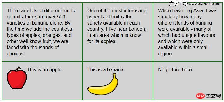
CSS表格布局的一个优点是自动调整单元格大小,因此,行是由该行中内容最高的单元格决定的,列是由该列中内容最宽的单元格决定的,这从上图也能看出来。
The above is the detailed content of Learn more about creating layouts with CSS. For more information, please follow other related articles on the PHP Chinese website!


