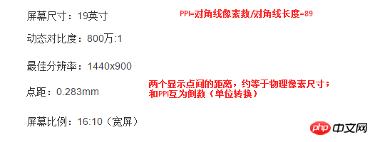
Screen size refers to the length of the diagonal of the screen, generally in inches, 1 inch (inch) = 2.54 centimeters (cm). Photo size in the traditional sense is also the same concept. Therefore, screens of the same size (referring to diagonal) may have different aspect ratios.
Pixel: It is an abstract concept in bitmaps (such as digital images). It refers to the sampling points of the image by the computer and has no specific size. The popular understanding is that each box (point) is one by one, and the computer will save the position and color value of the sampling point. 
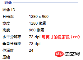
Resolution: The total number of pixels. For example, 1024px*600px means that there are 1024 pixels (sampling points) in each row and 600 pixels (sampling points) in each column.
Note that as long as the digital image itself is not edited, any display or print settings will not change the image itself (resolution).
Pixel Density (PPI): The number of pixels per inch, in English, Pixels Per Inch. 
DPI (Dot Per Inch) : The meaning is the same as ppi, which refers to the number of dots printed per inch and is the unit of measurement in the printing industry. Ppi and dpi are often used interchangeably. Generally, "pixel" is used in the computer display field, while "point" is used in the printing or printing field.
The relationship between resolution, PPI and size:
The physical size of the picture × the PPI of the picture = the physical size of the picture displayed on the screen × the PPI of the screen = the total number of pixels in the picture (resolution )
Photos with a resolution of 1920x1080, output to a piece of 5-inch photo paper, PPI is 440.
If it is output to a 760-inch (19-meter) billboard, the PPI is only 3, which is very blurry.
Commonly used PPI/DPI settings:
1. Photo printing: 300 or above
2. Business cards, magazines, etc.: 300
3. High-definition photo posters: 96~200
4. Internet pictures, web interface: 72
5. Large-scale inkjet printing: 25~50
When the same digital picture is displayed on a computer monitor or mobile phone screen, the higher the PPI of the monitor or mobile phone screen, the higher the PPI of the monitor or mobile phone screen. The more delicate the effect, the smaller the picture will look on the monitor or mobile phone; conversely, the lower the PPI of the monitor or mobile phone screen, the rougher the effect (even graininess can be seen), and the smaller the picture will look on the monitor or mobile phone. big.
Physical resolution is an inherent parameter of monitors and other devices and cannot be adjusted. Generally refers to the highest (best) number of pixels that the device can display. For example, an LED LCD screen divides the liquid crystal through a grid, and one liquid crystal (photoelectric) is a physical pixel. Similarly, the higher the PPI, the higher the resolution.
Monitor resolution actually refers to the resolution set by the operating system, not the physical resolution of the monitor. However, the LCD display has the best display effect only when the system resolution is consistent with the physical resolution (i.e. point-to-point display), so the two can be considered equivalent. 
px in Css is a relative unit, relative to different devices viewport. The same element (in px) has different physical dimensions on different devices.
Css2 specification recommends 96px within 1 inch. If the user agent is on a device that does not have this value, the user agent should be rescaled to a more reasonable value. Therefore, in order to take into account the display effects of different devices during development, only need to consider the physical resolution of the device . You can check the page effects under various screens through Chrome's resolution test plug-in or tool website.
Page zoom in/out:
The total pixels of the elements remain unchanged, and the physical pixels of the device remain unchanged, but the corresponding relationship changes. It turns out to be 1 to 1. After the element is enlarged, the pixels are transitioned from the left and right pixels through the interpolation algorithm to fill in, occupying more physical pixels, that is, one element pixel corresponds to multiple physical pixels (display points).
The above is the detailed content of Detailed introduction to resolution, pixels and PPI. For more information, please follow other related articles on the PHP Chinese website!


