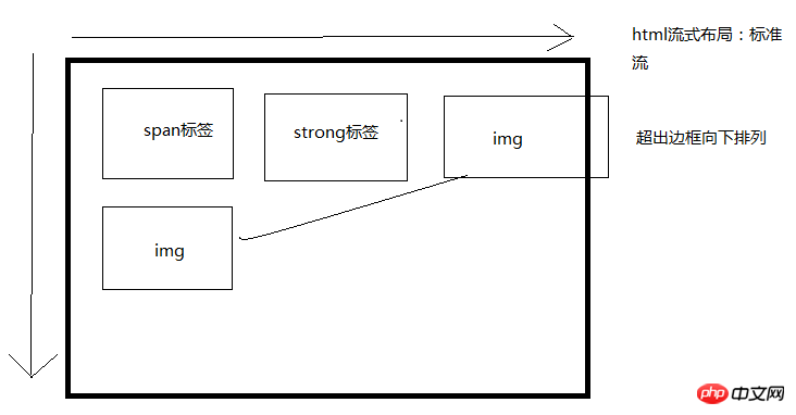
1. The standard flow is the default layout of the browser, which is the default scheduling layout from top to bottom and from left to right.

2. Layout method
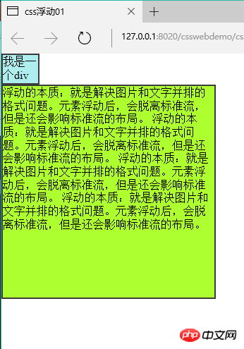
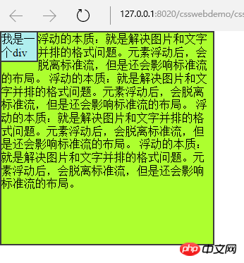
2.1The essence of floating: solve the formatting problem of pictures and text side by side.
*After the element is floated, it will break away from the standard flow and affect its layout.
2.1.1 Before the float is set (before):

2.1.2. Set the float After(after)
* {
                padding: 0;
                margin: 0;
            }

            .box1 {
                width: 50px;
                height: 40px;
                background-color: #AFEEEE;
                border: 2px solid #3C3C3C;
                float: left;
            }

            .box2 {
                width: 300px;
                height: 300px;
                background-color: #ADFF2F;
                border: 2px solid #3C3C3C;

} *Floating elements will not occupy the space of the standard stream. But it will affect the formatting of text in the standard stream.
 3. Characteristics of floating
3.1. Floating is separated from the standard flow and does not occupy a position, which will affect the standard flow. Floating only floats left and right.
3.2. The arrangement position of floating element A is related to the previous element (block level). If the previous element has a float, the top of the A element will be aligned with the top of the previous element; if the previous element is a standard flow, the top of the A element will be aligned with the bottom of the previous element.
3.3. If one of the child boxes in a parent box is floated, all other children need to be floated in order to be displayed in one row.
3.4. Float displays the corresponding float according to the writing position of the element.
3.5. After the element is floated, if the width and height are not set, the element will have the characteristics of an inline block element. The size of the element depends entirely on the defined size or default content, that is, it has wrapping properties.
3.6. Floating is destructive: after the element is floated, it destroys the original normal flow layout and causes the content to collapse.
Note: If the parent box of a standard stream is not set high and all child boxes float, the height of the parent box will collapse to 0;
4. Solve the height caused by floating destructiveness Collapse problem
4.1.
overflowMethod: Set overflow:hidden on the parent box; (make it wrapping)
<!DOCTYPE html>
<html>
    <head>
        <meta charset="UTF-8">
        <title>溢出处理案例</title>
        <style>
            .box1 {
                /*滚动条随着需要而产生*/
                height: 60px;
                width: 60px;
                overflow: auto;
                float: left;
                background-color: #5F9EA0;
            }

            .box2 {
                height: 60px;
                width: 60px;
                overflow: hidden;
                float: left;
                background-color: #ADFF2F;
            }

            .box3 {
                height: 60px;
                width: 60px;
                overflow: visible;
                float: left;
                background-color: #CCCCCC;
            }
            .box4 {
                /*始终有滚动条*/
                height: 160px;
                width: 160px;
                overflow: scroll;
                float: right;
                background-color: #FFC0CB;

            }
        </style>
    </head>
    <body>
        <div class="box1">overflow:auto;**minking 的博客minking 的博客minking 的博客</div>
        <hr />
        <div class="box2">overflow: hidden;**minking 的博客minking 的博客minking 的博客</div>
        <hr />
        <div class="box3">overflow: visible;**minking 的博客minking 的博客minking 的博客</div>
        <hr />
        <div class="box4">overflow: scroll;**minking 的博客minking 的博客minking 的博客</div>
    </body>
</html>
5. Supplement: BFC
Overflow can trigger the BFC of the element, allowing the element to have independent layout space and permissions. All elements within the BFC are typeset and typed according to the parent element. Layout, all parent elements have wrapping properties, which is the principle that solves the problem of height collapse.
For example: Floating can also trigger bfc, and then there are: positioning, overflow,
display: table, table-cell...6. Page center: website The core display area is usually displayed in the center. The widths are: 960px 980px 1000px 1190px 1200px;
7. Floating clearing: Only when there are no floating elements on the left and right sides of the current element will the element be displayed in the standard flow.
**********
clearThe above is the detailed content of Detailed introduction to CSS floating. For more information, please follow other related articles on the PHP Chinese website!
 function function usage
 How to view stored procedures in MySQL
 How to check deleted call records
 The difference between insertbefore and before
 What language is generally used to write vscode?
 How to convert nef to jpg format
 Ranking of the top ten digital currency exchanges
 What is the core of a database system?


