The editor below will share with you the implementation method of table-cell layout such as fixed width on the left, fixed width on the right, and fixed width on the left and right. The editor thinks it is quite good, so I will share it with you now and give it as a reference for everyone. Let’s follow the editor and take a look.
Use table-cell to complete the following layouts (compatible with ie8 and above)
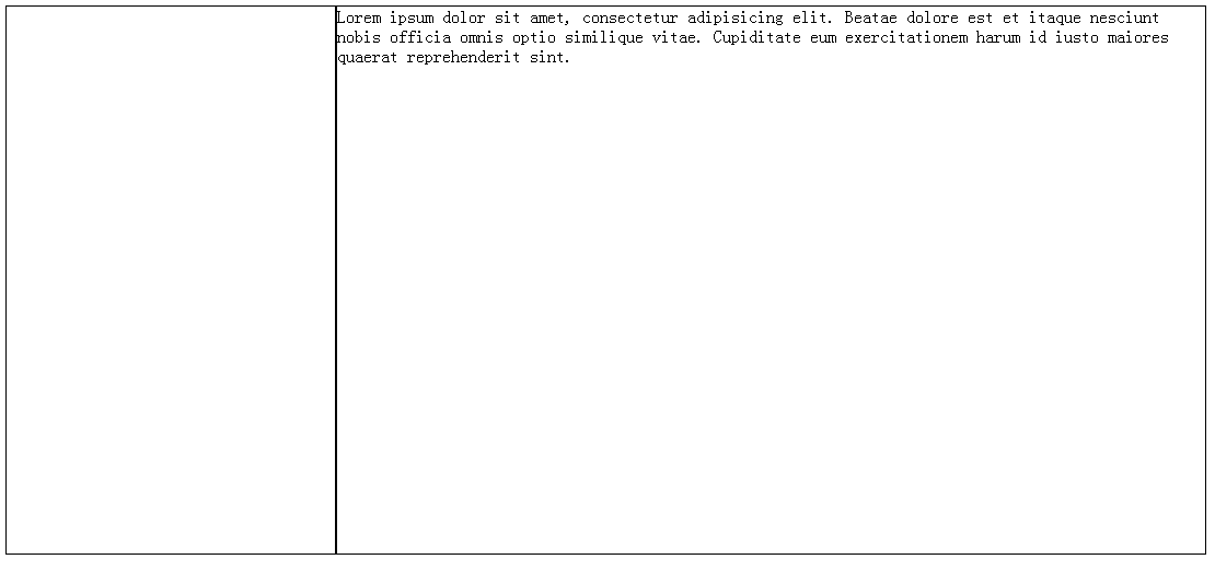
1. Fixed width on the left side - fixed width on the right side Adaptive
.left{
            width: 300px;
            height: 500px;
            border: 1px solid;
            float: left;
      }
.right{
            width: 10000px;
            height: 500px;
            display: table-cell;
            border: 1px solid;
      }
    </style>
<p class="left"></p>
<p class="right">
Lorem ipsum dolor sit amet, consectetur adipisicing elit. Beatae dolore est et itaque nesciunt nobis officia omnis optio similique vitae. Cupiditate eum exercitationem harum id iusto maiores quaerat reprehenderit sint.
</p># #The effect is as follows:

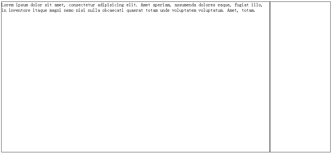
2. Fixed width on the right side - adaptive left side
<style>
        .right{
            width: 200px;
            height: 500px;
            border: 1px solid;
            display: table-cell;
        }
        .left{
            height: 500px;
            border: 1px solid;
            display: table-cell;
        }
        .parent{
            display: table;
            table-layout: fixed;
            width: 100%;
        }
</style>
<p class="parent">
    <p class="left">
            Lorem ipsum dolor sit amet, consectetur adipisicing elit. Amet aperiam, assumenda dolores eaque, fugiat illo, in inventore itaque magni nemo nisi nulla obcaecati quaerat totam unde voluptatem voluptatum. Amet, totam.
    </p>
    <p class="right"></p>
</p>

XML/HTML CodeCopy content to clipboard
<style>
       .parent{
           display: table;
           table-layout: fixed;
           width: 100%;
       }
        p{
            border: 1px solid;
        }
        .left,.right,.center{
            display: table-cell;
        }
        .left{
            width: 100px;
            height: 200px;
        }
        .right{
            width: 100px;
            height: 200px;
        }
</style>
 <p class="parent">
      <p class="left"></p>
        <p class="center">
         Lorem ipsum dolor sit amet, consectetur adipisicing elit. Alias amet delectus ducimus ea eos eum, libero modi quia, soluta temporibus unde,
      ut. Aliquam, dolorem ipsam porro quae quisquam saepe vitae!
        </p>
      <p class="right"></p>
</p>
The above is the detailed content of Share the implementation method of table-cell to complete the layout of fixed width on the left, fixed width on the right and fixed width on the left and right.. For more information, please follow other related articles on the PHP Chinese website!
 What software is premiere
 Why can't I access the Ethereum browser?
 python packaged into executable file
 The difference between UCOS and linux
 what does os mean
 0x00000006 What to do if the printer cannot be connected?
 Top ten currency trading software apps ranking list
 How to solve the problem that Ethernet cannot connect to the internet


