The following editor will bring you a learning experience (share) about the important properties of CSS float. The editor thinks it is quite good, so I will share it with you now and give it as a reference for everyone. Let’s follow the editor and take a look.

Let’s take a look at the important CSS attribute-float.
The following content is divided into the following sections:
1: float attribute
2: Characteristics of float attribute
2.1: The text wrapping effect of float
2.2: The height of the parent element of float is collapsed
3: The method of clearing float
3.1: The html method
3.2: css pseudo-element method
4: Float despacing
5: Float element blockization
6: float fluid layout
6.1: One-sided fixing
6.2: One-sided fixing where the DOM and display position are different
6.3: One-sided fixing where the DOM and display position are the same
6.4: Intelligent layout
1: float attribute
float, as the name suggests, means floating. But in css it is understood as float. float has four attributes, namely
float:none;
float:left;
float:rightright;
float:inherit;
The two more commonly used attribute values are left floating and right floating. In the following sharing, only left floating will be used as an example. The principle of other floating attribute values is the same as that of left floating.
2: Characteristics of float attribute
2.1: Text wrapping effect of float
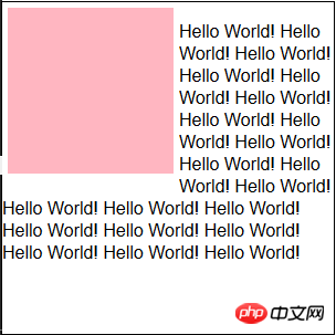
Floating The original intention is for the text wrapping effect.
Look at the following code and demo.
<p class="container">
    <p class="content"></p>
    <p>
Hello World!Hello World!Hello World!Hello World!Hello World!Hello World!Hello World!Hello World!Hello World!Hello World!Hello World!Hello World!Hello World!Hello World!Hello World!Hello World!Hello World!Hello World!Hello World!Hello World!Hello World!Hello World!Hello World!Hello World!Hello World!Hello World!
        </p>
</p>.container {
width: 300px;
height: 300px;
border: 1px solid black;
}
.container .content {
float: left;
width: 150px;
height: 150px;
background-color: lightpink;
margin: 5px;
}
The content element is set to left floating, which makes the p element break away from the document flow and the text is displayed around it. .
2.2: The parent element of float is highly collapsed
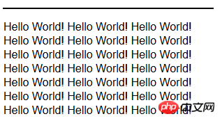
Take the p element as an example. The height of the p element will be automatically expanded by the content. In other words, the height is as high as the content is. But when the float attribute is set on the internal element, the height of the parent element will collapse. The code and examples are as follows.
<p class="container">
    <p>
Hello World!Hello World!Hello World!Hello World!Hello World!Hello World!Hello World!Hello World!Hello World!Hello World!Hello World!Hello World!Hello World!Hello World!Hello World!Hello World!Hello World!Hello World!Hello World!Hello World!Hello World!Hello World!Hello World!Hello World!Hello World!Hello World!
    </p>
</p>is as follows, css and demo after collapse.
.container {
  width: 300px;
  border: 1px solid black;
}
.container p {
  float: left;
}
3: Method of clearing floats
Then the question arises , if the internal elements are to be floated, how to avoid the height collapse of the parent element?
Some students will definitely think, wouldn’t it be enough to set the height directly on the parent element? This is not possible in practice. Because if the height of the parent element is fixed, then if you want to add content to it later, you will have to modify the css code, which is very troublesome.
There are two ways to solve the problem of height collapse of the parent element.
3.1: Add an empty p at the bottom of the parent element, and then add the attribute clear: both.
code show as below.
<p class="container">
            <p>
            Hello World!Hello World!Hello World!Hello World!Hello World!Hello World!Hello World!Hello World!Hello World!Hello World!Hello World!Hello World!Hello World!Hello World!Hello World!Hello World!Hello World!Hello World!Hello World!Hello World!Hello World!Hello World!Hello World!Hello World!Hello World!Hello World!
            </p>
            <p class="clearfix"></p>
</p>.container {
width: 300px;
border: 1px solid black;
}
.container p {
float: left;
}
.container .clearfix {
overflow: hidden;
*zoom: 1;
}3.2: The parent element sets the pseudo-class after.
<p class="container">
            <p>
            Hello World!Hello World!Hello World!Hello World!Hello World!Hello World!Hello World!Hello World!Hello World!Hello World!Hello World!Hello World!Hello World!Hello World!Hello World!Hello World!Hello World!Hello World!Hello World!Hello World!Hello World!Hello World!Hello World!Hello World!Hello World!Hello World!
            </p>
</p>.container {
width: 300px;
border: 1px solid black;
*zoom: 1;
}
.container p {
float: left;
}
.container:after {
content: "";
display: table;
clear: both;
}#4: Float elements are despaced
What is What does it mean? In daily coding, in order to comply with HTML coding standards, indentation is added to html tags to achieve a beautiful effect. However, spaces will be generated when indenting, that is, . When setting left floating for an element, the element itself floats left, and the remaining spaces will be squeezed to the end, which is the text wrapping effect mentioned above. However, one thing to keep in mind is that has slightly different effects than the space you hit with Enter.
5: Blocking float elements
After setting the floating attribute for inline elements, the display attribute changes from inline to block. And you can set the width and height for inline elements. Some simple fixed-width layout effects can be achieved using float and width attributes.
6: float fluid layout
6.1: Fixed on one side, adaptive layout on the right side.
<p class="container">
             <p class="left">左浮动+固定宽度</p>
             <p class="right">右边自适应宽度+margin-left</p>
</p>.container{
max-width:90%;
margin:0 auto;
}
.left{
float:left;
text-align:center;
background-color: lightpink;
width: 200px;
height:300px;
}
.rightright{
background-color: lightyellow;
margin-left:200px;
height:300px;
padding-left:10px;
}##6.2: One-sided fixation of DOM and display position different
<p class="container">
             <p class="right">右浮动+固定宽度</p>
             <p class="left">左边自适应宽度+margin-right</p>
</p>.container {
max-width: 90%;
margin: 0 auto;
}
.container .rightright {
float: rightright;
width: 200px;
height: 200px;
background-color: lightpink;
}
.container .left {
background-color: lightyellow;
margin-right: 200px;
height: 300px;
padding-left: 10px;
}6.3: One-sided fixation of the same DOM and display position
<p class="container">
            <p class="left-content">
                <!-- 左浮动+width100% -->
                <p class="left">margin-right</p>
            </p>
            <p class="right">左浮动+固定宽度+margin-left负值</p>
</p>.container {
max-width: 90%;
margin: 0 auto;
}
.container .rightright {
float: left;
width: 200px;
height: 200px;
background-color: lightpink;
margin-left: -200px;
height: 300px;
}
.container .left {
background-color: lightyellow;
margin-right: 200px;
height: 300px;
text-align: center;
}6.4: Smart layout
The so-called smart layout means that there is no need to set the width of the two columns, and the width adapts to the content.<p class="container">
<p class="left">
float+margin-right+自适应宽度
</p>
<p class="right">
display:table-cell ---IE8+;
display:inline-block ---IE7+;
自适应宽度
</p>
</p>.container {
max-width: 90%;
margin: 0 auto;
}
.container .left {
float: left;
height: 300px;
background-color: lightpink;
}
.container .rightright {
display: table-cell;
*display: inline-block;
height: 300px;
background-color: lightyellow;
}.container {
max-width: 90%;
margin: 0 auto;
}
.container .left {
float: left;
height: 300px;
background-color: lightpink;
}
.container .rightright {
display: table-cell;
*display: inline-block;
height: 300px;
background-color: lightyellow;
}Summary as follows:
1: When an element sets the float attribute, it will cause the element to become blocky.
2: The float attribute was originally created for the text wrapping effect.
3: Float elements will cause the height of the parent element to collapse.
4: Float elements will remove spaces caused by line breaks.
5: Use float to achieve a two-column adaptive layout.
The above article’s learning experience (sharing) on float, an important attribute of CSS, is all the content shared by the editor. I hope it can give you a reference, and I also hope that everyone will support PHP Chinese. net.


