
text-shadow is to add a shadow effect to the text, and box-shadow is to add a surrounding shadow effect to the element block. With the popularity of HTML5 and CSS3, the use of this special effect is becoming more and more common.
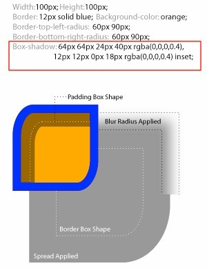
The basic syntax is {box-shadow:[inset] x-offset y-offset blur-radius spread-radiuscolor}
Object Selector {box-shadow:[Projection method] XAxis offset YAxis offset shadow blur radiusShadow expansion radiusShadow color}
##box-shadow Parameter setting value of attribute:
Shadow type: This parameter is optional. If no value is set, the default projection method is outer shadow; if the unique value "inset" is taken, the projection is inner shadow; X-offset: shadow horizontal offset, its value can be positive or negative . If the value is positive, the shadow is on the right side of the object. If the value is negative, the shadow is on the left side of the object; Y-offset: the vertical offset of the shadow, its value can also be positive or negative. . If it is a positive value, the shadow is at the bottom of the object. When its value is negative, the shadow is at the top of the object; Shadow blur radius: This parameter is optional, but its value can only be positive. If its value is 0, it means that the shadow has no blurring effect. The larger the value, the blurr the edge of the shadow; Shadow expansion radius: This parameter is optional, and its value can be positive or negative. If the value If it is positive, the entire shadow will be extended and expanded, otherwise if the value is negative, it will be reduced; Shadow color: This parameter is optional. If the color is not set, the browser will use the default color, but the default color of each browser is inconsistent, especially the transparent color under the Safari and Chrome browsers under the webkit kernel, and the black color under Firefox/Opera (has been verification), it is recommended not to omit this parameter. Browser compatibility:
based on Webkit When using the box-shadow attribute on browsers such as Chrome and Safari, we need to write the name of the attribute in the form -webkit-box-shadow. Firefox browser needs to be written in the form of -moz-box-shadow.
.box-shadow{
   //Firefox4.0-
  -moz-box-shadow:投影方式 X轴偏移量 Y轴偏移量阴影模糊半径 阴影扩展半径 阴影颜色;
   //Safariand Google chrome10.0-
  -webkit-box-shadow:投影方式 X轴偏移量 Y轴偏移量阴影模糊半径 阴影扩展半径 阴影颜色;
  //Firefox4.0+、 Google chrome 10.0+ 、 Oprea10.5+ and IE9
  box-shadow:  投影方式 X轴偏移量 Y轴偏移量 阴影模糊半径 阴影扩展半径 阴影颜色;
}tests to see the effect:
Related code:
<!DOCTYPE html>
<html>
<head>
<meta content="text/html; charset=utf-8" http-equiv="Content-Type">
<title>CSS3属性:box-shadow测试</title>
<script type="text/javascript" src="js/jquery.min.js"></script>
<script type="text/javascript" src="js/jquery.boxshadow.js"></script>
<style type="text/css">
.box-shadow-1{
-webkit-box-shadow: 3px 3px 3px;
-moz-box-shadow: 3px 3px 3px;
box-shadow: 3px 3px 3px;
}
.box-shadow-2{
-webkit-box-shadow:0 0 10px #0CC;
-moz-box-shadow:0 0 10px #0CC;
box-shadow:0 0 10px #0CC;
}
.box-shadow-3{
-webkit-box-shadow:0 0 10px rgba(0, 204, 204, .5);
-moz-box-shadow:0 0 10px rgba(0, 204, 204, .5);
box-shadow:0 0 10px rgba(0, 204, 204, .5);
}
.box-shadow-4{
-webkit-box-shadow:0 0 10px 15px #0CC;
-moz-box-shadow:0 0 10px 15px #0CC;
box-shadow:0 0 10px 15px #0CC;
}
.box-shadow-5{
-webkit-box-shadow:inset 0 0 10px #0CC;
-moz-box-shadow:inset 0 0 10px #0CC;
box-shadow:inset 0 0 10px #0CC;
}
.box-shadow-6{
box-shadow:-10px 0 10px red, /*左边阴影*/
10px 0 10px yellow, /*右边阴影*/
0 -10px 10px blue, /*顶部阴影*/
0 10px 10px green; /*底边阴影*/
}
.box-shadow-7{
box-shadow:0 0 10px 5px black,
0 0 10px 20px red;
}
.box-shadow-8{
box-shadow:0 0 10px 20px red,
0 0 10px 5px black;
}
.box-shadow-9{
box-shadow: 0 0 0 1px red;
}
.obj{
width:100px;
height:100px;
margin:50px auto;
background:#eee;
}
.outer{
width: 100px;
height: 100px;
border: 1px solid red;
}
.inner{
width: 60px;
height: 60px;
background-color: red;
-webkit-box-shadow: 50px 50px blue;
-moz-box-shadow: 50px 50px blue;
box-shadow: 50px 50px blue;
}
</style>
</head>
<body>
<p class="obj box-shadow-1"></p>
<p class="outer">
<p class="inner"></p>
</p>
<p class="obj box-shadow-2" ></p>
<p class="obj box-shadow-3" ></p>
<p class="obj box-shadow-4" ></p>
<p class="obj box-shadow-5" ></p>
<p class="obj box-shadow-6" ></p>
<p class="obj box-shadow-7" ></p>
<p class="obj box-shadow-8" ></p>
<p class="obj box-shadow-9" ></p>
<script type="text/javascript">
$(document).ready(function(){
if($.browser.msie) {
$('.obj').boxShadow(-10,-10,5,"#0cc"); //obj元素使用了box-shadow
}
});
</script>
</body>
</html>
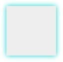
3) From the effect of . box-shadow-2 to . box-shadow-5, we can understand the role of box-shadow value.
. box-shadow-2 is xy with no offset, shadow size 10px, no expansion radius, color #0CC which is rgba(0, 204,204, 1), here we are using the color HEX value; the effect is
while box-shadow-3 is in. Based on the box-shadow-2 effect, rgba color values are applied. The advantage is that the alpha transparency effect is added to the box-shadow shadow. Effect:

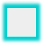
. box-shadow-4 adds a shadow expansion radius of 15px based on the box-shadow-2 effect.
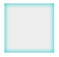
. box-shadow-5 is based on the effect of box-shadow-2, and sets the outer shadow to the inner shadow.
4). box-shadow-6 An element uses multiple shadows, and multiple shadows are separated by commas. To set the shadow effect on the four sides of the object, we achieve it by changing the positive and negative values of x-offset and y-offset. When x-offset is a negative value, the left shadow is generated. When it is a positive value, the right shadow is generated. The y-offset is Positive values produce a bottom shadow, negative values produce a top shadow. And set the blur radius to 0. If it is not set to 0, the other three sides will also have shadows. This needs attention!
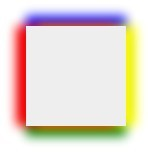
Note that this writing is wrong: {box-shadow:-10px 0 10px red, box-shadow:10px 0 10px blue,box-shadow:0 -10px 10px yellow,box-shadow:0 10px 10px green}
And there is also a multi-shadow order issue involved here. When using multiple shadow attributes for the same element, you need to pay attention to their order. The shadow written first will be displayed at the top, such as. box-shadow-7 is set to different blur values:
. box-shadow-7{
box-shadow:0 0 10px 5px black,
0 0 10px 20px red;
}
You will be able to see the cascading sequence effect:
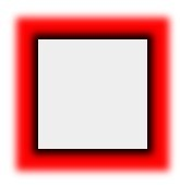
If you adjust the two shadow effects After a while, change it to the following:
.box-shadow-8{
box-shadow:0 0 10px 20px red,
0 0 10px 5px black;
}
will only show the red shadow effect, because the red shadow layer is on top and the blur radius is large, completely blocking the black shadow behind it.
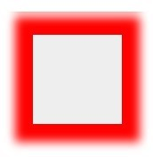
The conclusion is: if the blur value of the shadow in the front is less than the blur value of the shadow in the back, then the front one is displayed above the back. If the blur value of the front shadow is greater than The shadow in the back is blurred, so the shadow in the front will cover the shadow effect in the back.
4) Border-like border effect (only set shadow expansion radius and shadow color)
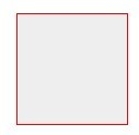
The effect presented by.box-shadow-9 is similar to border:1px solid red, but the effect of box-shadow is different from the border effect in the object height, which is exactly one expansion radius larger than the border height. And the shadow does not affect any layout of the page, which can be confirmed by viewing the layout diagram under firebug.
5) Simulate css3 under ie box-shadowShadow effect
Method 1: You can use IEShadowFilter
Basic syntax: filter:progid:DXImageTransform.Microsoft.Shadow(color='color value', Direction =Shadow angle (numeric value),Strength=Shadow radius (numeric value));
Note: This filter must be used together with the background attribute, otherwise the filter will be invalid.
Simulate box-shadow (shadow) code in css3 under IE:
background-color: #ccc ;
-moz-box-shadow:2px 2px 5px #969696;/*firefox*/ -webkit-box-shadow:2px 2px 5px #969696;/*webkit*/ box-shadow:2px 2px 5px #969696;/*opera or ie9*/ }[css] view plain copy
##li.blk-item{
:423px;
height:229px;
float:left;
padding:8px;
margin:2px 18px 13px 21px;
display:inline;
border:1px solid #d3c998; border-radius:2px; , Direction=135,Strength=5);/*for ie6,7,8*/
background-color: #fff;
-moz-box- shadow:2px 2px 5px#d3c998;/*firefox*/ -webkit-box-shadow:2px 2px 5px#d3c998;/*webkit*/
box-shadow:2px 2px 5px #d3c998;/*opera or ie9*/
}
##Method 2: Some
## The
files of #js and .htc can implement IE Shadow effect in . ie-css3.htc is an htc file that allows the IE browser to support some CSS3 attributes, not just box-shadow, but also allows your IE browser to support the rounded corner attribute border -radius and text-shadow properties text-shadow. How to use it is: download it and put it in your server directoryWrite the following code in your
:The disadvantage of this script is that IE only supports part of the box-shadow values. Note:
When you use this htc file, as long as box-shadow, -moz-box-shadow or -webkit-box-shadow is written in your CSS Either way, IE will render.
jquery.boxshadow.js, The download address of the plug-in is //m.sbmmt.com/The usage method is very simple, introduce the file and jquery version library into the head tag, and insert the following js effect code: ##
Note: You can use: obj.style in js .webkitBoxShadow=value (string);obj.style.MozBoxShadow=value (string);obj.style.boxShadow=value (string);
Supplementary knowledge : CSS3 Property
border-top-left-radius: [
Default value: 0
Value:
Use the length value to set the top-left corner radius length of the object. Negative values are not allowed
Sets the object's top-left corner radius length as a percentage. Negative values are not allowed
Description:
Sets or retrieves the upper left corner rounded border of the object. Provide 2 parameters, separated by spaces. Each parameter is allowed to set 1 parameter value. The first parameter represents the horizontal radius, and the second parameter represents the vertical radius. If the second parameter is omitted, it defaults to the 1st parameter. parameters. For example, setting border-top-left-radius:5px10px; means that the horizontal corner radius of the top-left corner is 5px and the vertical corner radius is 10px. The corresponding script feature is borderTopLeftRadius.
For more CSS3 shadow box-shadow usage and summary of techniques, please pay attention to the PHP Chinese website for related articles!


