Basic syntax for linear gradient design in CSS gradient design using Gecko engine
-moz-linear-gradient([
Parameter description:
Basic usage of linear gradient
/*The simplest linear gradient, you only need to specify the start color and end color, and the linear gradient will be implemented from top to bottom by default*/background: -moz-linear-gradient(red, blue) ;
Demonstration effect:
/*Gradient from the upper left corner to the lower right corner, where the top keyword sets the x-axis of the starting point, and the left keyword sets the y-axis coordinate of the starting point*/
background: -moz-linear- gradient(top left,red, blue)
Demonstration effect:
/*Set a colorful gradient from left to right, where the y-axis coordinate defaults to center, and multiple color scales are displayed evenly by step size*/background: -moz-linear-gradient(left, red, orange, yellow, green, blue, indigo, violet);
Demo effect:
/*Red gradient from the upper left corner to the lower right corner, where the red gradually weakens, And finally displayed as transparent*/background: -moz-linear-gradient(top left, red, rgba(255,0,0,0));
Demo effect:
/*Set the angle value*/background : -moz-linear-gradient(0deg, red, rgba(255,0,0,0));
Demonstration effect:
Summary: When the angle is specified, it is positioned counterclockwise along the horizontal line. Therefore, setting 0deg will create a horizontal gradient from left to right, while setting 90 degrees will create a gradient from bottom to top.
/*Colorful gradient from top to bottom, adding a green color scale at 80% of the y-axis to design a three-color gradient effect. If no position is specified, the three colors will be evenly distributed*/background: -moz-linear-gradient(top, blue, green 80%, orange);
Demonstration effect:
/*Design gradient translucent effect Background image, cover the background image with a gradient fill layer from left to right from white to transparent*/
background: -moz-linear-gradient(right, rgba(255,255,255,0), rgba(255,255,255,1)) , url(images/bg4.jpg);
Demo effect:
Basic syntax of radial gradient
-moz-radial-gradient([
Demonstration effect:
/*The simplest radial gradient, showing red, yellow and blue gradients from the middle to the outside, and setting different color scales Display position*/background: -moz-radial-gradient(red 20%, yellow 30%, blue 40%);
Demo effect:
/*Radial gradient, from red to yellow outward from the lower left corner , blue gradient display, and set the display position of the blue color scale */background: -moz-radial-gradient(bottom left, red, yellow, blue 80%);
Display effect:
/*radial gradient , the shape is circular. Display a gradient from red, yellow to blue from the middle of the left side outwards, and set the display position of the blue color scale*/background: -moz-radial-gradient(left, circle, red, yellow, blue 50%);
Demonstration effect:
/* Radial gradient, shape is ellipse. Display a gradient from red, yellow to blue from the middle outward, and set the gradient size to the cover keyword*/background: -moz-radial-gradient(ellipse cover, red, yellow, blue);
Demo effect:
Summary:
The size parameter contains multiple keywords, closest-side, closest-corner, farthest-side, farthest-corner, contain and cover. Use these keywords to define the size of the radial gradient.
In addition, the Gecko engine also defines two attributes -moz-repeating-linear-gradient and -moz-repeating-radial-gradient, which are used to define repeating linear gradients and repeating radial gradients.
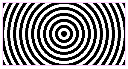
background: -moz-repeating-radial-gradient(circle, black, black 10px, white 10px, white 20px);
Demo effect:

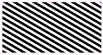
background: -moz-repeating-linear-gradient( top left 60deg,black, black 10px, white 10px, white 20px);
Demo effect:

Application of gradient
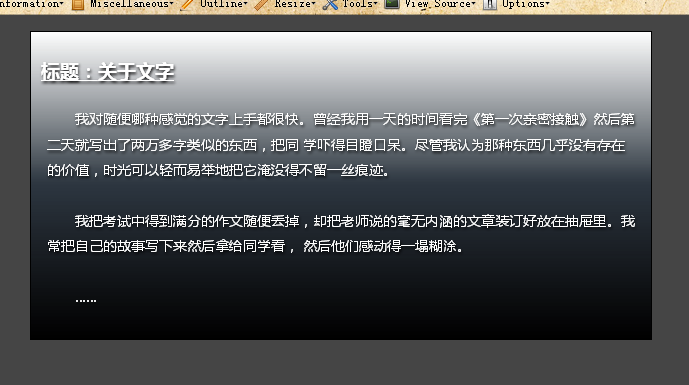
<meta http-equiv="Content-Type" content="text/html; charset=utf-8" /><title>Webkit引擎的应用</title><style type="text/css">body {/*页面初始化*/ background-color: #454545; margin:1em; padding:0;}.box {/*设计模块样式*/ -moz-border-radius: 10px;/*设计圆角*/ -moz-box-shadow: 0 0 12px 1px rgba(205, 205, 205, 1);/*设计阴影特效*/ border: 1px solid black; padding: 10px; max-width: 600px;/*最大宽度显示*/ margin: auto;/*居中显示*/ text-shadow: black 1px 2px 2px;/*设计文本包含阴影*/ color: white; background-image: -moz-linear-gradient(bottom, black, rgba(0, 47, 94, 0.2), white); /*设计直线渐变背景*/ background-color: rgba(43, 43, 43, 0.5);}.box:hover {/*设计鼠标经过时,放大阴影亮度*/ -moz-box-shadow: 0 0 12px 5px rgba(205, 205, 205, 1);}h2 {/*在标题前面添加额外内容*/ font-size: 120%; font-weight:bold; text-decoration:underline;}h2:before { content: "标题:";}p { padding: 6px; text-indent:2em; line-height:1.8em; font-size:14px;}</style></head><body><div class="box"> <h2>关于文字</h2> </div></body></html>Demo effect:

More《 CSS3 Practical "Notes - Gradient Design (2) For related articles, please pay attention to the PHP Chinese website!
 Ethereum browser blockchain query
 What to do if the computer desktop icon cannot be opened
 What is the difference between database views and tables
 How to use python for loop
 What currency does USDT belong to?
 How to turn off WeChat automatic download
 Full-width symbol input tutorial
 Build an Internet server


