*The following techniques are all derived from "CSS Secrets" written by Lea Verou
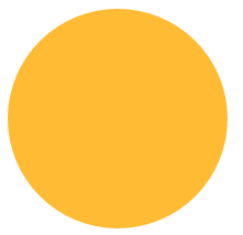
To construct a circle on CSS, you only need to set the border-radius attribute value to half the side length.
<!DOCTYPE html><html lang="en"><head><meta charset="UTF-8"><title>border-radiustitle>
<style>
.borderRadius{
display: inline-block;
background: #fb3;
min-width: 200px;
height: 200px;
line-height: 200px;
border-radius: 100px;
/* 边长的一半 */box-sizing: border-box;
padding:0 5px;
}<style>
<head>
<body>
<p class="borderRadius">
<p class="innerTxt">p>p>body>html>The display effect is as follows:

The above layout When we add too much content in innerTxt, we will get the following effect:

If we want an adaptive ellipse If so, then the border-radius should not be a fixed value. When we set the border-radius to 50%, the display effect is as follows:

This becomes an adaptive ellipse.
Here we give a comprehensive introduction to the properties of border-radius. Border-radius is an abbreviated property. Its expansion formula is border-top-left-radius, border-top-right-radius, border-bottom-right-radius, border-bottom-left-radius.
It also has a little-known feature: border-radius can specify horizontal and vertical radii separately, just use a slash ( / ) to separate the two values ( Circle fillets have equal horizontal and vertical radii and can be merged).
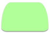
Combining these characteristics, the detailed expansion of border-radius:50%; should be border-radius:50% 50% 50% 50%/50% 50% 50% 50%. Next, we use our imagination to construct various graphics based on the known fillet characteristics. border-radius: 50% / 100% 100% 0 0 (when the corner radius is less than 4, css will automatically repeat it for you)

border-radius:

.borderRadius{display: inline-block;background: rgba(255,160,220,.8);
box-shadow: hsl(0, 0%, 60%) 0 3px 3px;min-width: 200px;height: 100px;line-height: 200px;
border-radius: 50% 10% / 100% 10%;
        }
.borderRadius{display: inline-block;background: rgba(157, 255, 127, 0.8);
box-shadow: hsl(0, 0%, 60%) 0 3px 3px;min-width: 160px;height: 100px;
line-height: 200px;border-radius: 20% 20% 12% 12%/ 80% 80% 12% 12%;
        }
.borderRadius{display: inline-block;background: rgba(167, 255, 250, 0.8);
box-shadow: hsl(0, 0%, 60%) 0 3px 3px;min-width: 160px;height: 100px;
line-height: 200px;border-radius: 20% / 50%;
        }
 css3 tutorial
 What are the css3 gradient properties?
 Is OnePlus or Honor better?
 How to turn off windows security center
 What to do if the documents folder pops up when the computer is turned on
 Detailed explanation of dd command
 Usage of calendar class in java
 Tutorial on adjusting line spacing in word documents


