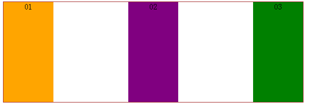
display:box; is a newly added box model attribute in CSS3. The classic layout application is the vertical equal height, horizontal division, and proportional division of the layout.
Currently, the box-flex attribute is not fully supported by firefox, Opera, and chrome browsers, but you can use their private attributes to define firefox (-moz-), opera (-o-), chrome/safari (-webkit- ).
1. box-flex attribute
1. Horizontal equal-width box
Code:
<html>
<head>
<style>
.wrap{
    width:600px;
    height:200px;
    display:box;
    display:-moz-box;
    display:-webkit-box;
}
.sectionOne{
    background:orange;
    box-flex:1;
    -moz-box-flex:1;
    -webkit-box-flex:1;
}
.sectionTwo{
    background:purple;
    box-flex:1;
    -moz-box-flex:1;
    -webkit-box-flex:1;
}
.sectionThree{
    background:green;
    box-flex:1;
    -moz-box-flex:1;
    -webkit-box-flex:1;
}
</style>
</head>
<body>
<article class="wrap">
    <section class="sectionOne">01</section>
    <section class="sectionTwo">02</section>
    <section class="sectionThree">03</section>
</article>
</body>
</html>Display effect:

Note: The parent element style must use display:box; before the child element can be placed in the parent container Divide within; the child element style uses the box-flex attribute to specify the proportion (number of copies) of the parent container. The above is an equal-width division. The three sub-containers have the attribute box-flex: 1; in total, the parent container is divided into three parts according to the width, so the sub-containers are divided into equal widths.
Note: If display:box is set, the container is defined as an inline element. Using margin:0px auto to center it is invalid. To center it, you can only use text-align:center of its parent container. .
2. Customize the divided width ratio
Change the box-flex:1; in the above CSS code to a different ratio.
Code
.sectionOne{
    background:orange;
    width:300px;//设置固定宽度
}Display effect:
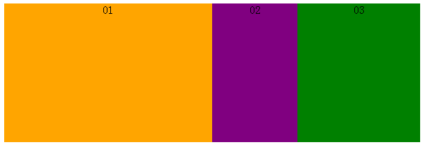
If margin is set, the margin is also included in the fixed width, and the remaining width is divided.
Code (changed to the above code):
<style>
.wrap{
    width:600px;
    height:200px;
    display:box;
    display:-moz-box;
    display:-webkit-box;
    text-align:center;
}
.sectionOne{
    background:orange;
    box-flex:1;
    -moz-box-flex:1;
    -webkit-box-flex:1;
}
.sectionTwo{
    background:purple;
    box-flex:1;
    -moz-box-flex:1;
    -webkit-box-flex:1;
    margin:0 50px;//添加margin宽度
}
.sectionThree{
    background:green;
    box-flex:1;
    -moz-box-flex:1;
    -webkit-box-flex:1;
}
</style>Display effect:
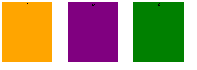
The width of each block is 166.7px after subtracting the left and right margin: 100px, not 200px, and the layout is also equally distributed.
2. Other attributes of box
Other attributes include: box-orient | box-direction | box-align | box-pack | box-lines.
1. The role of the box-orient attribute: determines the arrangement of child elements in the parent element, whether it is horizontal or vertical.
Attribute values: horizontal | vertical | inline-axis | block-axis | inherit.
If the parent element box-orient:horizontal; or box-orient:inline-axis;, to arrange the child elements horizontally is to divide the width of the parent element. (At this time, if the parent element defines a height value, the height value setting of its child elements will be invalid. The height of all child elements is equal to the height value of the parent element; if the parent element does not set a height value, the height value of its child elements will be valid. And take the height of the child element with the maximum height value.) The height of the child element will exceed the height set by the parent element, and each child element has its own set height, which is inconsistent. The instructions in parentheses need to be verified, the code and the display effect. as follows.
Code:
<style>
.wrap{
    width:600px;
    height:200px;
    display:box;
    display:-moz-box;
    display:-webkit-box;
    text-align:center;
    -moz-box-orient:inline-axis;
    -webkit-box-orient:inline-axis;
}
.sectionOne{
    background:orange;
    height:100px;
    box-flex:1;
    -moz-box-flex:1;
    -webkit-box-flex:1;
}
.sectionTwo{
    background:purple;
    height:200px;
    box-flex:1;
    -moz-box-flex:1;
    -webkit-box-flex:1;
}
.sectionThree{
    background:green;
    height:300px;
    box-flex:1;
    -moz-box-flex:1;
    -webkit-box-flex:1;
}
</style>Display effect:

If the parent element box-orient:vertica;l or box-orient:block-axis; (this attribute is the default value), the child elements are arranged vertically, that is Divide the height of the parent element. (At this time, if the parent element defines a width value, the width value setting of its child elements will be invalid; if the parent element does not set a width value, the width value of its child elements will be valid and the width of the child element with the largest width value will be taken.) Same as above. I personally tested that the width of the child element will exceed the height set by the parent element, and each child element has its own set width, which is inconsistent. The instructions in brackets need to be verified. The code and display effect are as follows.
Code:
<style>
.wrap{
    width:600px;
    height:200px;
    display:box;
    display:-moz-box;
    display:-webkit-box;
    text-align:center;
    -moz-box-orient:vertical;
    -webkit-box-orient:vertical;
}
.sectionOne{
    background:orange;
    width:500px;
    box-flex:1;
    -moz-box-flex:1;
    -webkit-box-flex:1;
}
.sectionTwo{
    background:purple;
    width:600px;
    box-flex:1;
    -moz-box-flex:1;
    -webkit-box-flex:1;
}
.sectionThree{
    background:green;
    width:700px;
    box-flex:1;
    -moz-box-flex:1;
    -webkit-box-flex:1;
}
</style>Display effect:

box-orient:inherit; is set to inherit this value from the parent element.
2. Box-direction
attribute function: determine the order of child elements in the parent element, whether it is normal order or reverse order.
Attribute values: normal | reverse | inherit.
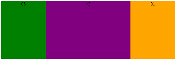
This attribute value is easy to understand. The parent element attribute box-direction:normal; refers to arranging child elements in the normal order of html tags. box-direction:reverse; refers to arranging child elements in reverse (reverse order) order. box- direction:inherit; refers to inheriting the changed value of the parent element. Give the display effect directly.
Display effect (forward order):
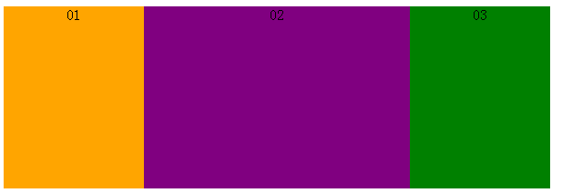
Display effect (reverse order):
3. box-align
attribute function: Determine the vertical alignment of child elements inside the parent element.
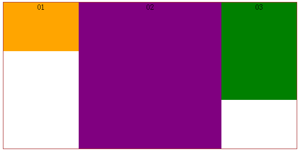
Attribute values: start | end | center | baseline | stretch.
box-align:start; indicates that the child elements are aligned at the top, and the display effect is:
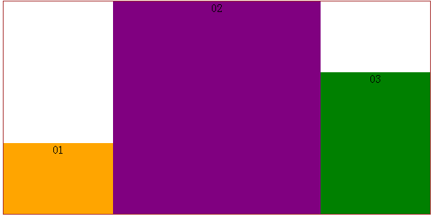
box-align:end; indicates that the child elements are aligned at the bottom, and the display effect is:
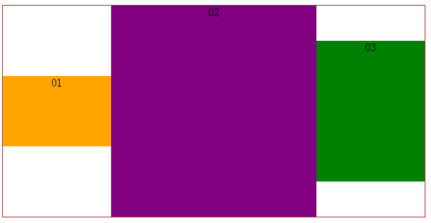
box-align:center;表示子元素居中对齐,展示效果:
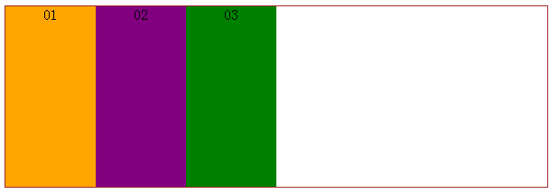
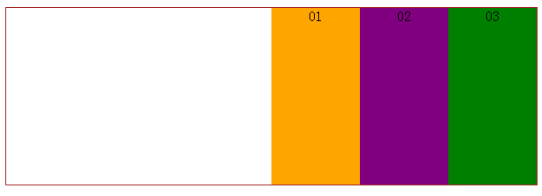
4、box-pack
属性作用:确定父元素里面定宽子元素的水平对齐方式。
属性值:start | end | center | justify。
代码:
<style>
.wrap{
    width:600px;
    height:200px;
    display:box;
    display:-moz-box;
    display:-webkit-box;
    text-align:center;
    border:1px solid brown;
    -webkit-box-pack:justify;
}
.wrap section{
    width:100px;
}
.sectionOne{
    background:orange;
}
.sectionTwo{
    background:purple;
}
.sectionThree{
    background:green;
}
</style>box-pack:start;表示子元素整体水平居左对齐,展示效果:
box-pack:end;表示子元素整体居右对齐,展示效果:
box-pack:center;表示子元素整体居中对齐,展示效果:

box-pack:justify;表示子元素水平等分父元素宽度,展示效果:
