This video introduces how to create tooltip-like tooltip boxes and arrow shapes using only CSS!
First introduce CSS: after selector
Definition and usage: (Refer to w3school:after selector)
: The after selector is inserted after the content of the selected element Content, use the content attribute to specify the content to be inserted
Example:
p:after
{
content:"台词:-";
background-color:yellow;
color:red;
font-weight:bold;
}Let’s introduce the use of: after selector to create CSS arrows and other prompt boxes: (Here will be a simple step by step The design added in each step is the extra style code content in the previous step. Pay attention to the difference! )
First, our HTML code:
<body>
<div class="demo">
</div>
</body>
Let’s set this Box style:
<style>
.demo{
background-color: lightgreen;
height: 100px;
position: relative;
width: 100px;
}</style>Screenshot:
It should be noted here that we set the position attribute to relative to allow us to set our "arrow" (Not yet) Absolutely position it and keep it connected to our box!
Then we continue to insert the "arrow" (not yet appeared) basic style:
<style>
.demo{
background-color: lightgreen;
height: 100px;
position: relative;
width: 100px;
}
.demo:after{
content:'';
position:absolute;
height:20px;
width:20px;
background:yellow;
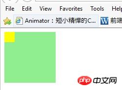
}</style>Screenshot:

You will Notice a few things, first, we only inserted a yellow square, that is the square we will design as an arrow; second, we set absolute positioning so that we can move it to the position we want!
Continue, set a border for the yellow square (the predecessor of "arrow"). The border here is the entity of the arrow, and remove the content of the yellow square (by setting the style "height:0" in demo:after ;width:0" to remove the yellow square, here we omit the height and width of the yellow square):
<style>
.demo{
background-color: lightgreen;
height: 100px;
position: relative;
width: 100px;
}
.demo:after{
content:'';
position:absolute;
//height:20px;
//width:20px;
background:yellow;
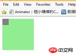
border:10px solid gray;
}</style>Screenshot:

Now add The gray border square is designed in the form of an arrow:
<style>
.demo{
background-color: lightgreen;
height: 100px;
position: relative;
width: 100px;
}
.demo:after{
content:'';
position:absolute;
//height:20px;
//width:20px;
//background:yellow;
//border:10px solid gray;
border:10px solid transparent;
border-top-color:gray }
</style>Screenshot:
OK! We can see the arrow taking shape!
Let’s set its position as we want (in this case the arrow moves to the lower end):
<style>
.demo{
background-color: lightgreen;
height: 100px;
position: relative;
width: 100px;
}
.demo:after{
content:'';
position:absolute;
//height:20px;
//width:20px;
//background:yellow;
//border:10px solid gray;
border:10px solid transparent;
border-top-color:gray;
top:100%;
left:10px;
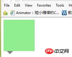
}</style>Screenshot:

This is basically done
The overall style design is as follows (in fact, the background color of the box is changed to be the same as the arrow color):
<style>
.demo{
background-color: gray;
height: 100px;
position: relative;
width: 100px;
}
.demo:after{
content:'';
position:absolute;
//height:20px;
//width:20px;
//background:yellow;
//border:10px solid gray;
border:10px solid transparent;
border-top-color:gray;
top:100%;
left:10px;
}</style>Screenshot:
You can set the specific style you need! For example, to move the arrow to the other three sides, you can set border-TRBL-color:gray; and TRBL (TRBL refers to toprightbottomleft)!
Of course, when you want to modify the position of the arrow on the box border, you also need to pay attention: the size of the border is not included in the size of the box itself! Therefore, you need to pay attention to the influence of margin when designing. For example, if the arrow is centered in the lower border, we consider the above and also need to add: "margin-left:-10px;" to be centered!
The conclusion comes from the comments of yy Duckweed Life (concise image~~haha~~):
The design principle of this example: Set the width and height of the pseudo-class selector box to 0, over there The area formed by the border looks like [X], and the other three sides are transparent, so a triangle is displayed!
Source of this article: https://www.cnblogs.com/xuyongsky1234/p/4152853.html