


Tired of clunky form validation messages? Let's elevate the user experience with CSS pseudo-classes for instant, intuitive feedback. This article demonstrates how to create more responsive and user-friendly forms using CSS.
This tutorial requires a basic understanding of HTML and CSS. That's all you need!
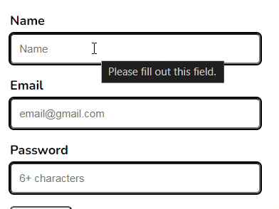
We'll illustrate real-time feedback using simple HTML form elements and CSS.
Initial HTML Structure (Simplified):
<code class="language-html"><div>
  <label for="name">Name</label>
  <input type="text" id="name" required>
  </div>
  <div>
  <label for="email">Email</label>
  <input type="email" id="email" required>
  </div>
  <button type="submit">Submit</button>
</div></code>
Initial CSS Styling (Simplified):
<code class="language-css">form {
    padding: 1rem;
    width: 50%;
    div {
        display: flex;
        flex-direction: column;
        margin-bottom: 1rem;
        label {
            font-weight: bold;
            margin-bottom: 5px;
        }
        input {
            padding: 10px;
            border-radius: 5px;
            outline: 2px solid black;
        }
    }
    button {
        padding: 10px 1rem;
        border-radius: 5px;
        cursor: pointer;
    }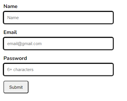
}</code>Initial Appearance:
Now, let's add the magic of CSS pseudo-classes:
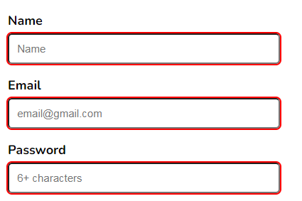
:valid and :invalid: These provide immediate feedback based on whether the input is valid according to the HTML5 constraints (e.g., required, type="email").<code class="language-css">input:valid {
outline-color: lightgreen;
}
input:invalid {
outline-color: red;
}</code>:valid and :invalid in Action:
:user-valid and :user-invalid: These provide feedback based on user interaction, even before the browser's built-in validation kicks in. Note: Browser support for these is not yet universal.<code class="language-css">input:user-valid {
outline-color: lightgreen;
}
input:user-invalid {
outline-color: red;
}</code>:user-valid and :user-invalid (Illustrative - Check Browser Compatibility):
:placeholder-shown: This targets input fields while the placeholder text is visible. Combined with :valid and :not(), we can provide feedback only after the user starts typing.<code class="language-css">input:not(:placeholder-shown):valid {
outline-color: lightgreen;
}
input:not(:placeholder-shown):invalid {
outline-color: red;
}</code>:placeholder-shown in Action:
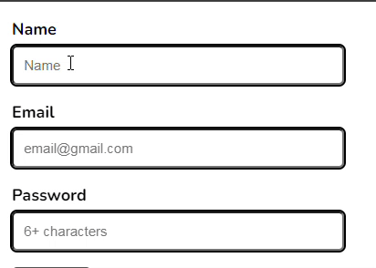
:focus: To refine feedback during the typing process and avoid immediate :invalid highlighting before the user has fully entered data, use :focus:invalid.<code class="language-html"><div> <label for="name">Name</label> <input type="text" id="name" required> </div> <div> <label for="email">Email</label> <input type="email" id="email" required> </div> <button type="submit">Submit</button> </div></code>
:focus:invalid for a More Refined Experience:
By strategically using CSS pseudo-classes, you can create forms that provide clear, immediate feedback, significantly enhancing the user experience. Experiment with these techniques to build more intuitive and user-friendly interfaces. Share your thoughts and other CSS pseudo-class ideas in the comments below!
The above is the detailed content of Enhancing Form User Experience with CSS: Real-Time Feedback Techniques for Better User Interaction. For more information, please follow other related articles on the PHP Chinese website!


![[Web front-end] Node.js quick start](https://img.php.cn/upload/course/000/000/067/662b5d34ba7c0227.png)


