I couldn't wait to have some "free" time so I could add styling to my project. Something about a little bit of interactivity adds life to the page.
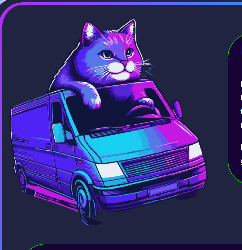
You want a floating cat? No problem. I made an image of a cat using AI and extracted the background in Illustator "by hand" to get a nice cut-out effect for my .png image. Bam. Cat.
Lets make him move a little bit so it looks like he's floating. One of my favorite CSS animations is orbit. It is really useful and you can do a lot with it.
In the view, I bring the image of my cat in and assign it the class "cat"
<%= image_tag "favicon.png", alt:"vendor booth", width:"40%", height:"40%", class:"cat" %>
Now, in my css file, I build my style for "cat". In cat, we call our animation, orbit, as shown below.
.cat {
  animation: orbit 3s infinite linear;
}

@keyframes orbit {
  from {
    transform: rotate(0deg) translateX(15px) rotate(0deg);
  }
  to {
    transform: rotate(360deg) translateX(15px) rotate(-360deg);
  }
}
You see here that we are "rotating the cat starting at an angle of 0 degrees", at 15px away from the x-origin, starting at 0 degrees.
The cat goes a full circle to 360 degrees, at 15px away, all the way around. The second rotation of -360 is canceling out the first rotation, to keep the cat upright. It's easier if you just see the animation. XD.
We are just moving him a tiny amount, as we don't want him flying all over the page. Just enough to be exciting.
A little bit to the left,

A little bit to the right.

Magic!
I had previously learned how to create a cube with css. While that's fine and dandy, I got the wild hair idea today about re-using the cube in a dynamic way. I wanted to populate the cube faces with data in real time. Like say, the next few upcoming events. As like a fun discovering thing on the landing page. Why not. This is exciting.
So as anything, I build out the skeleton in the view. Our cube needs a home after all.
I've got some radio buttons so the user can interact with the cube.
Each radio button will show a different cube face.
I add the information I want to display on each face in a loop:
  <div>


<hr>

<p>Handling the css is a bit of a dance. Especially with viewports and what not. This is not the answer for mobile but it will work and be functional on a bigger screen, LOL. I'm just gonna leave this here for you. Open to suggestions for handling a small screen size. <br>
</p>
<hr>


<p><img src="/static/imghw/default1.png" data-src="https://img.php.cn/upload/article/000/000/000/173429456116557.jpg" class="lazy" alt="Floating Cats and Cubes"><br>
<br><br>
</p>

<pre class="brush:php;toolbar:false">
/*===========
rotating cube
==============*/

.cube-container {
  width: 30vw;
  height: 40vh;
  text-align: center;
  perspective: 100em;
}

.cube {
  width: 100%;
  height: 100%;
  position: relative;
  transform-style: preserve-3d;
  transition-duration: 2s;
  border: 5px solid transparent;
  margin-top:100px;
  display: block;
}

.cube-side {
  position: absolute;
  width: 300px;
  height: 300px;
  background-color: rgb(64, 0, 148);
  border: 1px solid white;
  background-position: center;
  background-size: cover;
  border: 4px solid lime;
}

.cube-side:nth-child(1){
  transform: rotateY(0deg) translateZ(10em);
}

.cube-side:nth-child(2){
  transform: rotateY(90deg) translateZ(10em);
}

.cube-side:nth-child(3){
  transform: rotateY(180deg) translateZ(10em);
}

.cube-side:nth-child(4){
  transform: rotateY(-90deg) translateZ(10em);
}

.cube-side:nth-child(5){
  transform: rotateX(90deg) translateZ(9.75em);
  border-top: 8px solid lime;
  border-bottom: 8px solid lime;
}

.cube-side:nth-child(6){
  transform: rotateX(-90deg) translateZ(9.3em);
  border-top: 8px solid lime;
  border-bottom: 8px solid lime;
}


/* cube radio buttons */

.radio-button {
  transform: translateX(-50px);
}

.radio-button:checked ~ .cube{
  transition-duration: 3s;
  transition-timing-function: cubic-bezier(0.19. 1, 0.22, 1);
}

.radio-button:nth-child(1):checked ~ .cube {
  transform: rotateX(-15deg) rotateY(20deg);
}

.radio-button:nth-child(2):checked ~ .cube {
  transform: rotateX(-15deg) rotateY(180deg);
}

.radio-button:nth-child(3):checked ~ .cube {
  transform: rotateX(-15deg) rotateY(90deg);
}

.radio-button:nth-child(4):checked ~ .cube {
  transform: rotateX(-15deg) rotateY(-90deg);
}

.radio-button:nth-child(5):checked ~ .cube {
  transform: rotateX(-105deg) rotateY(0deg);
}

.radio-button:nth-child(6):checked ~ .cube {
  transform: rotateX(75deg) rotateY(0deg);
}
Each button and side is being handled individually. I'd love to see a more elegant solution if it exists.
I'm just really excited it worked.
Thanks for looking!
The above is the detailed content of Floating Cats and Cubes. For more information, please follow other related articles on the PHP Chinese website!


